Showing posts with label Posters. Show all posts

Wednesday, 13 July 2011

Competition

Whilst I was away I did a few random little things outside of work to help keep my brain in its usual state and one afternoon on twitter I saw the words space exhibition floating around. No idea what it was about, so I clicked around and discovered a competition to create a poster based on the word "SPACE".

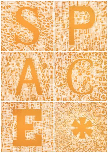
I went away and came back to this a day or so later, whilst I was clearing out some of the fonts on my computer, I had over a thousand, I remember thinking to myself, "I doubt I have used even half of these fonts! All they do is take up space..." flash of inspiration... "how can I use all these fonts in some way connected to the word space? Wait a minute, I could make something using all the fonts and negative space!"

So that is what I did! I chose a few of the most used fonts on my computer and put a letter in each space (sorry for the pun-ish nature of this), added a star for the last square (you know, stars, outer space) and then proceeded to build a negative space letter.

Photobucket

2 things:

1. I promise I haven't used the same font twice inside one square.

2. If you are thinking, "That must have taken hours!" yes it did! The star alone took nearly two!

But I do love it! I keep thinking I should get one printed for my wall! Quick thanks to Neil Asher from Black Sheep for giving me the kick up the arse to do this.

I think its time I went to bed...
Michael

Links
Larger Versions
Space Exhibition

A positive relationship...

...with clients can be an incredible thing! It really can.

Once again Mike Borgia came to me to get a few things ready for their summer tour. He wanted a tour poster, that wasn't all about the details, more something they could sell for a few bucks/give away happily.

I did my best to accommodate them by making this:

Photobucket

This was meant to be a 2 colour screen print on off white/creamy brown stock, don't know if thats how it got printed.

There are 3 members in the band, they are off on tour...so scouts and jamboree's. It makes perfect sense to me!

Maybe one more...
Michael

Links
Larger Versions
Mike Borgia

Artistic Poster

I was given an amazingly ambiguous brief, which was, "You know those gig posters that have next to no detail on them and look awesome? Do that!"

What a brief!

Given that amount of freedom, what do you even attempt to do?

Photobucket

Do some type that is halfway between custom and a font and a man hanging from a hot air balloon, whilst he he eats his lunch. Trust me that is what is happening! It was/is meant to be an A2 print, the detail would be clearer at that size.

More to come...
Michael

Links
Larger Versions

Saturday, 19 March 2011

The beginning stages...

I love it when clients come back to you! I really do. It means I must have done something right last time. So welcome to working with a great film maker called Suni Khan again! Woo!

This time Suni sent me an email and asked if I could make a title card for his new film "Goodbye Ivy", I was suitably excited.

I must confess at this point, I got a little carried away...I had what I thought was a great idea, I'll admit it was something I wanted try doing and as always I got carried away. Just so you know, this is the result of me getting carried away...

Photobucket

(worth looking at the larger version, link later, to see some of the detail)

...now, again I have to admit, this is my blog so I can say this. I like this, but after getting a few more emails from Suni about the plot and feel of the film, even I knew I was off the mark with this. Once again, it's my blog, I like this, I know it doesn't work for the plot and feel of the film, but I still think its a nice piece of type.

Right back on plot folks!

After a few more emails, where we talked about what the film was about, a few reference ideas and some general laughs about 4am emails (have a look at some of my instant album art) I had a great idea of what Suni wanted, and a few interesting ideas of my own!

There are several versions of this, but together we got to an end result that we both really like!

Photobucket

As always I like to go the extra mile for clients and decided to include this little taster poster for the future of the project.

Photobucket

The film is still in pre-production stages, but I am rather excited as I am going to be working on the credits for the film as well! This is going to be an awesome project!

Bring it on!
Michael

Links
Suni's Website
Larger Versions

Tuesday, 15 March 2011

Again...how do I categorise this?

An awesome piece that I totally forgot to post when I finished it!

I am grateful for regular clients, I am even more grateful for regular client who constantly turns up with interesting ideas and challenges me to do fun things!

I got an email asking for a playbill for a release show, it was an interesting idea that I had never consider being a cool thing to do, but when I started looking into playbills from the 1940's, this fast became one of the best ideas I have heard in ages!

I will admit, I went a little overboard on the idea, but for all the right reasons! I had no idea how much fun it would be incorporating elements from their album artwork into the design, whilst adding random details along the way....

Photobucket

This has to be one of my favourite pieces.

Thank Mike, Nathan and Brian for being amazing.
Michael

Link
Mike Borgia's Website

Thursday, 10 March 2011

Going backwards and forwards!

Another poster for the crew at the Croft, this was a really odd one as the band name was painfully long, "Hammer no more the fingers", if I had used the format they like the headline act's name would have been tiny! So I decided to try and make this one more typographical.

In the process of doing so, I seemed to manage to take a step back to 2009ish, in terms of my style, and make it very similar to what I used to do rather than what I have been doing. Does that make sense? Who cares? Visuals time!

Photobucket

You will have to troll through some of my old work if you don't believe me, or you could just not and believe me...I'd prefer that.

Few more posts....
Michael

Link
Larger Version

Wednesday, 26 January 2011

Something different...

Another poster for The Croft, this was a weird one as I accidentally did something that would have been perfect for a venue I have never heard of! Strange really, it will have a great use elsewhere, so its no worries!

This poster was half looking at a tutorial and half doing my thing. I am trying to improve and do something different you see, it's called self improvement and I like it!

The headline band are called Dead to Me, so it seemed fairly obvious what I should do.

Photobucket

Any guesses what the tutorial was? We'll just say B Movie horror.

There is more to come.
Michael

Link
Larger Version

Saturday, 8 January 2011

A response!

One of my friends passed comment that some of my posters were a little samey, I have no problem with this as it would seem I am developing a style of some description! I mean who knew?

But I can't take something that sounds like a challenge and not do anything about it! So I designed a poster that was a little different to my...what am I saying...it still looks like my work to me!

Photobucket

The awkward thing about this poster is that it couldn't be drastically different as it is for a release show for the artwork I have already completed!

Right, time to go...
Michael

Link
Mike Borgia's Website
Largesr Version

A little different than usual

I saw someone screen printing onto old wallpaper recently, it was a cool effect! I don't have any wallpaper or any method of screen printing things, so I decided to cheat and make something that looked like it had been screen printed onto wall paper!

Photobucket

Again, its a poster for Dead Punk at The Croft, so I tried to keep it within the style they like, but mix it up a little.

Enjoy!
Michael

Link
Larger Version

Tuesday, 30 November 2010

Posterism

Another poster for the Deadpunk crew at The Croft in Bristol. Not a lot to say about it really as they like what I did the first time and asked me to stick to the programme.

Photobucket

I guess its a little different, but not very! Ha!

Link
Larger Version

Wednesday, 27 October 2010

Poster time....

It's always nice to know that people will come back to you when you have done work for them!

I got a call from the guitarist from They Walk Amoung Us asking for a poster, as they had a gig they wanted to pimp! Brief was virtually non-existent, "You know what I like, just do something like our artwork!"

I had always liked the image I had put on the bad of their album, and I didn't think it ever took centre space, so I thought I would give it the attention it deserved!

Photobucket

Always happy to do something like this!

Bed time...
Michael

Links
Larger Versions
They Walk Among Us Myspace

Resigning in 40 minutes!

I recently played a gig with a band called AC4, the members of which graced such incredible bands as The International Noise Conspiracy and the enormously influential and sadly missed Refused, sorry I'm getting off point.

I also went to an event in a local venue called "Design Wars" (great event put on by great people, links later), but the challenge was put to a small group of people/designers to create some album artwork, using words chosen at random (for band name and title) and the genre was also chosen at random. Each group was given 40 minutes to then create artwork from scratch using the equipment and images that were on the desk! I was in a group with 3 of my friends, 2 code geeks and a european union schmooser, we didn't win, but it was great fun! AND I liked the concept of designing something in 40 minutes!

So with a gig coming up, with a poster I wasn't fussed on...

Photobucket

...again nothing bad, but I need a poster to try and design in 40 minutes! So I limited myself to photos of the band (as in the original poster), and tried to focus on the main details of the original. The biggest concern I had was showing the band in their normal environment, they are a hardcore band after all and the original picture wasn't exactly complimentary, even the band joked at the gig, they wouldn't want to watch themselves if they saw that photo!

So here we go, poster in 40 minutes!

Photobucket

Its not a major change, but I think its much cleaner.

Enjoy
Michael

Links
Largesr Version
AC4 on Myspace
Design Wars Official Blurb
Photos from Design Wars

Wednesday, 13 October 2010

Movie Poster!

This was a happy brief to receive! The client saw one of my previous pieces of work and got in touch with me, so this is a little success story! Anyway, the plot!

This is a poster for a short film, made by Suni Khan, about 2 soldiers who are caught in the repetition stage of war, and hence the title is "Nothing Happened" the challenge was creating a poster with stills from the film that was mainly for online usage (I still have an idea for a print one which was not part of the brief, but I will probably do anyway at some point, the logistics of it would make it awful for online use).

The real challenge of this job was taking landscae images and making them effective in a portrait context, harder than it sounds, believe me!

I can't post the film as it isn't online anymore as it is being subbed to various festivals for consideration, but the poster is fine!

Photobucket

There were a few ideas bouncing around between myself and the film maker, but this was the result we were both very happy with.

I will gladly update this when the film is available somewhere!

For now...
Michael

Links
Largesr Version
Follow the film maker, Suni Khan, on Twitter!

Wednesday, 6 October 2010

Rejected...

EDIT: This wasn't rejected, I just got the wrong end of the stick!

Sad times, I did this and it was rejected, or atleast sort of, there was some misunderstanding about who was supposed to be doing this and I got carried away and did the dam thing without waiting for the ok from the big dude. So it's my fault this is going unused! However I love it! I really love it!

The idea was to create a deck of cards based on hardcore punk stereotypes, the suits being some of the obvious things:
1. Stars - loads of star tattoos in the world, and the revelation records logo is also a star.
2. Knuckle dusters - more stereotyping.
3. XXX - the standard symbol for the straight edge punk.
4. Wreath - go look at hardcore punk band logos, they are everywhere!

And for some reason, I decided the Ace of Spades with a Sick of it All Dragon (which I happen to have tattooed on me) in the midst acting as the joker!

Photobucket

I love this idea, and I think it might get recycled in some way or another. Not sure where yet, but it will!

Nearly bedtime...
Michael

Link
Larger Version

Redesigning some more things!

This is a weird one, I don't dislike the poster that I saw, but at the same time, I don't like it. In truth I was half way through an idea for a Die Hard poster and lost the plot and wanted to give this idea a home.

Meet the original:

Photobucket

Considering I am playing this show, I doubt anyone will mind a rethink!

Meet the redesign:

Photobucket

The show is tomorrow, so I won't worry about anything complicated, just did it for fun really.

Little more to post!
Michael

Link
Larger Version

I do make a lot of posters!

Well I do!

After the success of the Swingin' Utters poster, the folks at the Croft asked me to do another one for another show! Good times!

The brief on this one was as comical as ever, "I liked your last one, do it the same, but different!" So that was my mission, the same but different...

Once again, 2 colour screen print ready on an ash white paper.

Photobucket

The band are pretty cool too, indie punk from Philly. I am looking forward to going to the show.

It's one of those days...
Michael

Link
Larger Version

Sunday, 19 September 2010

Played for and got...

This poster was designed for a competition, now I am not normally one for competitions, but there was something about this film that caught my attention and clicked something in my brain that said, "make the poster brainless!"

Here is the official word from them:

"Clint Eastwood wannabe Jimmy finds escape in his shoot 'em-up video games - which leads to a caffeine-induced flight of fancy including Mexican stand-offs, mischievous gnomes, and invisible bullets!"

As it happens, I wasn't doing anything when the I saw the comp posted (I was idly time wasting on the internet), and I've been telling myself that I should make more positive steps when things like this happen, so this seemed like a good reason to stop faffing and start doing something.

I'll cut to the chase, I enter and won. Meet the poster for a special film that is part of the Virgin Media shorts competition.

Photobucket

The poster might be a little lost on you, if you haven't seen the film, so be ready for a lot of links to follow! Fair play to the team behind the film, they have done a wonderful job of promoing the film, just follow the links...

Hold your breath...
Michael

Links
Largesr Version
Watch the Film
Invisible Bullets Homepage
Stan the Gnome on Twitter

Exciting times!

I was asked to produce a poster for a gig I am playing, the brief was "Do whatever you feel like, just make it screen printable and 3 colours or less. Oh, and make sure it doesn't suck!"

So thats a simple brief and a job I can really get behind, mainly because I get to support the Swingin' Utters! Remember them for the heyday of Fat Wreck Chords? No, shame. It makes me very happy!

I started doing the poster and got a bit confused by the idea of 3 colours, so stuck to 2.

Photobucket

Woo!

Roll on Novemeber!
Michael

Link
Larger Version

The best looking quiz poster ever!

It's a brave claim to fame, but I'm going to run with it regardless. What? Are you arguing? Prove me wrong, most of them are done in word!

This one was a weird challenge as I had an idea that was awesome, cheesy and fantastic in the best kind of way! Then I went hunting for logos, and corporate information and my idea got totally shelved.

So this became a real challenge as I had to make a poster that worked within 2 sets of corporate guidelines. Meet my effort...

Photobucket

Not complicated, not mental, but far FAR more stylish than the average word art rubbish!

It's getting hard to post and watch Mythbusters!
Michael

Link
Larger Version

Something I should have posted ages ago!

I spent the best part of 6 months working on this, seriously 6 months! Not constantly, but it was a long time from the first photo to the sending off stages.

I will give some explanation of this, as I am happy to explain; Peachfuzz are an amazing rock band from Bridgend, they needed artwork for their album, they asked me to do it. I have know Peachfuzz for some years, and I would describe their sound as similar to the Lemonheads and the Replacements, you know the wonderous branch of rock that fills you with happy thoughts of summer and the perfect soundtrack to a beautiful holiday...

When I listened to their record(s) I think of a soundtrack to a summer film based in a run down theme park, if we are being stereotypical I would say Coney Island, NY, this all got me thinking about a chapter from Mitch Albom's "The 5 People You Meet in Heaven", the lead character arrives in the afterlife to be greeted by a carnival freak who's idea of heaven is Coney Island (where he worked) without people to point and shout at him. "But these guys are from Bridgend in south Wales" I hear you say, so I decided to take advantage of the dilapidated south Wales seaside!

I spent an afternoon in November in Penarth, an afternoon in January in Porthcawl and an afternoon in Barry Island in February. the hardest part of getting good quality/brightly lit photos in Wales in the winter is waiting for the day where the sun was out and the sky was clear. If you know Welsh weather at all, you know how rare this is! I'm not lying when I say some of these photos were taken in a scarf and gloves!

Front Cover:

Photobucket

On body:

Photobucket

Back:

Photobucket

Sleeve outside:

Photobucket

Sleeve inside:

Photobucket

I would like to thank Tom at Sound Print for doing an awesome job helping me turn my artwork into an awesome poster, which I swear one day I will find a frame that will fit it!

Photobucket

One day I will get the enormous InDesign files off my external hardrive and posting them here, I swear!

These 2 made me smile as well...

Photobucket

Yes, up for sale on HMV.com, its a small thing that made me smile...

Photobucket

and my artwork taking over the homepage of their label!

Right...more posts to come.
Michael

Links
Check out Sound Print
Peachfuzz's Myspace