skip to main |
skip to sidebar
Well I do love it!! I think it is a really great idea, the brief was to create some form of promotional material that discourages people from dropping gum. It costs so much money to clean up!! It costs approximately, if memory serves, 17p to remove each piece from the ground!! And when you think a pack costs 30 something pence (don't know don't buy it) it is an insane amount of money being thrown at a problem.
I am really proud of this result as it was shear research that got me there, research into disposal methods, solutions that have been trailed, comparative solutions....and most of the solutions that were in effect were stupidly expensive, plastic pouches, some really disgusting posts/walls covered in gum...
I've always been aware that negative slogans/advertising don't have any effect whatsoever, look at the average smoker, you could put pictures of brutal deformed lungs fill with tar (wait they do that now) and it does nothing to stop them smoking, I found a completely random study done in Holland's public toilets where they printed a fly on a urinal. I won't repeat the statistic as I can't believe that they measured it, but it's safe to say it stopped people pissing on the floor as much because they were aiming for the fly! So here research said something funny...
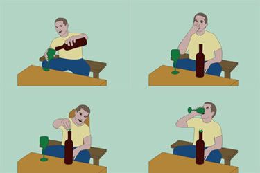
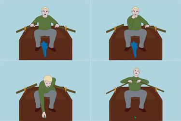
Roll on the alternate uses for chewing gum, I knew full well that these would probably have to come with an idiot warning on them, but I love the idea. There was an abandoned idea involving superheroes. So I tried my best to come up with as many ideas as possible, I think I got to 20 something, but to be honest I was clutching at straws past 10.
So I focus on the few that would make the best visuals, and did my homework into instructional images, that usually come on planes and warning cards...
And this is what I came up with....
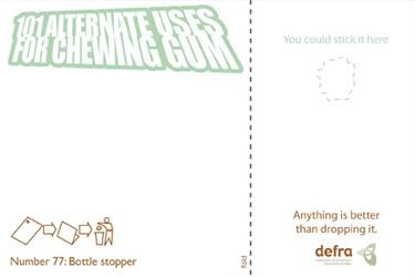
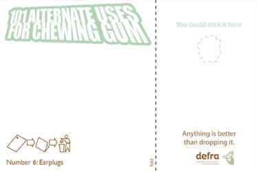
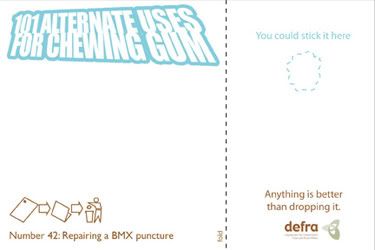
Somewhere in the final stages, this went from just being a postcard, to the idea that you could stick the gum on the postacrd, doubling its usefulness! This came up when I looked back at the research, realising that it would costs roughly 5p per card, thus saving 12p on cleaning costs.
Please don't judge the quality of some of the drawing to harshly, I wanted to learn how to use illustrator at the time and this was my baptism by fire, I can see things I'd change now, but I still think it is a great idea and that's what counts! I still think the back is a lovely combination of colours and style, it's formal enough to be a government thing, but funky enough (colours and logo) to be cool!
Other things to do...
Michael
Link
Larger Versions
And I'm not talking about Lex Luger (he was a wrestler for WCW in the 90's, went on to wrestle in WWF? Wrestlemania 10? Bret Hart? Yokozuna? Royal Rumble 1994? The double elimination bit? No? Wow! I remember some rubbish!)
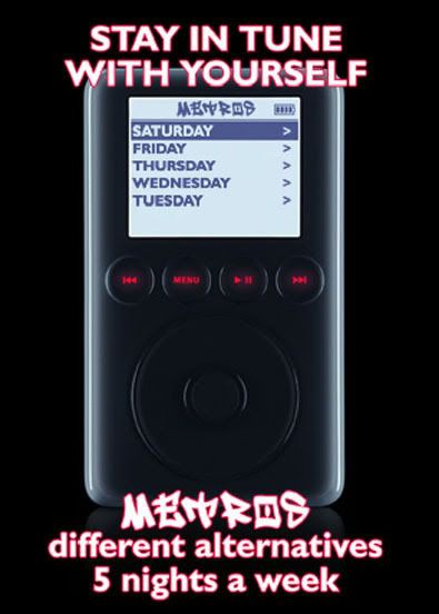
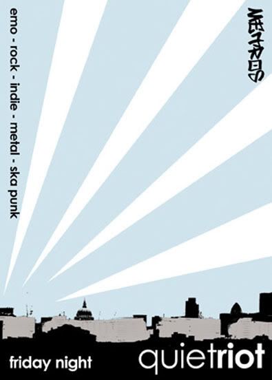
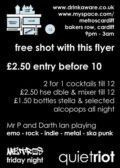
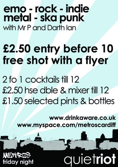
Well, I was asked to completely re-brand a club night with a new name, new flyers, new posters and a new look!! Away with the bright gaudy colours please! Away with the stupid Nu-metal graffiti style graphics! Well that wasn't exactly what I was told, but you get the idea (or you will if you ever see some of the other flyers!!)
New name was quiet riot, I had the idea when listening to a Brand New song, seemed appropriate for a predominantly emo night.
Don't have a clean version of the logo, but it is coming up.
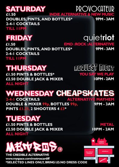
So first of I had to make the flyers!
Flyer front
and back
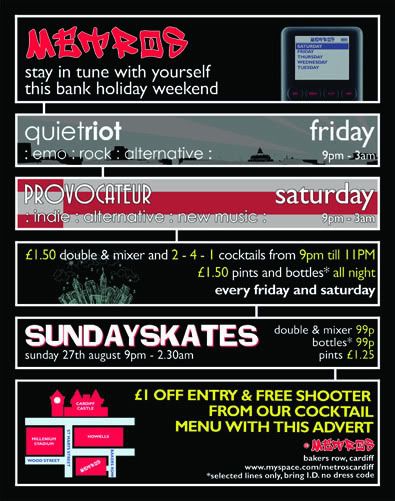
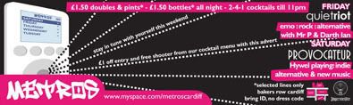
Poster
I am not going to lie and say at this point (around 2005-6) in my life as a designer I wasn't obsessed with grungy objects and vector shaped, because I was! WAIT!! I STILL AM!
But I had used this layout for a uni project and really liked it, so I brought it back to life in this series of images, it was nice to see it out in the world rather than just getting marked by a lecturer.
The random thing was, I kinda knew that bosses at the club were trying to save some money so I had it in the back of my mind to keep the design universal so they could print Black and White if they wanted/needed to and I think when you look at the Black and White versions as well....
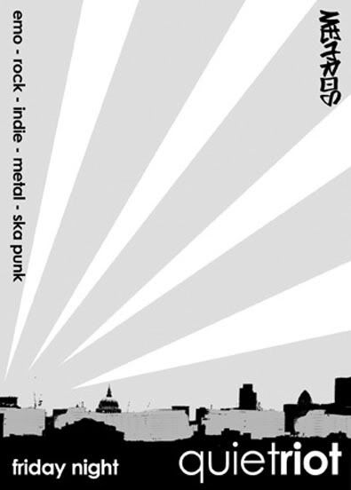
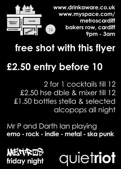
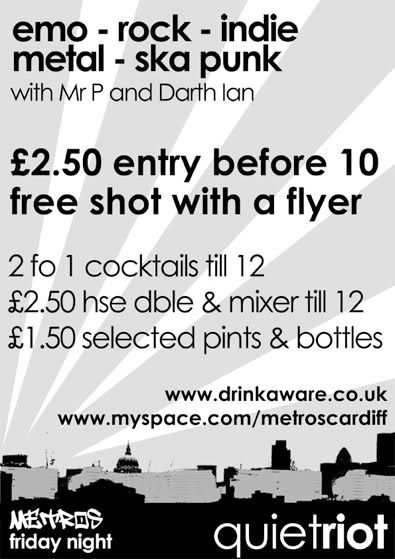
it stands up, in both forms! The gentle blue makes it cool looking, where as it still retains the style of the piece in Black and White.
This was actually the first thing I had proof read twice by different people and it still got through with a spelling error, which was jokingly referred to then on as the Mr. T mistake! Points if you can spot it!
Love
Michael
Links
Larger Versions
So, these were done somewhere around the middle end of 2006(oh my god it's the middle of 2008!!!) both were for clubs I was working for at the time, one in Bristol and the other in Cardiff.
Both were for nights of the week that had to be "fun", so I couldn't get all serious with it, so deliberately crappy looking illustrations here we come!!!!
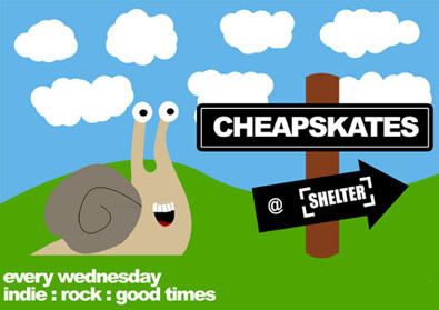
This one always makes me smile, I think i had read something about snails in a book the night before, so had snails on the brain...
This to makes me smile, I think that is the magic of both of these flyers, they are kinda silly, but serve a purpose. I am actually proud of both!
Love
Michael
Link-a-roo
Larger Versions
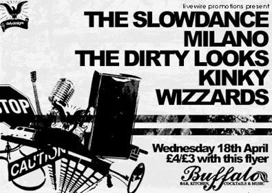
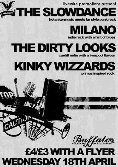
This space isn't about me and the fact that I'm in a band, it's about me as a Designer, so let's just get on with this.
I'm in a band called the Slowdance, from time to time I have done a poster/flyer for us, this is one of those times.
I did this summer 2007, I was just discovering texture's...
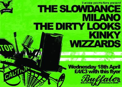
The reason for the chaos in the corner, I'm was thinking about things that seem to go into a modern band, it's not just about the music anymore!
I had to make a poster version aswell, which was a challenge to change the aspect and keep the vibe the same without it looking daft! I think I did well, I used the extra space for detail, now that's a bright idea!!!
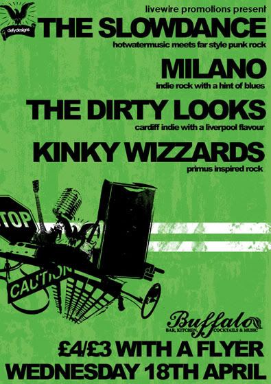
As I have previously mentioned, reproduction across levels of printing is important to me, so here are the black and white's as well!
I'm going to get me some food!
Defy Designs
Link Hawk(you know from "Over The Top")
Larger Versions
The Slowdance