Wednesday 20 July 2011

Thinking for Tuesday (part 1)

Are a bad from Portsmouth and a generally nice bunch of people. When they needed a logo and a website, they came to me! Which is always nice.

There is a site, which you can see in the links at the end, but I want to go into more detail about in another post, so this is part one, just the logo. This is one of those jobs that I look at and think to myself, "Did I make that?" It is different enough for me to feel really positive about it, whilst still being very interesting.

Photobucket

There is a version without the background detail, but this is how they want to try and use it in this form as much as possible, don't worry there is a version without the detail too.

Links
Larger Versions
Thinking for Tuesday

Personal projects rock!

And they do! It's a great way to exercise that corner of your creative mind that doesn't get the work out it needs very often.

This project was started by a bizarre conversation about bad celebrity endorsements (John Lydon and butter!) and the idea that some celeb's should have signature products! The only downside of this conversation was, the funny ideas were/are a little politically incorrect. I decided that it would be interesting to try brand a few of these ridiculous products.

The first one:

Photobucket

I can see it for sale in coffee shops everywhere...I can even visualise the brand mugs....

Photobucket

This shouldn't exist as a product and never will, but it would be funny if it did. The thing that worries me the most...I've got more!

Please don't be offended.
Michael

Link
Larger Versions

Monday 18 July 2011

An interesting website and a little more!

I was asked to create a website for a photographer, after some conversations (involving some comedically bad English and Italian) I had figured out that he was a bit of a technophobe and wanted to be able to update it 'easily' himself if possible.

I love this approach to the web. I love the challenge of making something that is easily updatable without having to understand what HTML is, or how you log in to a profile...you understand. There are countless platforms out there with some really interesting CMS, but I still wanted to try and integrate the platforms he already used to make the whole thing straightforward.

He had a flickr, and after some googling about flickr slideshows, I found a javascript frame that would pool his flickr feed into a 100% background! Great find, after some noodling with the code, there was a fair amount of unnecessary info in there and a menu that didn't suit what I wanted, I had an animating slideshow background pooled by flickr! Which meant he didn't need to touch the site in terms of photos, it did the work for him!

I had to design the logo and think about a menu next. I decided to keep the menu really simple, but decided to incorporate some web fonts to try and add some SEO value to a very minimal site. The logo was a fairly straightforward excercise as he suggested I do something with a view finder.

Photobucket

The menu had to be very non-invasive, so it didn't interfere with the main content. I had been playing with drop down menus on another project and I decided to do the same on this site. After trying it, I realised it didn't work and my brain made the logical conclusion, "No down....UP!" So a flyout menu instead.

Photobucket

Photobucket

Photobucket

Photobucket

Photobucket

All very straight forward, but very effective.

After another chat, business cards were mentioned, I suggested Moo, as they can print multiple images on the front of their cards, which suits a photographer perfectly! So mini moo business cards!

Photobucket

No sense showing you the front, as they are all different! AND on the site!

Big project, well happy.
Michael

Link
Franco Fontani - Street Photography

Friday 15 July 2011

CD artwork...

As part of getting back in touch with the boys from They Walk Among Us to do their site, they asked me to get involved with the artwork for their new EP.

The title is "Outside the Campfire Circle", without going into too much detail about what the title is about, Richard explained to me that the idea was one of not feeling connected with masses and accepting it. I liked the idea a lot! We hammered around some ideas and this is where we ended up.

Photobucket

Photobucket

I won't bother you with the onbody as it was just text details in one colour due to production costs.

I am really happy with this, mostly because it doesn't quite feel like my usual work, which is always a good thing.

Happy with that!
Michael

Links
Larger Versions
They Walk Among Us' homepage

There was a time...

...in my life when if I was asked, "Can you make us a website?" Part of me would have shriveled up and died! BUT not anymore! Now I actually seem to enjoy it! What happened to me? I think I caught a strange disease...

After my success with the anti-myspace web site for Mike Borgia, I put the word out that I was on the hunt for anyone else who was interested, Richard from They Walk Among Us got back to me first!

Photobucket

This site was a little simpler as it was mostly reverbnation plug-ins, but still very effective me thinks! I really like the side menu and logo header.

More to come...
Michael

Links
Larger Versions
See it in action

Myspace is dead...

and it has been for a long time. Yet somehow no site has really managed to fill the void it left, there are a few that are coming close, but not quite managing to do the whole nine yards. So when I got into a conversation about what the solution to the lacking of a myspace was, I got my thinking cap on.

After some thinking I found the answer, cross platform integration. Bands in this day and age have several online presences, twitter, facebook, blogs, bandcamp, reverbnation.....the list is endless! So the plan was to make a site that had next to no content stored on servers and was auto updated via some/all of these external sources!

As always I ended up doing something for Mike Borgia. He likes my screwy ideas.

Photobucket

So what you see there is a one page site that incorporates (from top to bottom) video from youtube, mailing list from reverbnation, photos from flickr, music from bandcamp, shows listings from reverbnation, blog rss feed via blogger and a javascript twitter feed!

It's a lot of elements but it does come together nicely.

I also made them a nifty little logo as an added extra to go with the site!

Photobucket

I'm still proud of how well this all came together.
Michael

Links
Larger Versions
See it in action

Website

When I arrived at my new job in Italy I was given the task of rebranding the company. I made a policy decision, within about 30 minutes of realizing how massive an undertaking that was within confines of language barriers and several other major factors, that the best thing to do was to take the branding they had, not do much with it and make a clean and effective website inside a few days to get a presence online.

This idea gave me the chance to go back to basics and work with the branding and site layout from the ground up and really get down to the nitty gritty of the browsing in 2 languages.

This was a fairly straight forward site layout, a few little bits of Javascript (slideshow of work and date/time), but nothing majorly complicated.

The interesting thing is that I had to build a mirror site in Italian and English, which created a few translation issues as good English and good Italian do not translate well. There may be a boring blog of this somewhere somewhen...

The site:

Photobucket

Photobucket

Photobucket

Photobucket

Photobucket

Photobucket

A random bunch of screen caps, nothing to complicated.

I would love to link you to the actual site, but it is down now and has been replaced with the real site!

More to come.
Michael

Link
Larger Versions

Wednesday 13 July 2011

Competition

Whilst I was away I did a few random little things outside of work to help keep my brain in its usual state and one afternoon on twitter I saw the words space exhibition floating around. No idea what it was about, so I clicked around and discovered a competition to create a poster based on the word "SPACE".

I went away and came back to this a day or so later, whilst I was clearing out some of the fonts on my computer, I had over a thousand, I remember thinking to myself, "I doubt I have used even half of these fonts! All they do is take up space..." flash of inspiration... "how can I use all these fonts in some way connected to the word space? Wait a minute, I could make something using all the fonts and negative space!"

So that is what I did! I chose a few of the most used fonts on my computer and put a letter in each space (sorry for the pun-ish nature of this), added a star for the last square (you know, stars, outer space) and then proceeded to build a negative space letter.

Photobucket

2 things:

1. I promise I haven't used the same font twice inside one square.

2. If you are thinking, "That must have taken hours!" yes it did! The star alone took nearly two!

But I do love it! I keep thinking I should get one printed for my wall! Quick thanks to Neil Asher from Black Sheep for giving me the kick up the arse to do this.

I think its time I went to bed...
Michael

Links
Larger Versions
Space Exhibition

A positive relationship...

...with clients can be an incredible thing! It really can.

Once again Mike Borgia came to me to get a few things ready for their summer tour. He wanted a tour poster, that wasn't all about the details, more something they could sell for a few bucks/give away happily.

I did my best to accommodate them by making this:

Photobucket

This was meant to be a 2 colour screen print on off white/creamy brown stock, don't know if thats how it got printed.

There are 3 members in the band, they are off on tour...so scouts and jamboree's. It makes perfect sense to me!

Maybe one more...
Michael

Links
Larger Versions
Mike Borgia

Artistic Poster

I was given an amazingly ambiguous brief, which was, "You know those gig posters that have next to no detail on them and look awesome? Do that!"

What a brief!

Given that amount of freedom, what do you even attempt to do?

Photobucket

Do some type that is halfway between custom and a font and a man hanging from a hot air balloon, whilst he he eats his lunch. Trust me that is what is happening! It was/is meant to be an A2 print, the detail would be clearer at that size.

More to come...
Michael

Links
Larger Versions

It's been far too long!

Hello everyone! Sorry I haven't updated this little corner of the internet recently! I have been away, come home, had to catch up on a few things and now I am getting back in the saddle with this place!

First thing I will post is a bunch of logos that I designed for a medical company! It's not all rock and roll...

This is a little annoying as I really liked the way these were going, but it was then decided that the companies the branding was for were going to be absorbed into the parent company. Or something like that. Regardless, I made some stuff I like, I want to post it.

First:

Photobucket

This companies name was in swedish and they were focusing on something to do with a degenerative eye condition. The initials were MMO, so the logo is simple and effective me thinks!

Second:

Photobucket

This example was something to do with heart attacks, so I decided to try and incorporate a wave form in there, I wanted to go with something a little more like an EKG, but it looked rubbish, so settled with a cleaner looking wave.

Third:

Photobucket

This was the potential branding for the parent company, but then they decided to not have a parent company. I wish I understood this side of things better, but I am just a designer, not their business manager!

Photobucket

I made a short hand version of it aswell, which I really like. The idea was to try and show an overlapping of several 'things' to create the logo.

I am still very happy with the results, even if they didn't get used.

It's good to be back...
Michael

Links
Larger Versions

Monday 16 May 2011

Dear world!

I am very sorry this place has stalled! I am working in Italy and I don't have internet access at my house, this means I can't keep this up to date without taking time out of my work day. I'm sorry about this!

I when I find myself a day where I can catch up, trust me there will be a great deal of interesting work to post, I have done loads since mid March!

Once again, sorry I have gone quite. Love to you all.
Michael

Saturday 19 March 2011

The beginning stages...

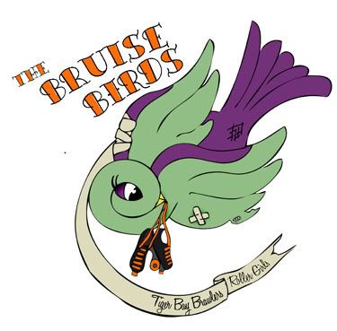
I love it when clients come back to you! I really do. It means I must have done something right last time. So welcome to working with a great film maker called Suni Khan again! Woo!

This time Suni sent me an email and asked if I could make a title card for his new film "Goodbye Ivy", I was suitably excited.

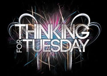
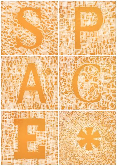
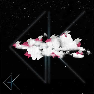
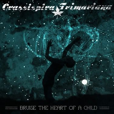
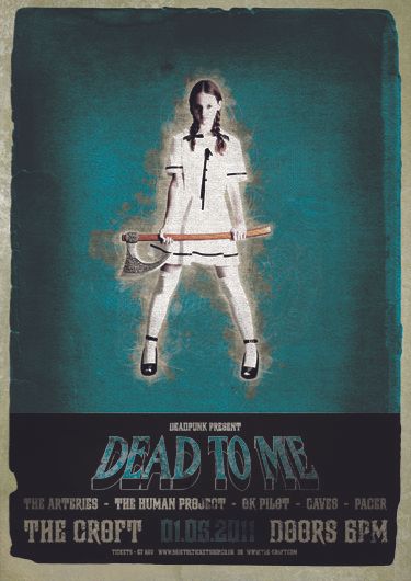
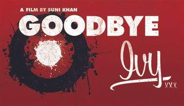
I must confess at this point, I got a little carried away...I had what I thought was a great idea, I'll admit it was something I wanted try doing and as always I got carried away. Just so you know, this is the result of me getting carried away...

Photobucket

(worth looking at the larger version, link later, to see some of the detail)

...now, again I have to admit, this is my blog so I can say this. I like this, but after getting a few more emails from Suni about the plot and feel of the film, even I knew I was off the mark with this. Once again, it's my blog, I like this, I know it doesn't work for the plot and feel of the film, but I still think its a nice piece of type.

Right back on plot folks!

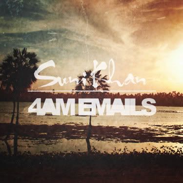
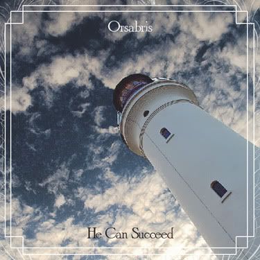
After a few more emails, where we talked about what the film was about, a few reference ideas and some general laughs about 4am emails (have a look at some of my instant album art) I had a great idea of what Suni wanted, and a few interesting ideas of my own!

There are several versions of this, but together we got to an end result that we both really like!

Photobucket

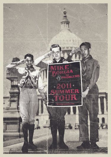
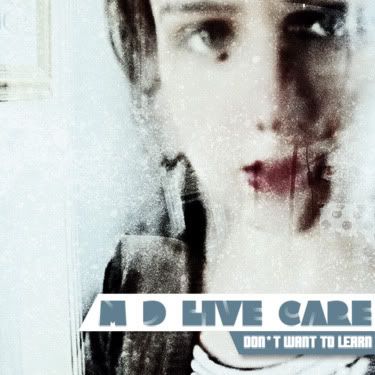
As always I like to go the extra mile for clients and decided to include this little taster poster for the future of the project.

Photobucket

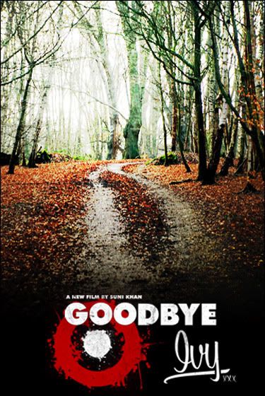
The film is still in pre-production stages, but I am rather excited as I am going to be working on the credits for the film as well! This is going to be an awesome project!

Bring it on!
Michael

Links
Suni's Website
Larger Versions

Tuesday 15 March 2011

Again...how do I categorise this?

An awesome piece that I totally forgot to post when I finished it!

I am grateful for regular clients, I am even more grateful for regular client who constantly turns up with interesting ideas and challenges me to do fun things!

I got an email asking for a playbill for a release show, it was an interesting idea that I had never consider being a cool thing to do, but when I started looking into playbills from the 1940's, this fast became one of the best ideas I have heard in ages!

I will admit, I went a little overboard on the idea, but for all the right reasons! I had no idea how much fun it would be incorporating elements from their album artwork into the design, whilst adding random details along the way....

Photobucket

This has to be one of my favourite pieces.

Thank Mike, Nathan and Brian for being amazing.
Michael

Link
Mike Borgia's Website

Thursday 10 March 2011

Roller Derby again!

Second thing I have done for my girlfriend's Roller Derby team! This time, rather than just colouring something in (seriously) I had to design something! Who would have thunk it?

This branch of the Tiger Bay Brawlers is called the "MERCHANTS OF MENACE" (caps used for drama).

I had to design this with heat pressing in mind, to there isn't any crazy texture details or anything like that, big and bold.

It needed to include:
A Venetian mask, check.
Their name, check.
Some reference to the Tiger Bay Brawlers, check.
And if possible some sort of skating reference, check. Thats what the 96A, 62MM bit is about, wheel dimension, hence the circle!

Photobucket

Ain't I clever! Shucks, Jon Boy!

End stereotyping.
Michael

Link
Larger Version

Corporate things..

I was asked to do this as part of a treatment of logos by a friend as she wanted something completely different in the mix of what she was doing. Strange explanation I know, but it's true, when stumped, asking someone else for an bright idea can always help!

Photobucket

What do you do when you have to design a logo for a company who are company at the top of a series of companies, so have no clear visual identity....the answer is some clean and cool looking! I did that ^.

Judge for yourself!

Listening to music on shuffle is a dangerous idea.
Michael

Link
Larger Version

Instant album art 6

This one didn't go quite to the rules as it was inspired by an odd conversation with a client about waking each other up sending '4am emails' and a random joke about that sounding like an album title. So my brain said, 4am emails does sound like an album title...artist can be the clients name...look out flickr random search here I come!

Photobucket

So I give you Suni Khan's '4am Emails', a never to be released experimental acoustic trip hop album.

Best ideas are often the weirdest!
Michael

Link
Larger Version

Going backwards and forwards!

Another poster for the crew at the Croft, this was a really odd one as the band name was painfully long, "Hammer no more the fingers", if I had used the format they like the headline act's name would have been tiny! So I decided to try and make this one more typographical.

In the process of doing so, I seemed to manage to take a step back to 2009ish, in terms of my style, and make it very similar to what I used to do rather than what I have been doing. Does that make sense? Who cares? Visuals time!

Photobucket

You will have to troll through some of my old work if you don't believe me, or you could just not and believe me...I'd prefer that.

Few more posts....
Michael

Link
Larger Version

Wednesday 23 February 2011

Corporate Logo

Bit of a weird one here, I was contacted at short notice to produce this logo, the client had a very solid idea of what he wanted, but was willing to let me run with most of the decisions, font choice, little embellishments...

This is a black version, if we are talking corporate guidelines, it should be a royal blue or white on a royal blue background.

Photobucket

An interesting little piece me thinks. It is also a middle finger to a designer I argue with a lot who says Trajan Pro is an awful font...I beg to differ, I think it looks great!

Listen to City and Colour, it's great.
Michael

Link
Larger Version

Friday 18 February 2011

Something for a competition.

I am a bit of a message board lover, I love the inspiration, I love the dramas...with one I love dying soon (Emptees), there seems to be a movement to another, and the other is Bandjob. Great place, they love competitions as well, this particular one was for Glamour Kills.

The challenge was to take their logo and just go wild. So I started thinking, their logo is a flying pig, and the expression is "when pigs fly" and one pig isn't a plural, so I thought about a flock of pigs and went from their!

Photobucket

So I have decided that this is a flock of pigs trying to hide using a smoke machine. I added a bit of text and I like that, I wish I could fit it in clearer, maybe I should post that separately....

Yeah, I like this!
Michael

Link
Larger Version
Contest on Bandjob

Saturday 5 February 2011

Pet food!

You heard me right, pet food!

I have just finished an info sheet for a pet food company! It's not all rock and roll, but it is always good!

Photobucket

It is an A5 info sheet, personally, I would have loved a little less info, but then that is always going to be the challenge with these things! Small space, loads of info, get it all in neatly!

Nearly bedtime...
Michael

Link
Larger Version

Monday 31 January 2011

Instant album art 5

I am going to have to stop doing these! I have spent ages doing them now! This might be the last one I do for a while, but I have enjoyed making them none the less!

Photobucket

Right thats it for a while!

I'm going to cook dinner.
Michael

Link
Larger Version

Thursday 27 January 2011

Instant album art 4

Ok, this is a sickness!

Photobucket

Would this be more or less interesting if I included the original image aswell?

I need a shower!
Michael

Link
Larger Version

Wednesday 26 January 2011

Instant album art 3

I have become obsessed with doing this! Meet number 3!

Photobucket

I wanted this one to feel a little abstract hip hop in style, kinda DJ Shadow or something to that effect? I don't know. The band name was M D Live Care, which is just incredible!

I think the best thing that has come from this has been learning about playing with text more and how to make it sit better.

Anyways, I should go to bed!
Michael

Link
Larger Version

Instant album art 2

I like doing these, it is an interesting challenge and it proves that you can stomp the cover of a CD in 45 minutes with a strong image and a clear vision! I know, I know, I spend way more time on things when I do them professionally as there is more concern to resolutions, visual representation....

So yeah, here is another.

Photobucket

With a band name like Crassispira Trimariana, it was great to have an image that involved stars, as it does sound like the name of a constellation!

Lie to Me is back on!
Michael

Link
Larger Version

Potential Shirt...

I wanted to do a design that one colour, simple and would be no problem to get printed in a hurry, so I did this, I have no idea if it will get used as I finished it and sent it with no consideration of whether or not it was going to be used!

It was my hope to make a design that would work as a dark colour on a light shirt and as a light colour on a dark shirt. Did I hit the mark?

Photobucket

Photobucket

and finally a better view of the artwork.

Photobucket

The band are on Bombed Out Records, hence the hand grenade. I hope they like it and it gets printed!

Right, back to work.
Michael

Link
Larger Version

Something different...

Another poster for The Croft, this was a weird one as I accidentally did something that would have been perfect for a venue I have never heard of! Strange really, it will have a great use elsewhere, so its no worries!

This poster was half looking at a tutorial and half doing my thing. I am trying to improve and do something different you see, it's called self improvement and I like it!

The headline band are called Dead to Me, so it seemed fairly obvious what I should do.

Photobucket

Any guesses what the tutorial was? We'll just say B Movie horror.

There is more to come.
Michael

Link
Larger Version

Instant album art 1

You know the drill, well if you don't where have you been? Random wiki, random quote, random flickr, piece it together, in an interesting fashion!

I had a lovely random photo, which was a great start!

My band name was, Juno Award, its an award to do with jazz, and my quote was "meet again in life".

I got lucky I guess.

Photobucket

Quite an easy task with the picture, it screamed arty indie, as did the name, so I did my thing to the photo to make it more interesting and then added the text. I think it went quite well!

Real work to do!
Michael

Link
Larger Versions

Tuesday 25 January 2011

Just about the biggest compliment...

I am fairly well tattooed as it happens, don't worry this is going somewhere, and the reason I get tattooed is to act as a positive reminder of great things from my life. Many of them are to do with my band and music experiences, but I have yet to get my own artwork done.

I have a band I played with's CD cover art on my arm, because I had an awesome weekend with them and we got to support Sick of it All, ok I have their cover art and a Sick of it All dragon...so I guess I can identify with what I have been getting at

I got sent this photo earlier.

Photobucket

And I must confess, my mind was blown! To get a message from a friend, who had my artwork tattooed on him, was a truly humbling gesture. Mike Borgia, I am with you for life now sucker!

With a thankful heart (for great friends), I bid you good night.
Michael

Link
Mike Borgia's Website

Sunday 23 January 2011

Colouring stuff in....

AND not with crayons!

As I have mentioned (anyone who pays attention) my girlfriend is in a roller derby team, the team has 2 sub teams, The Merchants of Menance & The Bruise Birds, my other half is a Bird. (Great sentence)

There was some conversation, and someone sketched a logo, my girlfriend drew it up in Illustrator and she said she was going to colour it, but didn't get round to it, so I have spent an hour or two watching rubbish on BBC3 and colouring it.

Meet the outline:

Photobucket

Not bad, classic tattoo bird. So I did a stage one colour:

Photobucket

I wasn't sure if she wanted it shaded or not, I quite like it flat, but I thought I would shade it as well. Meet a shaded version:

Photobucket

Whilst shading it, I hit a few problems, I was torn between shading it in a light source style or a tattoo style. I went with a more tattoo style approach, as their were a few lines that didn't quite sit where I thought they should have been.

It was a strange experience to colour someone else's drawing, but not a bad one at all. In fact I rather enjoyed it!

Nearly time for bed...
Michael

Links
Tiger Bay Brawlers
Larger Versions