Showing posts with label T-Shirts. Show all posts

Wednesday, 26 January 2011

Potential Shirt...

I wanted to do a design that one colour, simple and would be no problem to get printed in a hurry, so I did this, I have no idea if it will get used as I finished it and sent it with no consideration of whether or not it was going to be used!

It was my hope to make a design that would work as a dark colour on a light shirt and as a light colour on a dark shirt. Did I hit the mark?

Photobucket

Photobucket

and finally a better view of the artwork.

Photobucket

The band are on Bombed Out Records, hence the hand grenade. I hope they like it and it gets printed!

Right, back to work.
Michael

Link
Larger Version

Tuesday, 12 October 2010

I can't wait for one of these!

One of my clients emailed me this photo earlier!

Photobucket

Test print of the shirts I did for them! Makes me smile, that is all.

You know you want one...
Michael

Link
Order one!

Sunday, 19 September 2010

Digital artwork and shirt!

I was lucky enough some years ago to play a few shows with a fine gent from New York called Mike Borgia, and his new mini album/EP was recorded and ready to go, artwork was needed! This was a new experience for me as the focus was artwork for digital download more so than physical format, don't worry there will be a physical, just not yet.

The title was the simply amazing "Live or Die, you won't be Lonely", I was totally behind this project and I had the idea straight away that this reminded me of the sort of monogram you see on a family crest, so that was the inspiration for the artwork.

So cut the crap and post the artwork...

Photobucket

The interesting plan is that the band name is going to be on the back of the physical product, and not on the front, interest but an idea I love.

The best part of this job was the idea that the coat of arms should go on a shirt. Also an idea I liked! So here it is!

Photobucket

Mock up!

Photobucket

Link
Mike Borgia's Website
Largesr Version

For sale baby yeah!

I did this design whilst trying to convince my band that the design I am working on for them is the right one for the job, sound strange? It is!

What I am saying is, this is a perfectly good design that I did to prove that the design I am doing is the right style as something like this wouldn't work for us. Make sense? No, I don't think so either.

But there is a point, I did this design, I like it and its a shame it doesn't have a home, its a one colour print, so would be relatively cheap to get a run of shirts made! So if you want it, feel free to drop me a line and we can talk about making this yours.

Meet the artwork:

Photobucket

And a mock up!

Photobucket

Still posting more....
Michael

Link
Larger Version

To the max...

Or some kind of statement like that...oh, the point.

Not so long ago I did a shirt design for South Wales ParKour, great guys super happy with my work (who knew I could make people happy!) so when they wanted to focus on their team/crew they needed a branding and then something to start making them some dollar bill y'all (I swear I will stop talking like that). The aim of their branding was to move the feel of parkour away from martial arts style (go look its surprising) and closer to the high end skate feel (a la Volcom).

First of branding...

Photobucket

Strong bold text, I tried to link it together a little to keep the sense of flow to it, as flow is a big deal to free running.

Photobucket

This is the branding mark, now you can look at it for ages and get a bit confused as to what its about, or I can tell you it's the negative space between 2 f's facing each other. I tried loads of combinations of double f's, and this was the only one that looked individual.

In situ on a sticker:

Photobucket

I also did them a shirt design!

Photobucket

This is how it looks in 2 colour format. A few colour options...

Photobucket

Photobucket

Photobucket

The interesting part of this is, the screens for the white and black elements should work wonders in one colour as well!

Photobucket

Photobucket

I really enjoyed working on this piece, it was cool to combine a few things I really enjoy doing, branding and shirt designs. So plenty of love to them!

More to post!
Michael


Links
Fluidity Freerun
Larger Versions

Sunday, 25 July 2010

A poster idea that became a shirt...

I started out designing a poster kinda for fun, maybe to get used, I hadn't decided when I started doing it, but as I started to develop it I decided to use part of a bands album artwork, that I had recently finished and then by proxy, sub it to them. Thinking that is!

I won't show you stages, I will just skip to the final poster design...

Photobucket

As you can see this was designed, again, based on a 2 colour screen printing process, and as you can see there was potential to evolve this into a shirt, so I did.

Photobucket

I like it, they like it, I look forward to seeing it in the cotton!

Someday soon I will post the album artwork, it is in pieces in about 4 different file types, so please work with me people!

Mythbusters is on...
Michael

Links
Larger Versions
Peachfuzz's Myspace

Tuesday, 29 June 2010

Parody/homage

There is a fine line to walk between a homage, a parody and out and out theft. This shirt design was inspired by an afternoon following my girlfriend around various shops, a conversation about parody and knowing some friends far too well.

I give you...


This design came to life after wandering around shops seeing countless "Tapout" shirts in a few different shops, a conversation with a friend about how funny it would be to do a parody of it for my friends in Chains of Hate. I tried a few variations around the style that is generally used in "Tapout" shirts, grunge, heraldry, big text...

I wanted to get the heraldry as the focus of the shirt and use Chains of Hate to parody the Tapout logo, but I couldn't figure it out, I had a brain wave and their ever present UKHC was used instead. I really enjoyed making this!

Details time......


I'm going to be very upset if they don't get this printed on an A2 screen as it will look rubbish on an A3.

First post in ages...
Michael

Links
Larger Versions
Chains of Hate

Monday, 12 April 2010

Shirt and logo...

I've recently finished a myspace for an illustrator, and he is in a few bands and we were talking about his new band 'A Thousand Arrows', conversation meandered towards logos and design. There is a graphic designer (on guitar) and he is an illustrator of great skill himself, but I had an idea about the logo, so decided to just do it. Sometimes you just have to go with things.

I did a concept sketch...

Photobucket

Which on reflection I quite liked, but thought there was room for improvement, I couldn't quite get the dimensions right without a ruler and by the time I got to a ruler I was right by my computer! So I thought I would just get one the macbook.

The logo ended up looking like this:

Photobucket

I tried to keep the lines on the 'A's to follow through into the point of the 'T', but it just didn't look right, so I extended it a little, because, well it looked better.

I have a strange tendency to get carried away with what I am doing sometimes, so I carried on working on things, adding details, changing details...

Photobucket

...and it ended up being far to much for a logo and started to look more of a shirt design. So I mocked it up.

Photobucket

I think it looks pretty good. I liked it enough that I posted it over at emptees as well.

Photobucket

This has been an evenings work, that I honestly don't know will be picked up or not, but I enjoyed doing it regardless, hopefully they will print the shirt, even if the they don't use the logo.

Links
Larger Versions
A Thousand Arrows Myspace
Design on Emptees

Wednesday, 17 March 2010

2 pick ups!

Certainly a cool feeling, I did 2 designs for Juliet Echo, (well they liked what I did with her CD artwork, so it only makes sense to follow through) I always try and produce 2 or 3 rough concepts for a client, it gives them a choice and it also keeps me sharp.

But in this case I did 2 different designs, I wanted to do one that was more geared towards being printed in several different colour shirts using the same colours and one that worked on black shirts with a few different printing schemes. Make sense? Good.

One:

Photobucket

better view of the artwork...

Photobucket

Do you get me now? This would work on more or less any coloured shirt, I just prefered the grey (ash grey on American Apparel if you are a nerd like me), so sent it and they liked it like this, so bonus!

Two:

Photobucket

better view of the artwork...

Photobucket

See what I mean, the (Canadian) Northern lights could be several colours, but I sent it in green and they liked the green.

The interesting thing was, I was expecting an email back saying, this one, but not that one, however I got an email back saying, "We'll take both!" ROCK ON!

2 sent, 2 accepted. I hope it works like that in the future!

I can't leave this post with out offering a heads up to Bob "Thrash Nasty" Kawa, who's crazy use of geometric shapes inspired the first design. I'll link him in a second.

I think that is most everything for now...
Michael

Links
Bob "Thrash Nasty" Kawa
You can buy it here
Larger Versions
Juliet Echo

Satisfying

This is about vindication and how nice it is to see your work come to life.

Artwork for Captain Accident was a really satisfying, it was done at break neck speed and looked great, so it was rather satisfying to see it up on Amazon.

Photobucket

Now I was not aware of this, but the physical artwork got re-done as there was more time for that. My logo stayed on it, but it was mostly redrawn.

I had no idea there were going to be tshirts for the release show, so it was a pleasant surprise to see this when I walked into the show...

Photobucket

Here, have a better view, don't worry he is a friend, so he pulled a stupid face for me!

Photobucket

Sweet times.
Michael

Links
Why not go buy it?
Larger Versions
Captain Accident's myspace.

Monday, 14 December 2009

Random Nice Things

One of the best things about doing this blog is that I get to ramble a little (well, a lot) about things that I think are cool or things that I have done, you get the picture.

So this post is entirely about some recent niceness relating to my work.

First off:

I was featured on a design blog!

Photobucket

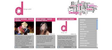
Interviewed and sample portfolio, it was nice to even be featured, let alone well recieved by Amber who runs the blog.

Go to Design Splat or My interview.

Second off:

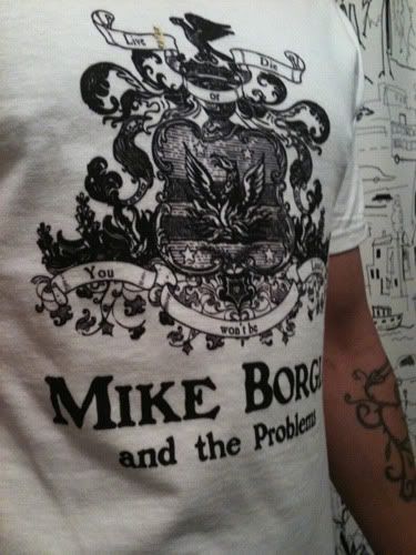
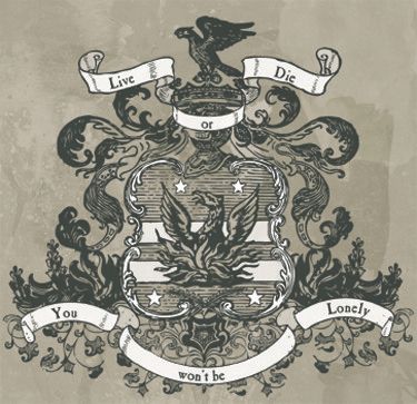
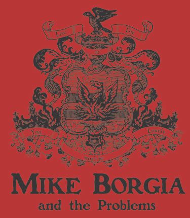
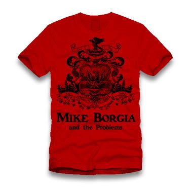
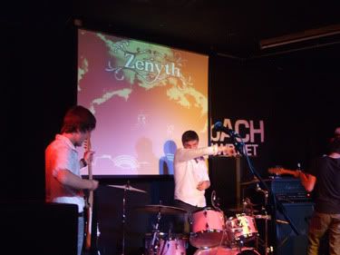
I enjoyed doing work on the Zenyth project, and it has resulted in some randomly cool things...

It was cool to go to their release show, take some photos and hang out with some friends, but it was way cooler to see my artwork projected on the screen behind the band.

Photobucket

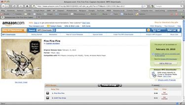
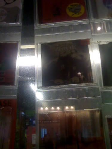
I may or may not have mentioned my love affair with my local indie record store, Spillers, I was walking past there a few weeks back and the Zenyth CD was in the window. Simple pleasure. Excuse the low quality, camera phone picture.

Photobucket

Alot of clients will try and sell you doing their work on where and who will see your work, whilst this is always nice, it should not be a motivation for doing your best work. I usually try to ignore these sorts of things as I want to concentrate on the work, not the aftermath. However, it was fairly cool to wandering around HMV and see it in the racks.

Photobucket

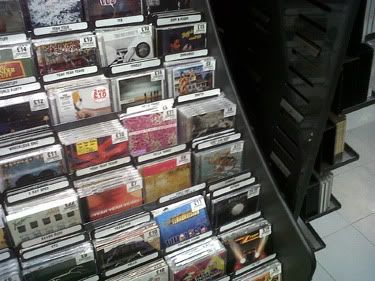
Can you see it? Want a clearer view?

Photobucket

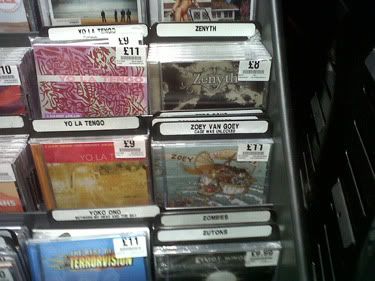
That put a smile on my face.

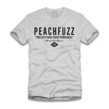
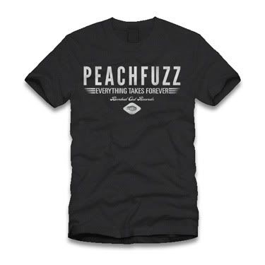
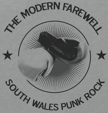
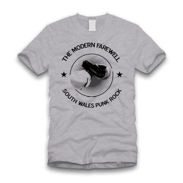
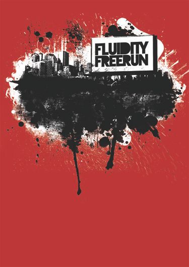
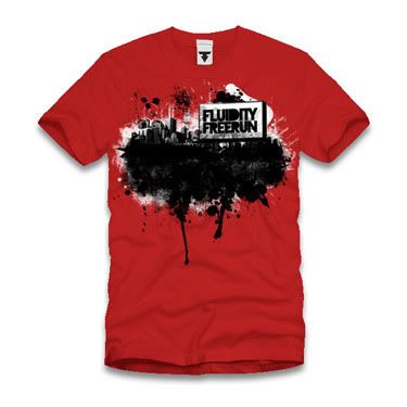
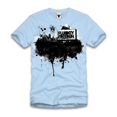
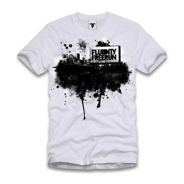
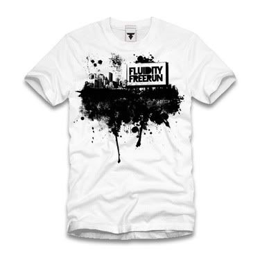
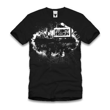
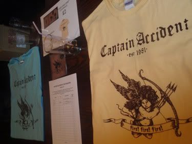
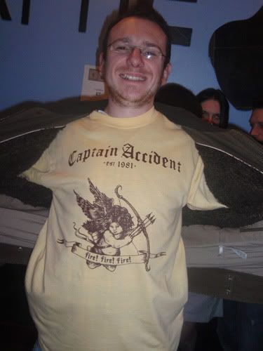
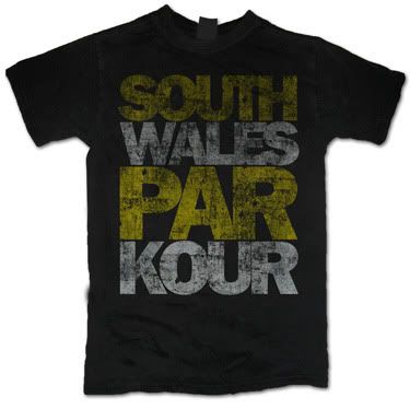
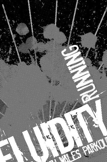
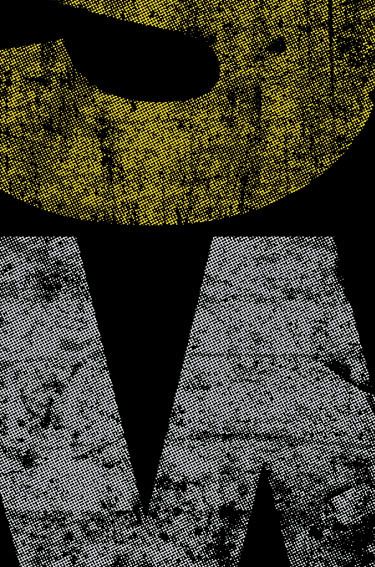
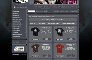
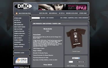
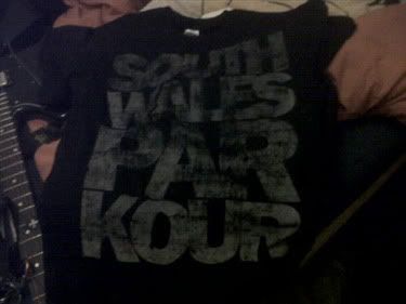
My shirt design for SWPK, was rather fun to do, I sent them a few drafts of the design and they ended up having 2 made, one colour and the 2 colour, I saw the 2 colour, it ended up different colours from my choice, but what the hell, they like it. I was also really happy to finally get my hands on one myself.

Photobucket

Success, success...
Michael

Monday, 2 November 2009

Shirt Designs 2 for 1 special offer (I kid)

A few months (maybe even a year ago) I had a rather random afternoon spent in the company of Mei Lewis (Mission Photographic) and a group of kids (I say kids, I'm just getting older), one dressed like the joker, one dressed like Ryu and about 15 others, little did I know at the time that this was a fledgling Free Running/Par Kour Crew.

I have kept an eye on them as they have gone from strength to strength, but whilst watching Skindred a few weeks back I bump into the crews mouth piece/head honcho Frazer Meek (google that name, his vids are amazing) we got talking about the usual rubbish, and we then happened across some business.

He needed some tshirts designing, and this is where I come in, a chat about designs and a promise of an email lead to these.

Photobucket

Photobucket

Brief was good, "Go nuts! Can you try and keep the cost down if possible?"

So I tried my best. The first design is halftone heavy one colour print, whats that you say? Details? Ok...

Photobucket

this design is rather interesting as this is the team shirt, and will probably end up in all manner of colours on all manner of shirts! I can't wait to see what the printers come up with!

The second design is 2 colours this time, and again is heavy on the halftones!

Photobucket

See? I really like it (Franklin Gothic Bold for you typo nerds), dead simple but big and ****ing bold! Bring it on. This one is for their gym and crew, so will probably come back from the printers much the same.

Sweet
Michael


Links
Fluidity Freerun
South Wales Par Kour

Monday, 2 March 2009

Update

Whilst February may have been quite on the (completed) design front March is in it's infancy and already offered a nice little start!

Well I'll put it simply:

BUY MY SHIRT!!

Photobucket

Photobucket

Really, it is a satisfying feeling to make a design, win a competition and see it up for sale! The design has changed a little, but that's ok...

Link
Buy the dam thing!!!!

Thursday, 29 January 2009

Technics Competition....

Well, not much to add apart from the fact that I won! Which all in all is pretty dam sick!

See for yourself

Much respect to the other winner Josh, click here to see his emptees portfolio.

"We had so many brilliant and innovative designs entered into the competition that we had trouble picking between the final 5. In the end, we settled for two winners so congratulations goes to Josh Ray for his Technics (S)Platter style T-Shirt and also Michael Partridge for his innovative "We Are As One" design. Your prizes are on their way to you gents!! "

I have always like admitting to process, so here we go...

Photobucket

First version of the vectors, yes the grouping went haywire on the ghettoblaster, but that is only a rough.

Photobucket

First drawing from vectors, no idea why I had that font on there, but it looked shit, so that was the first change, generally pretty happy with the rest of it though, this is where I first tried the idea of connecting the parts, but I just wasn't sold on how they were connected through the drawing, so attempt number 2....

Photobucket

Print out 2, this time with a different logo, I'm not entirely sure why I printed it out again, made sense at the time...

Photobucket

I've always loved a musician called Jonah Matranga, he performs under the name of OneLineDrawing, so this is what I tried here, but just didn't work on this format! It just looks messy.

I am not going to lie to you, I had a version I was pretty happy with, but needed to figure out the best way to finish this off, I need a new version of the logo and the last part of my idea...

Photobucket

So I drew the logo on the side of one of the other pieces of paper, and drew the hands again, this time with the fingers extending and at this stage I cheated. I stopped drawing and started photoshoping...

And the rest is history, design finito!

Photobucket

Some paper, 2 print outs, a pencil, a lightbox in my (well my girlfriend's) desk, a scanner and a good idea. Makes me happy!

I am rather happy with this one....
Michael