I did a concept sketch...
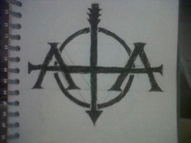
Which on reflection I quite liked, but thought there was room for improvement, I couldn't quite get the dimensions right without a ruler and by the time I got to a ruler I was right by my computer! So I thought I would just get one the macbook.
The logo ended up looking like this:
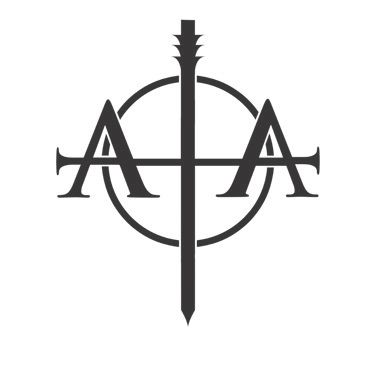
I tried to keep the lines on the 'A's to follow through into the point of the 'T', but it just didn't look right, so I extended it a little, because, well it looked better.
I have a strange tendency to get carried away with what I am doing sometimes, so I carried on working on things, adding details, changing details...
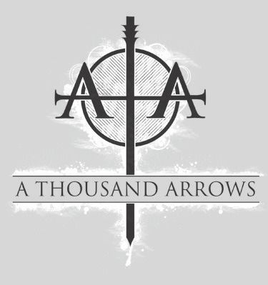
...and it ended up being far to much for a logo and started to look more of a shirt design. So I mocked it up.
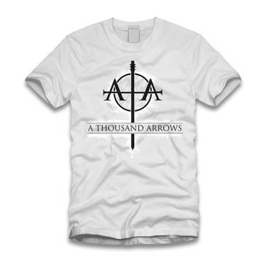
I think it looks pretty good. I liked it enough that I posted it over at emptees as well.
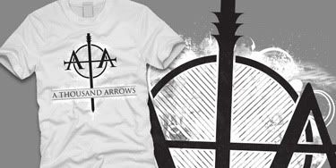
This has been an evenings work, that I honestly don't know will be picked up or not, but I enjoyed doing it regardless, hopefully they will print the shirt, even if the they don't use the logo.
Links
Larger Versions
A Thousand Arrows Myspace
Design on Emptees


No comments:
Post a Comment