Wednesday 23 February 2011

Corporate Logo

Bit of a weird one here, I was contacted at short notice to produce this logo, the client had a very solid idea of what he wanted, but was willing to let me run with most of the decisions, font choice, little embellishments...

This is a black version, if we are talking corporate guidelines, it should be a royal blue or white on a royal blue background.

Photobucket

An interesting little piece me thinks. It is also a middle finger to a designer I argue with a lot who says Trajan Pro is an awful font...I beg to differ, I think it looks great!

Listen to City and Colour, it's great.
Michael

Link
Larger Version

Friday 18 February 2011

Something for a competition.

I am a bit of a message board lover, I love the inspiration, I love the dramas...with one I love dying soon (Emptees), there seems to be a movement to another, and the other is Bandjob. Great place, they love competitions as well, this particular one was for Glamour Kills.

The challenge was to take their logo and just go wild. So I started thinking, their logo is a flying pig, and the expression is "when pigs fly" and one pig isn't a plural, so I thought about a flock of pigs and went from their!

Photobucket

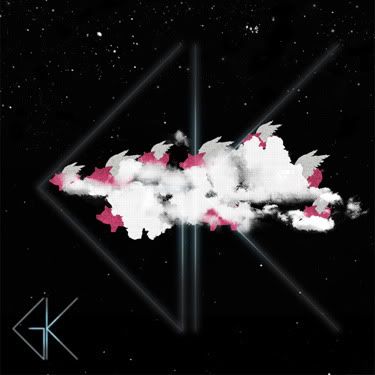
So I have decided that this is a flock of pigs trying to hide using a smoke machine. I added a bit of text and I like that, I wish I could fit it in clearer, maybe I should post that separately....

Yeah, I like this!
Michael

Link
Larger Version
Contest on Bandjob

Saturday 5 February 2011

Pet food!

You heard me right, pet food!

I have just finished an info sheet for a pet food company! It's not all rock and roll, but it is always good!

Photobucket

It is an A5 info sheet, personally, I would have loved a little less info, but then that is always going to be the challenge with these things! Small space, loads of info, get it all in neatly!

Nearly bedtime...
Michael

Link
Larger Version