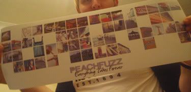
I spent the best part of 6 months working on this, seriously 6 months! Not constantly, but it was a long time from the first photo to the sending off stages.
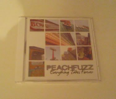
I will give some explanation of this, as I am happy to explain; Peachfuzz are an amazing rock band from Bridgend, they needed artwork for their album, they asked me to do it. I have know Peachfuzz for some years, and I would describe their sound as similar to the Lemonheads and the Replacements, you know the wonderous branch of rock that fills you with happy thoughts of summer and the perfect soundtrack to a beautiful holiday...
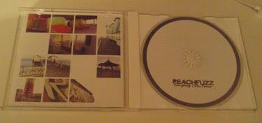
When I listened to their record(s) I think of a soundtrack to a summer film based in a run down theme park, if we are being stereotypical I would say Coney Island, NY, this all got me thinking about a chapter from Mitch Albom's "The 5 People You Meet in Heaven", the lead character arrives in the afterlife to be greeted by a carnival freak who's idea of heaven is Coney Island (where he worked) without people to point and shout at him. "But these guys are from Bridgend in south Wales" I hear you say, so I decided to take advantage of the dilapidated south Wales seaside!
I spent an afternoon in November in Penarth, an afternoon in January in Porthcawl and an afternoon in Barry Island in February. the hardest part of getting good quality/brightly lit photos in Wales in the winter is waiting for the day where the sun was out and the sky was clear. If you know Welsh weather at all, you know how rare this is! I'm not lying when I say some of these photos were taken in a scarf and gloves!
Front Cover:
On body:
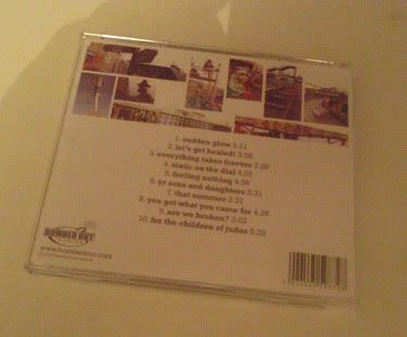
Back:
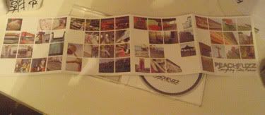
Sleeve outside:
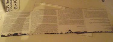
Sleeve inside:
I would like to thank Tom at Sound Print for doing an awesome job helping me turn my artwork into an awesome poster, which I swear one day I will find a frame that will fit it!
One day I will get the enormous InDesign files off my external hardrive and posting them here, I swear!
These 2 made me smile as well...
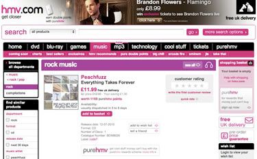
Yes, up for sale on HMV.com, its a small thing that made me smile...
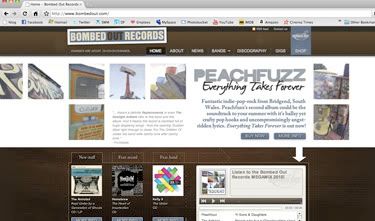
and my artwork taking over the homepage of their label!
Right...more posts to come.
Michael
LinksCheck out Sound PrintPeachfuzz's Myspace