Showing posts with label Corporate. Show all posts

Monday, 18 July 2011

An interesting website and a little more!

I was asked to create a website for a photographer, after some conversations (involving some comedically bad English and Italian) I had figured out that he was a bit of a technophobe and wanted to be able to update it 'easily' himself if possible.

I love this approach to the web. I love the challenge of making something that is easily updatable without having to understand what HTML is, or how you log in to a profile...you understand. There are countless platforms out there with some really interesting CMS, but I still wanted to try and integrate the platforms he already used to make the whole thing straightforward.

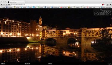
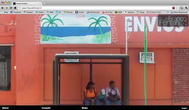
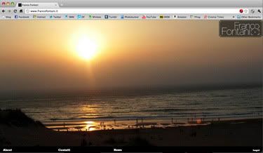
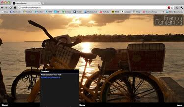
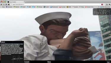
He had a flickr, and after some googling about flickr slideshows, I found a javascript frame that would pool his flickr feed into a 100% background! Great find, after some noodling with the code, there was a fair amount of unnecessary info in there and a menu that didn't suit what I wanted, I had an animating slideshow background pooled by flickr! Which meant he didn't need to touch the site in terms of photos, it did the work for him!

I had to design the logo and think about a menu next. I decided to keep the menu really simple, but decided to incorporate some web fonts to try and add some SEO value to a very minimal site. The logo was a fairly straightforward excercise as he suggested I do something with a view finder.

Photobucket

The menu had to be very non-invasive, so it didn't interfere with the main content. I had been playing with drop down menus on another project and I decided to do the same on this site. After trying it, I realised it didn't work and my brain made the logical conclusion, "No down....UP!" So a flyout menu instead.

Photobucket

Photobucket

Photobucket

Photobucket

Photobucket

All very straight forward, but very effective.

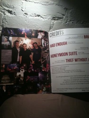
After another chat, business cards were mentioned, I suggested Moo, as they can print multiple images on the front of their cards, which suits a photographer perfectly! So mini moo business cards!

Photobucket

No sense showing you the front, as they are all different! AND on the site!

Big project, well happy.
Michael

Link
Franco Fontani - Street Photography

Wednesday, 13 July 2011

It's been far too long!

Hello everyone! Sorry I haven't updated this little corner of the internet recently! I have been away, come home, had to catch up on a few things and now I am getting back in the saddle with this place!

First thing I will post is a bunch of logos that I designed for a medical company! It's not all rock and roll...

This is a little annoying as I really liked the way these were going, but it was then decided that the companies the branding was for were going to be absorbed into the parent company. Or something like that. Regardless, I made some stuff I like, I want to post it.

First:

Photobucket

This companies name was in swedish and they were focusing on something to do with a degenerative eye condition. The initials were MMO, so the logo is simple and effective me thinks!

Second:

Photobucket

This example was something to do with heart attacks, so I decided to try and incorporate a wave form in there, I wanted to go with something a little more like an EKG, but it looked rubbish, so settled with a cleaner looking wave.

Third:

Photobucket

This was the potential branding for the parent company, but then they decided to not have a parent company. I wish I understood this side of things better, but I am just a designer, not their business manager!

Photobucket

I made a short hand version of it aswell, which I really like. The idea was to try and show an overlapping of several 'things' to create the logo.

I am still very happy with the results, even if they didn't get used.

It's good to be back...
Michael

Links
Larger Versions

Thursday, 10 March 2011

Corporate things..

I was asked to do this as part of a treatment of logos by a friend as she wanted something completely different in the mix of what she was doing. Strange explanation I know, but it's true, when stumped, asking someone else for an bright idea can always help!

Photobucket

What do you do when you have to design a logo for a company who are company at the top of a series of companies, so have no clear visual identity....the answer is some clean and cool looking! I did that ^.

Judge for yourself!

Listening to music on shuffle is a dangerous idea.
Michael

Link
Larger Version

Saturday, 5 February 2011

Pet food!

You heard me right, pet food!

I have just finished an info sheet for a pet food company! It's not all rock and roll, but it is always good!

Photobucket

It is an A5 info sheet, personally, I would have loved a little less info, but then that is always going to be the challenge with these things! Small space, loads of info, get it all in neatly!

Nearly bedtime...
Michael

Link
Larger Version

Thursday, 13 January 2011

How do I class this?

I try to keep my tags well organised, I do, so anyone can see a specific aspect of what I do with ease, but 2 posts now that are tagless. Do I make one for 'hat' and 'magazine'? Who knows, there will be a few posts about this, so maybe I should give in on the magazine front...

I was put the challenge by Mike Borgia to make a magazine/booklet that was an alternative to releasing a CD. Great idea Mr. B! There were 5 songs and 5 artists/designers had generously offered/donated/create a piece for the magazine, it was my job to piece the whole thing together and make it look snazzy!

I have had to keep the files off my computer, because it is a massive folder, but I was sent a few pictures of the finished article the other day, which made me smile, so I thought I would share them with you.

Photobucket

Photobucket

Photobucket

Photobucket

Photobucket

Photobucket

Photobucket

Photobucket

I am genuinely proud to have made that! I can't wait to get mine! A piece of mine that got reject a few years ago suited one of the songs so it is in there and it is tattooed on my left arm!

Night all.
Michael

Link
Mike Borgia's Website

Saturday, 8 January 2011

Press sheet...

What do you do when you need to get a van for free to transport a Virtua Fighter arcade cabinet? Offer to do someone in a band a favour in exchange for some design work! Yeah! You can't beat bartering! Ok, I DO NOT condone not paying for services, but it is ok when they are your friends!

I was given a photo, a blurb, logo and told to get it on one sheet of paper looking tidy.

I did this!

Photobucket

It's not rocket science, but it is purposeful clean design.

Mythbusters is on, so I am going to make the next post quick!

Sweet
Michael

Links
Larger Version
They Walk Among US Myspace

Sunday, 19 September 2010

The best looking quiz poster ever!

It's a brave claim to fame, but I'm going to run with it regardless. What? Are you arguing? Prove me wrong, most of them are done in word!

This one was a weird challenge as I had an idea that was awesome, cheesy and fantastic in the best kind of way! Then I went hunting for logos, and corporate information and my idea got totally shelved.

So this became a real challenge as I had to make a poster that worked within 2 sets of corporate guidelines. Meet my effort...

Photobucket

Not complicated, not mental, but far FAR more stylish than the average word art rubbish!

It's getting hard to post and watch Mythbusters!
Michael

Link
Larger Version

Tuesday, 17 August 2010

Redesigning again...

So far my redesigning has been fairly limited to...let's say rock and roll design work, for the sake of giving it a label. So this time I decided the thing to do was try something different.

Now for the reasons of a bit of privacy, I am not going to name the place in question, as then google might find me (ha!). So here we go, would you take a contemporary curry house in Cardiff city centre in an amazing location and then use comic sans in the branding?

If you thought yes I am going to hunt you down.

Don't believe me?

Photobucket

Photobucket

Photobucket

Photobucket

See! Does that make any sense? Well it must have to someone...just not me.

So I decided to redesign their logo! WITHOUT COMIC SANS!!!

This was the first version I did:

Photobucket

I thought about it, I like the way it is presented, this is how I would like to see it. But they have used browns and neutral colours inside, so I thought about it in terms of a practical redesign and I used a similar colour to that used inside.

Photobucket

Well thats another one for the pile of redesigns. Lets see if they ever find out about this...

Fingers crossed
Michael

Link
Larger Version

Competition!

I have written about my presence on Design Forums in the past, and their competitions are always an interesting opportunity to get a chance to do something different or just join in the fun of seeing how different a group of people interpret a brief (I will post a link to the brief later).

Short version would be contemporary English restaurant, serving high quality, fresh, local food.

Logo

Photobucket

Business Card

Photobucket

Photobucket

Photobucket

Letterhead

Photobucket

Photobucket

Menu

Photobucket

Photobucket

Site Layout

Photobucket

Thats a lot of info!

I need to finish something else...
Michael

Links
Larger Versions
DF Comp

Thursday, 23 July 2009

Random thing

This was random job via a friend, I had to sample a google map and then build a custom version of it, because the client didn't want to just use a google map! So 4 hours sat infront of illustrator turned this...

Photobucket

into this...

Photobucket

It's really was a daunting little prospect as it to ages to do and is was kinda like doing a jigsaw!!

Safe-ness
Michael

Links
Larger Versions

Monday, 8 December 2008

Real Corporate Work!

Well it's true, I have recently been taken on by on by moley.tv as general mac monkey, it's only part time, but I am learning more and hopefully I will get better learning at this guys feet, as he is seriously clued up!

But yeah I spent an afternoon doing some seriously functional design work, ready...rebranding internal PDF's!! Hell yes!

But you know what it was strangely satisfying. There was plenty to think about, positioning the new logo's in the right place, with the correct spacing (I had a 24 page logo use document that I had to read!), making sure that everything that needed to be changed got changed...basically what I'm getting at is, this should have been boring as hell, but I actually enjoyed it! I am actually rather happy that one of the documents had to be completely redesigned and I did it, it looks great in amongst the rest of them, so I did it right!

Yes I am in my heart a wannabe punk rock graphic designer, but even I am honest enough to admit that my split personality took over and the challenge of making corporate stationary look the best it could was actually enjoyable. So please dear friends do not scoff at doing something because it is not as "cool", as it might be more of a challenge than you thought!

Photobucket

T.T.F.N.
Michael

Links
Larger Version
Moley.tv

Sunday, 10 August 2008

Corporate ID Time again!

This was a recent brief for a new design agency, dot designs (designers of tomorrow), the was/is to recruit students in to work on professional briefs. Sound a little crazy? Well then you are a bit stupid, not completely stupid just a bit! Because lets face facts these kids will go on to be the designers of tomorrow!!!

I was a student once (still am Post Grad doesn't make me a real student) and I've gone on to do alright for myself, but I would have killed for some real life experience that you just don't get at uni! Anyone who has work in design knows the time difference between a uni project and a real life brief! I have to start a project tomorrow that I have 3 day to complete, ready for print on thursday! In uni it would have been 6 weeks! DEAR GOD I WOULD LOVE THOSE TIME FRAMES BACK!!!!

But I don't I'm a grown up now! I've digressed a little...

DOT designs, wicked idea, I'm not sure what state it's in at the moment, I think she had to put the idea on hold for a while till personal things sorted themselves out, but I hope it comes together because its a wicked idea!

This is a logo I do love, because there is something in there for the print design nerds, the idea was to make it seem like a thought bubble from a comic, but as it's a design agency I used CKMY as the colours, see that was subtle and it looks good too!

Photobucket

Love to you all
Michael

Link
Larger Version

Tuesday, 8 July 2008

Corporate ID

This is a corporate ID that I did for a hypothetical magazine, it was a mag-e-zine, I did the layouts as well, so I shall post some of that up as well later. The idea here was to create a logo and corporate ID that was an extension of my design ideals.

Full ID first...
Photobucket

Business card front..
Photobucket

Business card back...
Photobucket

Compliments slip front...
Photobucket

Compliments slip back...
Photobucket

Letterhead front...
Photobucket

Letterhead back...
Photobucket

This was an over the top and very clean piece of work at the same time. Front is simple and clean, back is OTT. It made me smile when I saw these printed, as the back of them was so ridiculous it was awesome!

Love to you all.
Defy

Link, link (sounds like a chicken)
Larger Versions

Sunday, 29 June 2008

Myspace layout and Corporate ID

As I just posted the poster design I did for Engineering Consent, it seems a little random to not include the myspace layout and corporate ID I did for them! I was given a ball park idea, he said he like political style posters, I was given an example from the fine selection of work(the graphic design, lets not get all political here) done by some of the Communists.

We'll start with the corporate ID as it's been a while since I made one!

First a full sheet...

Photobucket

Now a closer look at the front of the business card...

Photobucket

and the back, I did try to add continuity to the front and back.

Photobucket

Compliments slip...

Photobucket

Letterhead....

Photobucket

Myspace layout!!

I've included the little gif, just so you can see how I it works!

Photobucket

This was alot of fun to do, as it involved some random elements, but I was pleased with the result!

Much love
Michael

P.S. Definetly an example of spilt personalities working in harmony!

Link-tacualr:
Larger Versions
Engineering Consent