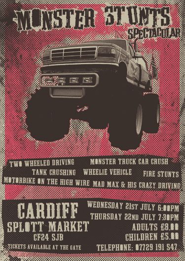
I won't show you stages, I will just skip to the final poster design...
As you can see this was designed, again, based on a 2 colour screen printing process, and as you can see there was potential to evolve this into a shirt, so I did.
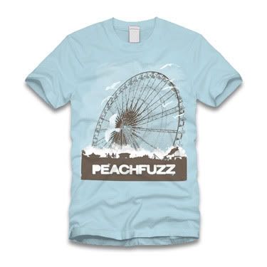
I like it, they like it, I look forward to seeing it in the cotton!
Someday soon I will post the album artwork, it is in pieces in about 4 different file types, so please work with me people!
Mythbusters is on...
Michael
Links
Larger Versions
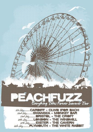
Peachfuzz's Myspace