Showing posts with label ReDesigns. Show all posts

Wednesday, 27 October 2010

Resigning in 40 minutes!

I recently played a gig with a band called AC4, the members of which graced such incredible bands as The International Noise Conspiracy and the enormously influential and sadly missed Refused, sorry I'm getting off point.

I also went to an event in a local venue called "Design Wars" (great event put on by great people, links later), but the challenge was put to a small group of people/designers to create some album artwork, using words chosen at random (for band name and title) and the genre was also chosen at random. Each group was given 40 minutes to then create artwork from scratch using the equipment and images that were on the desk! I was in a group with 3 of my friends, 2 code geeks and a european union schmooser, we didn't win, but it was great fun! AND I liked the concept of designing something in 40 minutes!

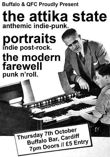
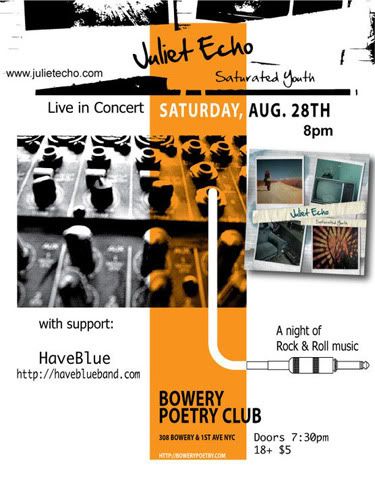
So with a gig coming up, with a poster I wasn't fussed on...

Photobucket

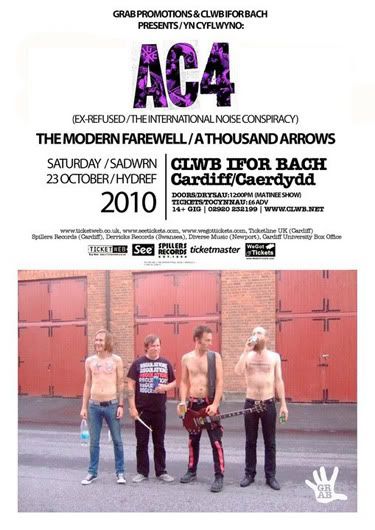
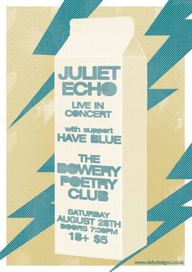
...again nothing bad, but I need a poster to try and design in 40 minutes! So I limited myself to photos of the band (as in the original poster), and tried to focus on the main details of the original. The biggest concern I had was showing the band in their normal environment, they are a hardcore band after all and the original picture wasn't exactly complimentary, even the band joked at the gig, they wouldn't want to watch themselves if they saw that photo!

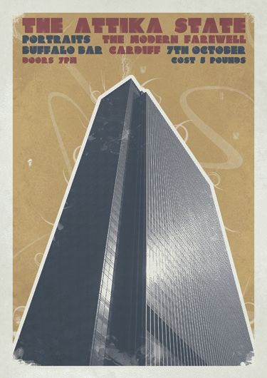
So here we go, poster in 40 minutes!

Photobucket

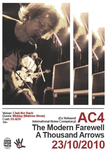
Its not a major change, but I think its much cleaner.

Enjoy
Michael

Links
Largesr Version
AC4 on Myspace
Design Wars Official Blurb
Photos from Design Wars

Wednesday, 6 October 2010

Redesigning some more things!

This is a weird one, I don't dislike the poster that I saw, but at the same time, I don't like it. In truth I was half way through an idea for a Die Hard poster and lost the plot and wanted to give this idea a home.

Meet the original:

Photobucket

Considering I am playing this show, I doubt anyone will mind a rethink!

Meet the redesign:

Photobucket

The show is tomorrow, so I won't worry about anything complicated, just did it for fun really.

Little more to post!
Michael

Link
Larger Version

Friday, 20 August 2010

Redesigning one of my favourite films...

I have seen loads of redesigns of movie posters recently (google Ollie Moss or Matt Needle for some excellent examples), and I thought I would throw my hands into the mix.

Most the redesigned poster I have seen have either been horror movies or current films. No jokes aside, I am a massive nerd, a serious nerd (Star Wars tattoos are a badge of pride) so I thought I would tackle a more nerdy subject matter. So I thought about some movies that I like and I narrowed it to 2.

I thought I'd pass on Star Wars, as there are way to many Star Wars variations in the world, so I picked on one of my other favourite movies...

Photobucket

Planet of the Apes baby! I even stuck to the original cast, none of that Tim Burton rubbish around here! No, the Time Burton version was ok, but still I wanted to stick to the classic version.

I hope you like it.
Michael

Link
Larger Version

Tuesday, 17 August 2010

Redesigning again...

So far my redesigning has been fairly limited to...let's say rock and roll design work, for the sake of giving it a label. So this time I decided the thing to do was try something different.

Now for the reasons of a bit of privacy, I am not going to name the place in question, as then google might find me (ha!). So here we go, would you take a contemporary curry house in Cardiff city centre in an amazing location and then use comic sans in the branding?

If you thought yes I am going to hunt you down.

Don't believe me?

Photobucket

Photobucket

Photobucket

Photobucket

See! Does that make any sense? Well it must have to someone...just not me.

So I decided to redesign their logo! WITHOUT COMIC SANS!!!

This was the first version I did:

Photobucket

I thought about it, I like the way it is presented, this is how I would like to see it. But they have used browns and neutral colours inside, so I thought about it in terms of a practical redesign and I used a similar colour to that used inside.

Photobucket

Well thats another one for the pile of redesigns. Lets see if they ever find out about this...

Fingers crossed
Michael

Link
Larger Version

Another redesign...

Number one; as you know (well if you've been following my recent work) I've been redesigning things that I see that I don't like. This is the first example I have done for a friend. I saw this on facebook...

Photobucket

and considering there is an old client and a dear friend involved in this show, I had to do something about it!

I have a strange obsession for awful stock photos, the kind of thing you have no idea why it is on a site, or why some people will pay for it? Regardless I saw a picture of a milk carton, and it has been in the folders on my computer for ages waiting for an opportunity to come to life! Here it seemed was my chance.

Photobucket

I was struggling with it a little, as I had the text on and the layout/texture all sorted, but it looked like it was lacking something. So for fun, I stuck some lightening bolts on it! AND I love it!

Take Care!
Michael

Links
Larger Version
Juliet Echo

Thursday, 22 July 2010

Re-design round 2!

This one was fun. End of. I saw this poster everywhere...

Photobucket

and I was reminded of a show on Channel 4, featuring some famous agent bloke, that was about rebuilding careers and such, In one episode he was faced with a circus and they had posters like this and insisted on bringing their design into the 21st century. When I saw this, I thought to myself that needs funking up.

I wrestled with what to do with this and decided on this.

Photobucket

Monster trucks are one of the last bastions of rock n roll! So why not go wild a produce a rock style poster for it! I wonder who the original poster would appeal to, I would like to meet them and ask them whether they prefer mine or the original...

For any nerds out there, this poster would be a 2 colour screen print on brown stock.

Word
Michael

Link
Larger Version

Tuesday, 29 June 2010

Contest

At the beginning of the year, I swore blind I was going to make a more concerted effort to try and do more projects for no reason/contests/just because, so it hasn't been going that well, but I have certainly tried a few things that haven't seen the light of day on here because they haven't been finished. Give me time, they will come.

I've mentioned Emptees in the past, there is a similar site called Bandjob, and there is currently a competition running to "Re-Design A Horrible Album", what a great idea, when I saw that it was Creed's "Human Clay", I thought to myself...screw sleeping I'm going to have a crack at this!

I hate Creed and I hate that album cover, its an embarrassment! So this was really exciting to even think about. Meet my offering...


It is a stock photo that I have treated pretty heavily to try and make it more interesting, my idea was to not get a million miles away from something that they could use, whilst being a thousand times better than the original. I'm going to list this as for sale, as I doubt I will win the contest and this might interest someone as a cover for their record, stranger things have happened, but I honestly have no idea what will go over well with the judges, we shall see...

Links
Larger Version
Contest on Bandjob