skip to main |
skip to sidebar
So, these were done somewhere around the middle end of 2006(oh my god it's the middle of 2008!!!) both were for clubs I was working for at the time, one in Bristol and the other in Cardiff.
Both were for nights of the week that had to be "fun", so I couldn't get all serious with it, so deliberately crappy looking illustrations here we come!!!!
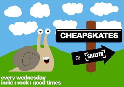
This one always makes me smile, I think i had read something about snails in a book the night before, so had snails on the brain...
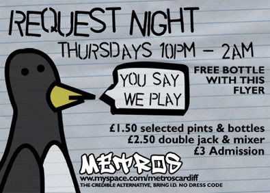
This to makes me smile, I think that is the magic of both of these flyers, they are kinda silly, but serve a purpose. I am actually proud of both!
Love
Michael
Link-a-roo
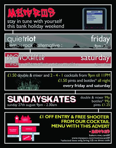
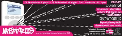
Larger Versions
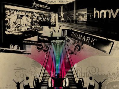
Now I would like to make this completely clear from the start:
THIS IS NOT A PIECE ABOUT CONSUMERISM!!! THIS IS NOT A SLIGHT AGAINST LARGE MULTI-NATIONAL COMPANIES! THIS IS NOT ME MAKING SOME BIG STATEMENT OF HATE AGAINST ANY COMPANY IN PARTICULAR! I HAVE NO ILL FEELING TOWARDS ANY OF THE LOGOS YOU CAN SEE IN THIS PIECE! I DO, DO NOT(!!) WANT THIS TO BE MISUNDERSTOOD AS AN INSULT OR SLIGHT TOWARDS THEM!
Right now thats out of the way, the meaning of what I'm getting at here...
I work a shit job in a place I won't mention (as it could get me into a lot of trouble) and I am often in work on Sunday morning's at 8 am. Sunday at this time is very peculiar, it is insanely quiet, very few cars, very little commotion, it's actually really nice to see the city centre so tranquil.
What does amazed me is, by 9am the nameless place I work is filling up with people wanting breakfast! Now Cardiff's city centre doesn't generally open till 10.30/11am and what amazes me even more is the fact that these people have come into town this early, to get breakfast and then get the jump on the other shoppers!!!
I grew up in a Roman Catholic family (again this is not a slight against religion), we were up and around at this time, but we were going to church. Maybe it has something to do with my background, but I am totally amazed at what was once a predominantly christian country has come so far away from its roots.
This is where this piece comes in, I just kept thinking on Sunday just gone, "Why aren't these people still in bed? Do people go to church anymore?" so I began thinking about how life has changed for me as well.
On a recent night out with friends a group with skatery/alternative people, we were refused entry to a popular chain bar, because of the dress code. No less than a week later did I walk past the same venue to see a girl outside the venue being violently sick, upon leaving the contents of her stomach outside, she walked straight back into the venue!! Sadly I recognised most (if not all) of the clothes she was wearing as being the summer line's from various high street fashion stores (once again, no problem if you want to shop there, go ahead. I have!). This got me think about how we are judged and how society views different social groups.
So all this brought me to this idea, one of worship of high street fashion and it's lifestyle.
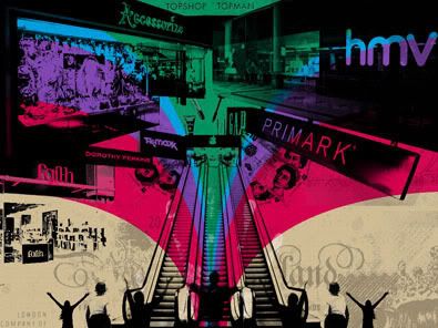
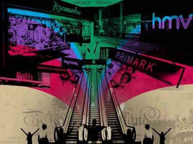
This is my first attempt, I like it, but I thought is was a little cultered, so I did this...
I prefer it, but I'm still not happy, so more versions may follow...
So here is the thing, I have nothing against high street fashion retailers, or the parent companies. I have nothing against this way of life. I have no idea why you are judged differently because you spent £20 on an outfit for a night out, rather than the skater bum who spent £70 on his trainers (yes I love my shoes!). But what this has left me feeling is, that the high street has replaced religion in modern society or atleast in a large part of it that I am exposed to.
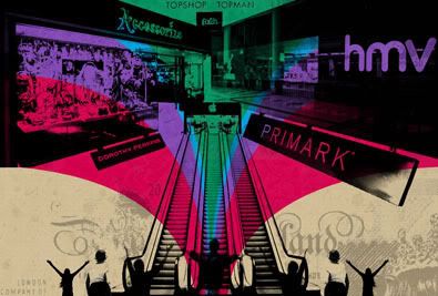
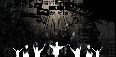
Returning to this a day later....
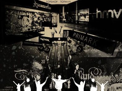
I was trying to add a gradient fade to the colours, but I ended up making a mistake, liked the result, and then modified everything to suit it. I do like this one.
This is what I was trying to do, I like it also.
Flipping the fade, also good.
Adding some texture to the fade, also ok. I'm still not sure whether I'm finished with it or not, but I am happier.
Now I did like the Black and Brown version, but I thought it needed some work so I've do this spin on it as well. This time I changed the shape and changed the background texture. I made it the shape of a note, and made the background match. I do like this...
Sorry about the rant.
Michael
Link
Larger Versions
I love taking photos, and every now and then I get the idea to play with them a little, and this was one of those times.
I'm not sure what I was trying to do here, but I tried to layer in some texture from a scan of a piece of cardboard and a little bit of added detail.
First attempt I liked the idea, but wasn't sure how the colours looked, so changed the colours around a little and...
And got a result I far preferred, I like the combination of colours and the original image was strong anyway. I'll post them later!
Love to you all
Michael
Links
Larger Versions
Most of these posters are old designs, that I look at now and like the idea, but I am willing to admit that if I went back to one or two now they would probably be executed way, way better!
But then that is part of being creative, improving, and being willing to admit your faults!
In this case, I must confess, I was experimenting with just basic photo typography experiment. But I do like the result, I love the colours that are used, the black, grey and blue combo is rather tasty!
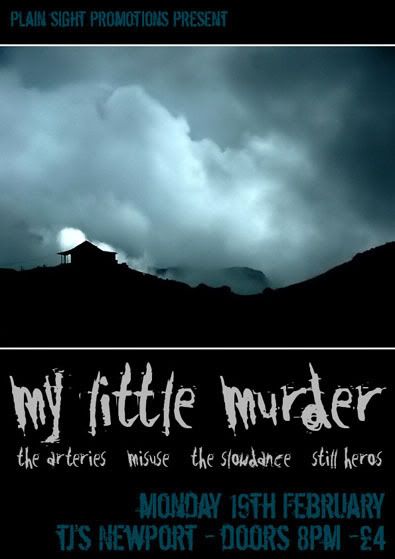
A gig with my band, I still don't hate the idea here.
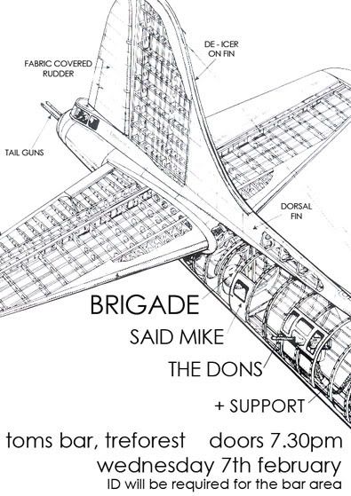
A poster for a venue in Pontypridd, I liked the idea alot! So much so....
I actually printed this on grey card/paper and it look pretty good. Possibly better than the other attempt.
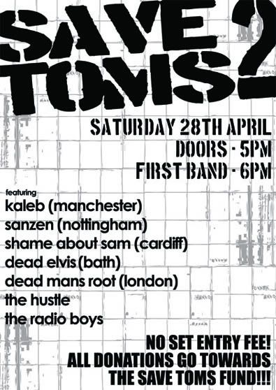
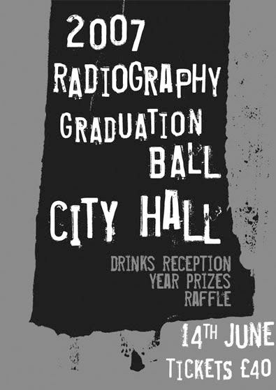
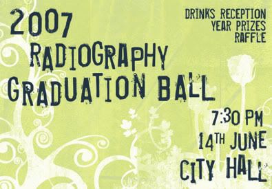
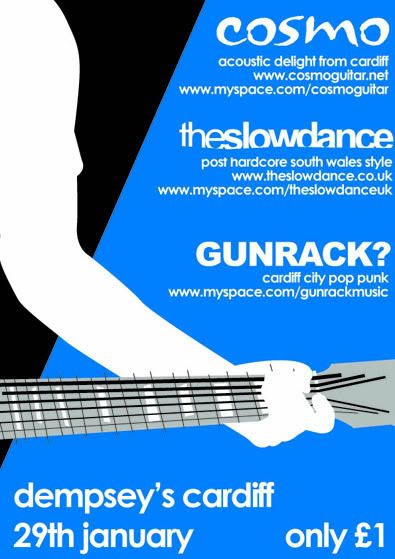
I'd been playing a Tony Hawk's Pro Skater game, and I think it shows, I like the fact that there isn't really an image on here, it is totally about the info!
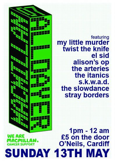
This was for a charity event, it was a real challenge as I was given an enormous amount detail, band descriptions, myspace address, photos, various logos.....
So I genuinely struggled with how to present it all, so decided not to!
Please keep scrolling this is old work....
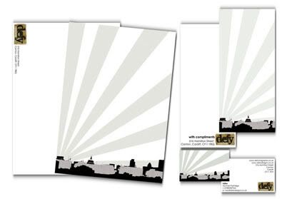
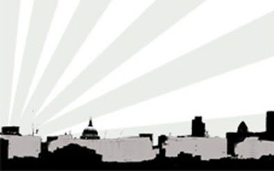
Defy Designs
Links
Larger Versions
The first part of this was meant to be a co-op, the second half I just found out, and was a complete surprise!
So part one:
I was talking to a friend (DJ Enzine) of mine about the flyers he was making for a funk/hip hop night he was running, we were talking about using parodying iconic images/flyers and generally ripping things off for comedy value. I had seen a cartoon character of Boba Fett and made a throw away comment about getting him some bling and a ghetto blaster! Before I knew it, I was re-drawing the Boba Fett image and adding some bling and a ghetto blaster!!
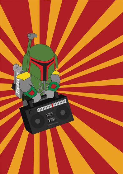
At this point I emailed this to my friend and said, "Send us the rest of the details and I'll finish it!" He said he'd rather put the info on, and here it is...
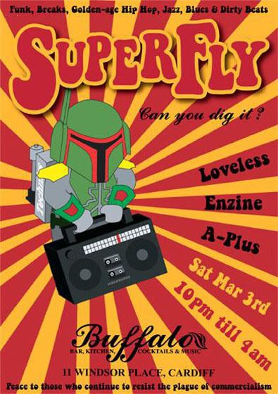
one of the only times I have (thought or atleast till 2 minutes ago) I have ever done anything co-op. I love the result!
Part two was an accident I think, but I'm still taking it!!!
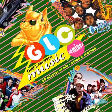
This is the cover of the GLC mixtape, as made by DJ Enzine, it wasn't until I really looked at it, I noticed a photo that I'd taken in the top corner!
See!
So one very deliberate co-op and one seeming accidental co-op!
Peace out.
Michael
Linking
Larger Versions
DJ Enzine VS The GLC
DJ Enzine
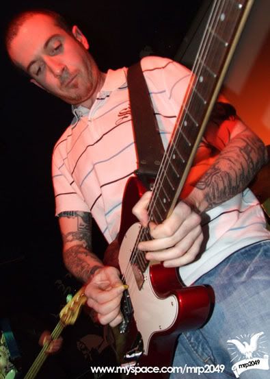
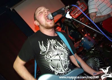
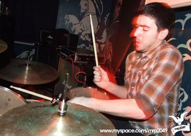
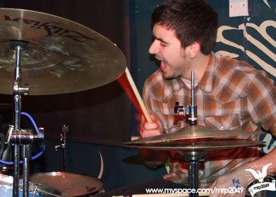
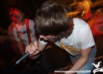
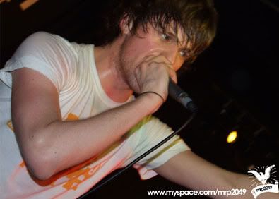
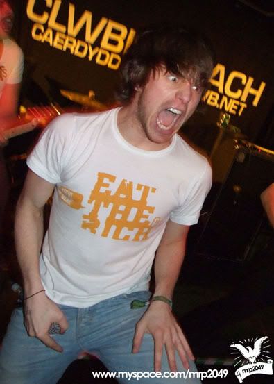
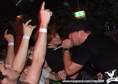
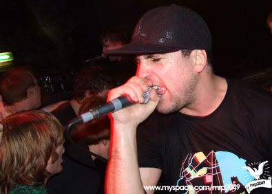
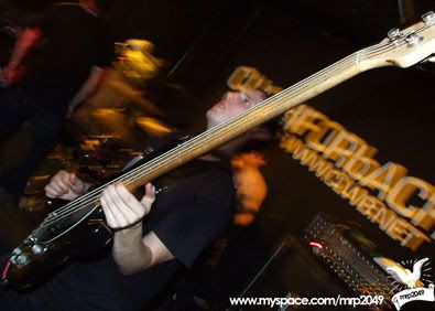
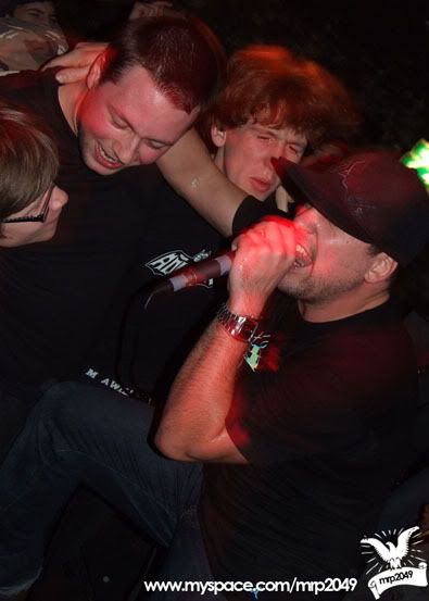
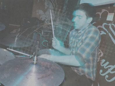
This space isn't about me and the fact that I'm in a band, it's about me as a Designer, so let's just get on with this.
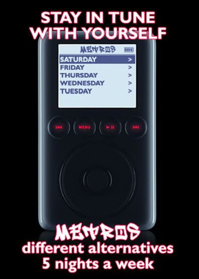
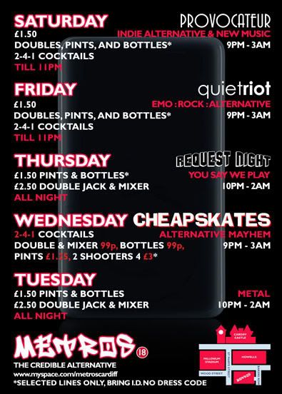
I'm in a band called the Slowdance, from time to time I have done a poster/flyer for us, this is one of those times.
I did this summer 2007, I was just discovering texture's...
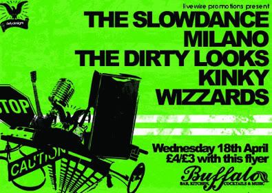
The reason for the chaos in the corner, I'm was thinking about things that seem to go into a modern band, it's not just about the music anymore!
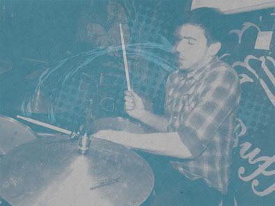
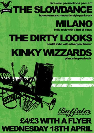
I had to make a poster version aswell, which was a challenge to change the aspect and keep the vibe the same without it looking daft! I think I did well, I used the extra space for detail, now that's a bright idea!!!
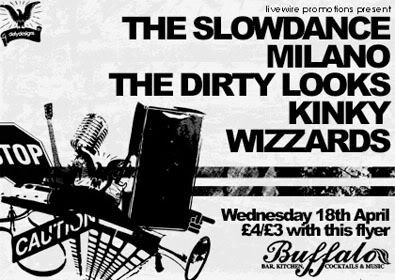
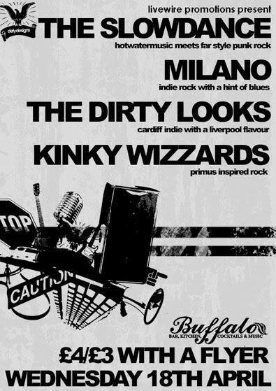
As I have previously mentioned, reproduction across levels of printing is important to me, so here are the black and white's as well!
I'm going to get me some food!
Defy Designs
Link Hawk(you know from "Over The Top")
Larger Versions
The Slowdance