
First attempt was based around an industrial idea, you know chains = industrial...
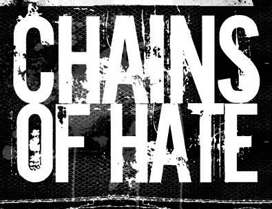
I wasn't at all sure whether this was any good or if I hated it! So back to the drawing board...
I started thinking about how hip hop style and NYHC have gone had in hand, so there had to be some easy way of getting the two together in a way I liked.
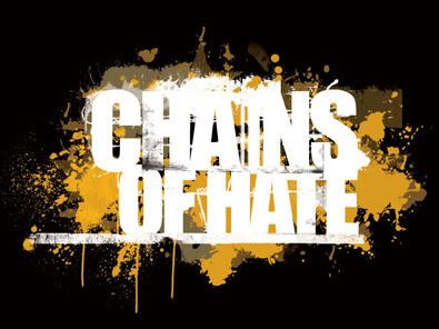
and the end result was a very hardcore looking logo, textually and visually, but I used a very hip hop colour palette, the main gold colour was sample directly from a pair of Missy Elliot signature Adidas! You can't get more bling bling than that!
We out!
Defy Designs
Link M***** F*****
Larger Versions
Chains of Hate


No comments:
Post a Comment