
But then that is part of being creative, improving, and being willing to admit your faults!
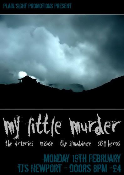
In this case, I must confess, I was experimenting with just basic photo typography experiment. But I do like the result, I love the colours that are used, the black, grey and blue combo is rather tasty!
A gig with my band, I still don't hate the idea here.
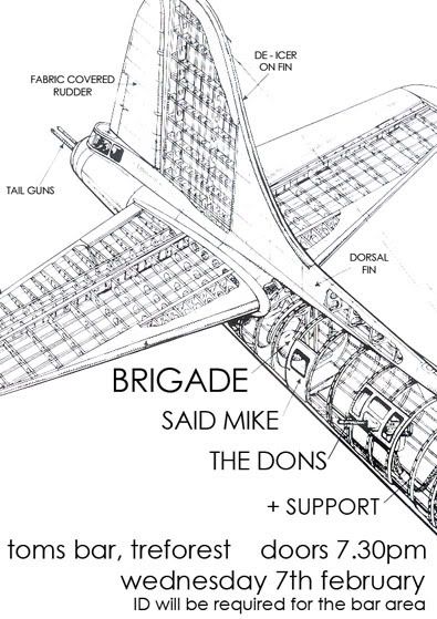
A poster for a venue in Pontypridd, I liked the idea alot! So much so....
I actually printed this on grey card/paper and it look pretty good. Possibly better than the other attempt.
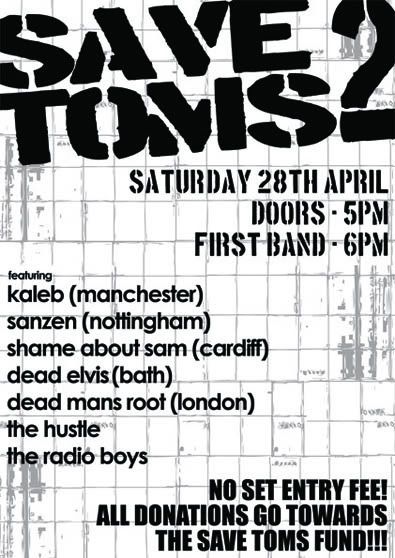
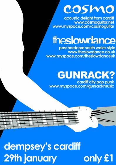
I'd been playing a Tony Hawk's Pro Skater game, and I think it shows, I like the fact that there isn't really an image on here, it is totally about the info!
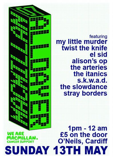
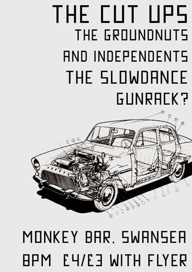
This was for a charity event, it was a real challenge as I was given an enormous amount detail, band descriptions, myspace address, photos, various logos.....
So I genuinely struggled with how to present it all, so decided not to!
Please keep scrolling this is old work....
Defy Designs
Links
Larger Versions


No comments:
Post a Comment