
So after 2 years of having a broken hard drive, that contained ALL of my degree work, thanks to a lovely lovely and very technologically mind friend I have it back!!! So I feel rather happy after a few hours sat around with the forgotten work, I feel proud as I can clearly see my improvements, and in a few cases I have been reminded of the wonder that is a good idea! No matter the technological skill level, it was a good idea!
So I am rather excited right now, that there could be a lot of old stuff that I am rather proud of re-surfacing!
Love
Michael
Sunday, 17 August 2008
Sunday, 10 August 2008
Lyrics and Art
Well something has been bothering me over the last few weeks and I didn't quite know how to deal with it, so rather than do nothing I made something that get it off my chest.
This piece is made using lyrics from one of my favourite bands ever, most people have never heard of them, and probably never will. They split up in 1999 and have vanished off the face of the earth ever since, that always makes me a little sad. But they recorded some amazing songs regardless. The band in question is Farside.
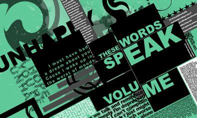
This was the original version, when I had finally got all the layers together I wasn't sure about the green background so...
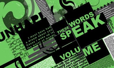
I made it a little "greener", but still I wasn't sure if that was right...
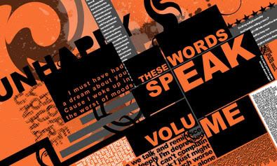
Try again, this is good too.
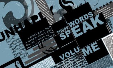
But this is probably my favourite, maybe if I'd made the green more shocking from the start? Who knows?
The reason I do everything this way is so people can see my ideas and tell me what they prefer....
Love
Michael
Links
Larger Versions
Farside Fan Myspace
This piece is made using lyrics from one of my favourite bands ever, most people have never heard of them, and probably never will. They split up in 1999 and have vanished off the face of the earth ever since, that always makes me a little sad. But they recorded some amazing songs regardless. The band in question is Farside.
This was the original version, when I had finally got all the layers together I wasn't sure about the green background so...
I made it a little "greener", but still I wasn't sure if that was right...
Try again, this is good too.
But this is probably my favourite, maybe if I'd made the green more shocking from the start? Who knows?
The reason I do everything this way is so people can see my ideas and tell me what they prefer....
Love
Michael
Links
Larger Versions
Farside Fan Myspace
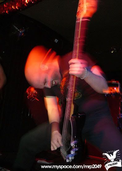
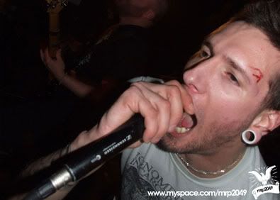
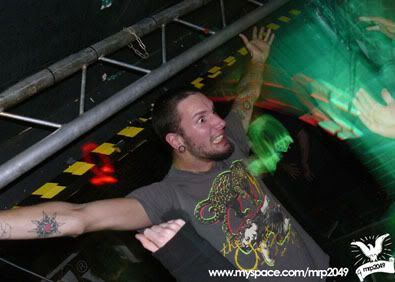
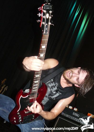
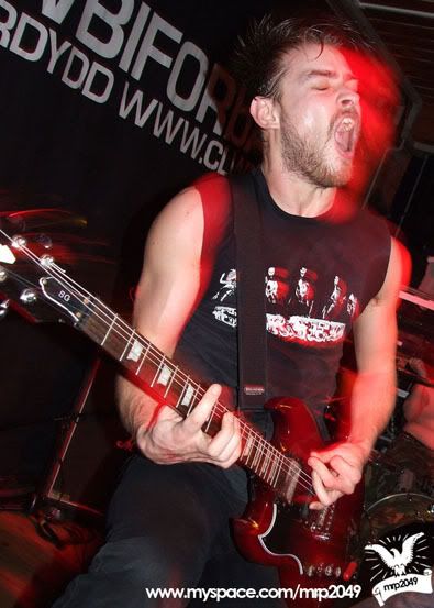
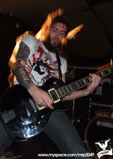
Friends and bands!!!
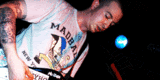
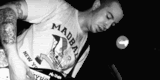
There is something totally amazing about being around the music scene in anyway! Whether it be in band yourself, promoter, photographer, whatever, you get to meet some amazing people! And by far and away the advantage of getting to know some of the bands well is you tend to have a lot more fun shooting them! As is the case with me and Shaped by Fate!
I love these guys! They have to be one of the best metal bands in the UK right now! Totally awesome! Super fun to shoot as they have one of the most energetic and intense live shows you will see! If you can't take good photo's of these guys you would have to be blind or stupid! I guess that makes me stupid...
Or you can judge for yourself...
Love to you
Defy
Links
Full Album
Shaped by Fate
The Total Package
And I'm not talking about Lex Luger (he was a wrestler for WCW in the 90's, went on to wrestle in WWF? Wrestlemania 10? Bret Hart? Yokozuna? Royal Rumble 1994? The double elimination bit? No? Wow! I remember some rubbish!)
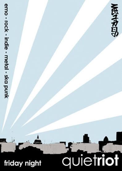
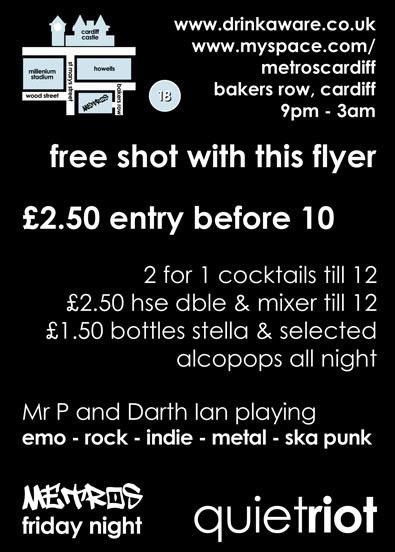
Well, I was asked to completely re-brand a club night with a new name, new flyers, new posters and a new look!! Away with the bright gaudy colours please! Away with the stupid Nu-metal graffiti style graphics! Well that wasn't exactly what I was told, but you get the idea (or you will if you ever see some of the other flyers!!)
New name was quiet riot, I had the idea when listening to a Brand New song, seemed appropriate for a predominantly emo night.
Don't have a clean version of the logo, but it is coming up.
So first of I had to make the flyers!
Flyer front
and back
Poster
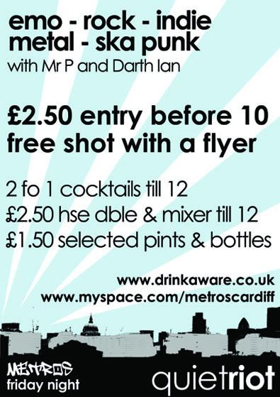
I am not going to lie and say at this point (around 2005-6) in my life as a designer I wasn't obsessed with grungy objects and vector shaped, because I was! WAIT!! I STILL AM!
But I had used this layout for a uni project and really liked it, so I brought it back to life in this series of images, it was nice to see it out in the world rather than just getting marked by a lecturer.
The random thing was, I kinda knew that bosses at the club were trying to save some money so I had it in the back of my mind to keep the design universal so they could print Black and White if they wanted/needed to and I think when you look at the Black and White versions as well....
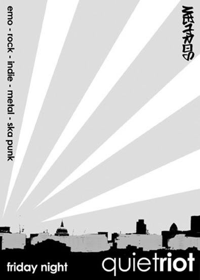
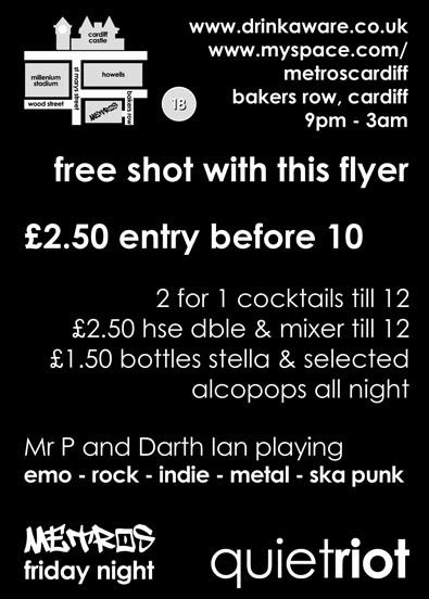
it stands up, in both forms! The gentle blue makes it cool looking, where as it still retains the style of the piece in Black and White.
This was actually the first thing I had proof read twice by different people and it still got through with a spelling error, which was jokingly referred to then on as the Mr. T mistake! Points if you can spot it!
Love
Michael
Links
Larger Versions
Well, I was asked to completely re-brand a club night with a new name, new flyers, new posters and a new look!! Away with the bright gaudy colours please! Away with the stupid Nu-metal graffiti style graphics! Well that wasn't exactly what I was told, but you get the idea (or you will if you ever see some of the other flyers!!)
New name was quiet riot, I had the idea when listening to a Brand New song, seemed appropriate for a predominantly emo night.
Don't have a clean version of the logo, but it is coming up.
So first of I had to make the flyers!
Flyer front
and back
Poster
I am not going to lie and say at this point (around 2005-6) in my life as a designer I wasn't obsessed with grungy objects and vector shaped, because I was! WAIT!! I STILL AM!
But I had used this layout for a uni project and really liked it, so I brought it back to life in this series of images, it was nice to see it out in the world rather than just getting marked by a lecturer.
The random thing was, I kinda knew that bosses at the club were trying to save some money so I had it in the back of my mind to keep the design universal so they could print Black and White if they wanted/needed to and I think when you look at the Black and White versions as well....
it stands up, in both forms! The gentle blue makes it cool looking, where as it still retains the style of the piece in Black and White.
This was actually the first thing I had proof read twice by different people and it still got through with a spelling error, which was jokingly referred to then on as the Mr. T mistake! Points if you can spot it!
Love
Michael
Links
Larger Versions
I didn't like my desktop top soo...
I remember one night staring at my computer and just getting annoyed that my photos didn't fit neatly into my desktop (curse you 1280x800 screen) so I thought to myself, surely I can make something that I like to go on there? After all this is what I do...
So I spent a few hours playing around with brushes, photo's, my scanner... and came out with these offerings...
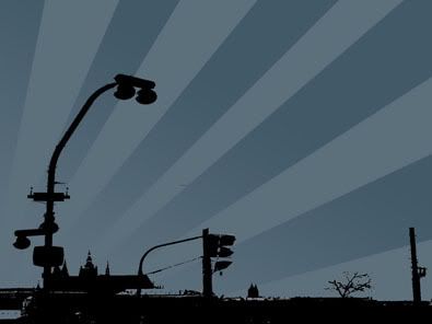
I took the photo in Prague, but very little of the original image is still in there, originally it was photo of a tram!
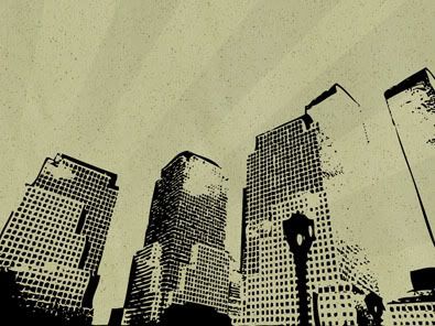
This is a scan of a piece of cardboard that was on my bed, and the photo is from a friends trip to New Zealand, I like this one because I used Illustrator to vector trace the details, so I could print any size if I wanted!!!
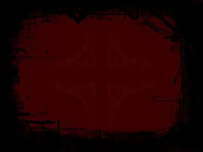
This time I was trying to make a frame, I used various brushes I had just found on misprinted type (what a website) and I can't remember where the middle bit came from.
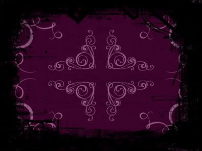
Again same format this time, different colour with some swirls I scanned off a wedding invite I had on my table!!
This was a random and cool exercise, there was about 14 more, but most of those were subtle variations on the same themes. These are my fav's of the bunch.
Much Love
Defy
Links
Larger Versions
Misprinted Type
So I spent a few hours playing around with brushes, photo's, my scanner... and came out with these offerings...
I took the photo in Prague, but very little of the original image is still in there, originally it was photo of a tram!
This is a scan of a piece of cardboard that was on my bed, and the photo is from a friends trip to New Zealand, I like this one because I used Illustrator to vector trace the details, so I could print any size if I wanted!!!
This time I was trying to make a frame, I used various brushes I had just found on misprinted type (what a website) and I can't remember where the middle bit came from.
Again same format this time, different colour with some swirls I scanned off a wedding invite I had on my table!!
This was a random and cool exercise, there was about 14 more, but most of those were subtle variations on the same themes. These are my fav's of the bunch.
Much Love
Defy
Links
Larger Versions
Misprinted Type
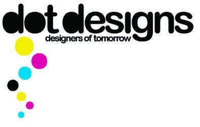
Corporate ID Time again!
This was a recent brief for a new design agency, dot designs (designers of tomorrow), the was/is to recruit students in to work on professional briefs. Sound a little crazy? Well then you are a bit stupid, not completely stupid just a bit! Because lets face facts these kids will go on to be the designers of tomorrow!!!
I was a student once (still am Post Grad doesn't make me a real student) and I've gone on to do alright for myself, but I would have killed for some real life experience that you just don't get at uni! Anyone who has work in design knows the time difference between a uni project and a real life brief! I have to start a project tomorrow that I have 3 day to complete, ready for print on thursday! In uni it would have been 6 weeks! DEAR GOD I WOULD LOVE THOSE TIME FRAMES BACK!!!!
But I don't I'm a grown up now! I've digressed a little...
DOT designs, wicked idea, I'm not sure what state it's in at the moment, I think she had to put the idea on hold for a while till personal things sorted themselves out, but I hope it comes together because its a wicked idea!
This is a logo I do love, because there is something in there for the print design nerds, the idea was to make it seem like a thought bubble from a comic, but as it's a design agency I used CKMY as the colours, see that was subtle and it looks good too!
Love to you all
Michael
Link
Larger Version
Friday, 8 August 2008
Drawing, drawing...
This one came about a year or so ago, when I was DJing in one club, I wasn't supposed to be working anywhere else, so me and a friend came up with this elaborate ruse to create an alter ego for me so I didn't get into trouble!
I had recently bought a mexican wrestling mask and the name just rolled off the tongue "The Lucha DJ".
So I made a little drawing to help create the illusion of the alter ego, we were going to do a whole series of photos etc etc, but the guy who put the night on told me to stop being ridiculous and just turn up and play or he might not let me! So I swallowed my pride and played!
Regardless I was left with this fun drawing!
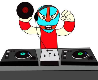
It does make me smile, maybe one day i'll DJ under the mask...
Love to you all
Michael
Link
Larger Version
I had recently bought a mexican wrestling mask and the name just rolled off the tongue "The Lucha DJ".
So I made a little drawing to help create the illusion of the alter ego, we were going to do a whole series of photos etc etc, but the guy who put the night on told me to stop being ridiculous and just turn up and play or he might not let me! So I swallowed my pride and played!
Regardless I was left with this fun drawing!
It does make me smile, maybe one day i'll DJ under the mask...
Love to you all
Michael
Link
Larger Version
Web Banners
I made these web banners, what feels like absolutley ages, and in fact it probably was!
This was my first attempt at combining a bit of casual logo design with some web banner animation...
Clear version
Version for myspace with a thanks on it.
I am not at all sure looking at it now whether I still like it or kinda hate it? It feels a little dated, but it was my first attempt at something like this! You need to start somewhere don't you. I think maybe the timing is a little off, I think that is what's bothering me.
My second attempt at this sorta thing was for my band, this wasn't so much an attempt at animation, but more a video effect through gif's, I think this worked rather well. Credit for the photos goes to Mei Lewis at mission photographic, boy got skills.
I did this in full colour first, then saw the file size and had an absolute heart attack! It is over 400k! Which is ridiculous unless you are on a super highspeed broadband, so I had to either make it look complete like complete arse or change it.
This is where the Black & White idea came in, that would reduce the file size loads to around 150k, which should load up quicker across most speed internet connections.
I like this as it is rather effective and looks vaugely like a video, but is just photos.
There is no need for band links, both bands have split up!
Peace out
Defy
Link
Mission Photographic
Sunday, 3 August 2008
Logo Design
So are fair few of my friends are in bands, there's is no escaping it! And every now and I get ideas I want to try, some it's easier to just use their band names to get the idea underway!
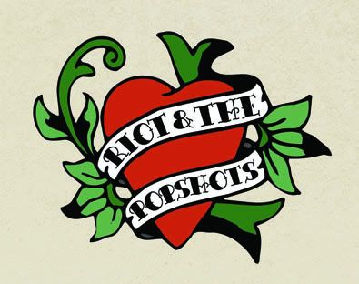
So Riot and the Popshots are a punk band, I guess you would call them horror punk or psycho billy or some strange pigeon hole like that. To be honest there is a lot of the Ed Hardy/Tattoo/50's/retro style in them, so that's what I was thinking.
I will admit that I have a style, and it's fairly obvious that I like grunge/vector shapes/clean typography, but it is occasionally nice to try something different and see how it turns out. So here is my first experiment into that world.
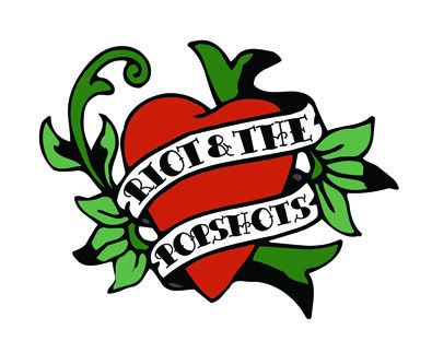
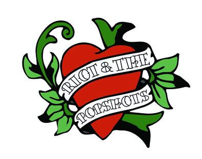
I kept this version clean without any texture or real detail.
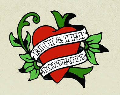
This one has some texture, and I tried a background colour. Liked the background colour.
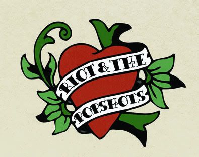
Then with a lot more texture detail.
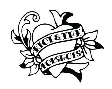
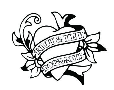
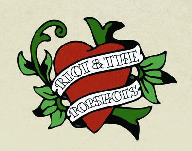
And then a look at it completely clean, I might try shading it at some point, but I've only tried that once or twice before, so we'll see.
Anyways, after something different, I'll find the plot again soon.
Much love
Michael
Links
Larger Versions
Riot and the Popshots
So Riot and the Popshots are a punk band, I guess you would call them horror punk or psycho billy or some strange pigeon hole like that. To be honest there is a lot of the Ed Hardy/Tattoo/50's/retro style in them, so that's what I was thinking.
I will admit that I have a style, and it's fairly obvious that I like grunge/vector shapes/clean typography, but it is occasionally nice to try something different and see how it turns out. So here is my first experiment into that world.
I kept this version clean without any texture or real detail.
This one has some texture, and I tried a background colour. Liked the background colour.
Then with a lot more texture detail.
And then a look at it completely clean, I might try shading it at some point, but I've only tried that once or twice before, so we'll see.
Anyways, after something different, I'll find the plot again soon.
Much love
Michael
Links
Larger Versions
Riot and the Popshots
Subscribe to:
Posts (Atom)


