Well, I was asked to completely re-brand a club night with a new name, new flyers, new posters and a new look!! Away with the bright gaudy colours please! Away with the stupid Nu-metal graffiti style graphics! Well that wasn't exactly what I was told, but you get the idea (or you will if you ever see some of the other flyers!!)
New name was quiet riot, I had the idea when listening to a Brand New song, seemed appropriate for a predominantly emo night.
Don't have a clean version of the logo, but it is coming up.
So first of I had to make the flyers!
Flyer front
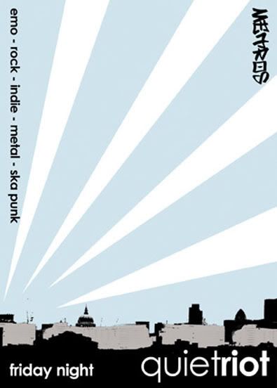
and back
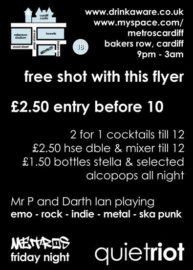
Poster
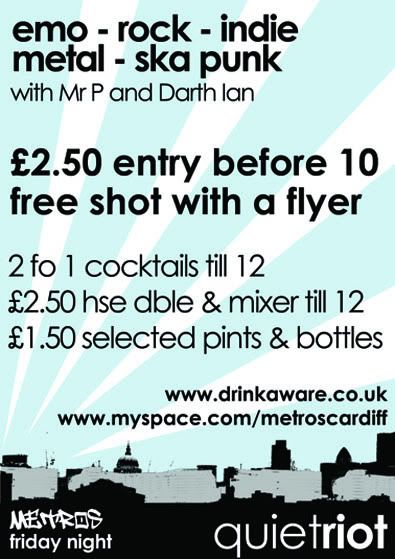
I am not going to lie and say at this point (around 2005-6) in my life as a designer I wasn't obsessed with grungy objects and vector shaped, because I was! WAIT!! I STILL AM!
But I had used this layout for a uni project and really liked it, so I brought it back to life in this series of images, it was nice to see it out in the world rather than just getting marked by a lecturer.
The random thing was, I kinda knew that bosses at the club were trying to save some money so I had it in the back of my mind to keep the design universal so they could print Black and White if they wanted/needed to and I think when you look at the Black and White versions as well....
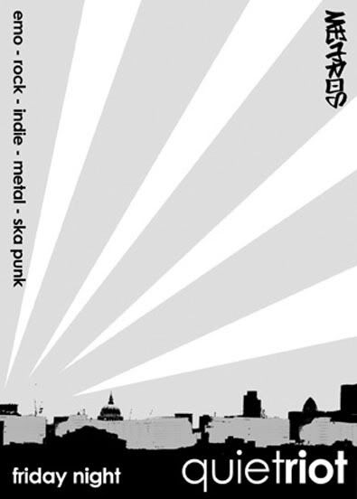
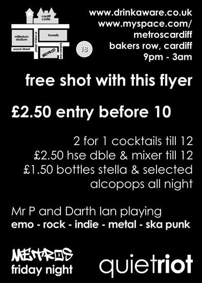
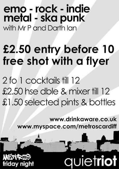
it stands up, in both forms! The gentle blue makes it cool looking, where as it still retains the style of the piece in Black and White.
This was actually the first thing I had proof read twice by different people and it still got through with a spelling error, which was jokingly referred to then on as the Mr. T mistake! Points if you can spot it!
Love
Michael
Links
Larger Versions


No comments:
Post a Comment