
So Riot and the Popshots are a punk band, I guess you would call them horror punk or psycho billy or some strange pigeon hole like that. To be honest there is a lot of the Ed Hardy/Tattoo/50's/retro style in them, so that's what I was thinking.
I will admit that I have a style, and it's fairly obvious that I like grunge/vector shapes/clean typography, but it is occasionally nice to try something different and see how it turns out. So here is my first experiment into that world.
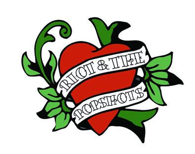
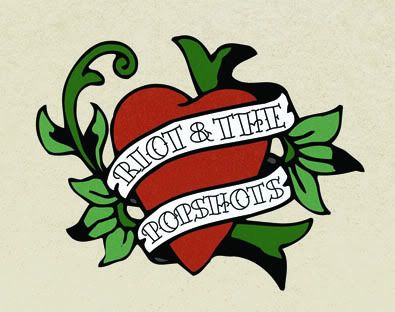
I kept this version clean without any texture or real detail.
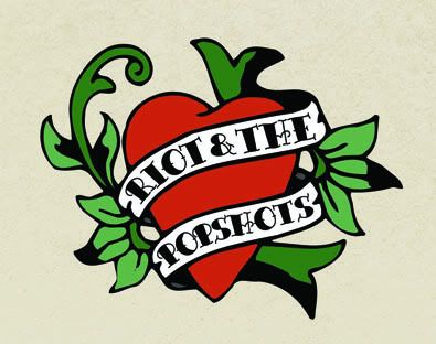
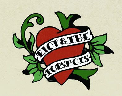
This one has some texture, and I tried a background colour. Liked the background colour.
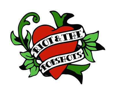
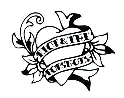
Then with a lot more texture detail.
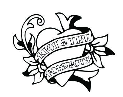
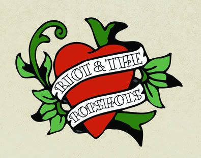
And then a look at it completely clean, I might try shading it at some point, but I've only tried that once or twice before, so we'll see.
Anyways, after something different, I'll find the plot again soon.
Much love
Michael
Links
Larger Versions
Riot and the Popshots


No comments:
Post a Comment