Once again with this one I've been looking at Scott Hansen, and got inspired. This was a different process as I had a large amount of detail that needed to be included, pictures, logos, details...so to get creative visually was a part of the fun!!!
This was a cool one to do, because I used some of the techniques I got from a Scott Hansen tutorial with computer arts in photoshop and then some of my own ideas in illustrator. First time I've programme hopped on a piece in ages.
But here are the result as I went through them.
stage one!
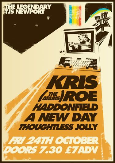
i thought that the rainbow across the image was a step too far, as looked a bit busy, so...
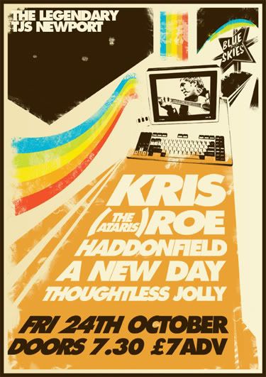
Now on reflection, the text was all a bit samey, soo...
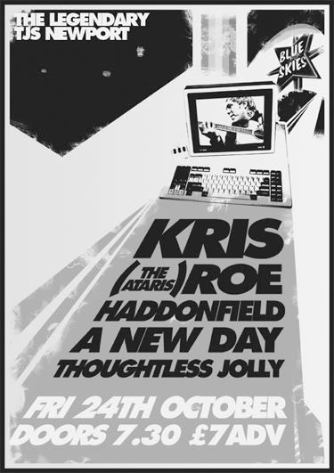
will it look better with the added detail?
maybe not, I thought it was important to look at the text the other way round...
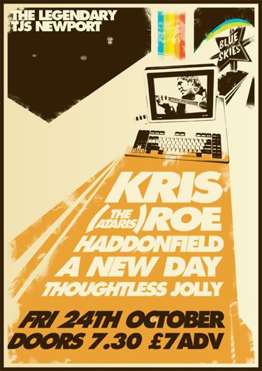
again it looks different, but I think the continuity of the top text being venue detail, and the price/date info being a different doesn't make good sense.
As always with me, you have to look to black and white...
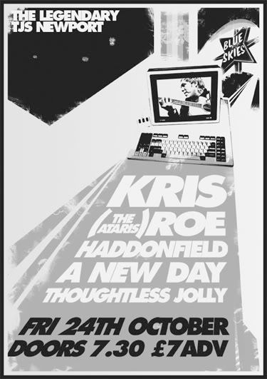
I had to change the contrast, as just a clean greyscale switch didn't work, so I upped the contrast a little so it was the details were clearer.
At this point I was happy with any of these really, but I prefered it without the extra detail, but this is work, not art! So it's not about what I think.
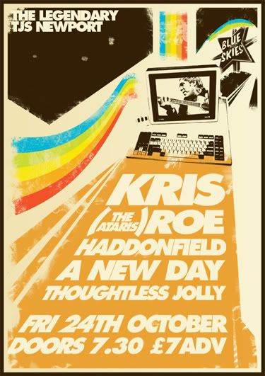
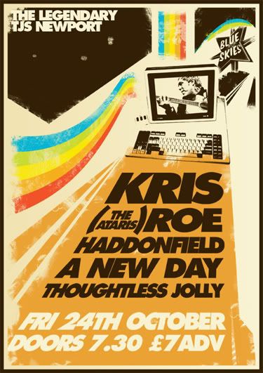
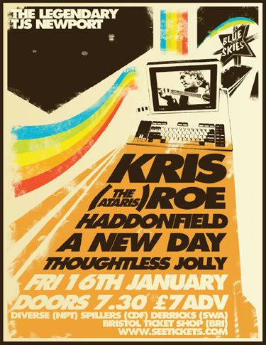
I sent it off to the client, and he had one addition and chose this...
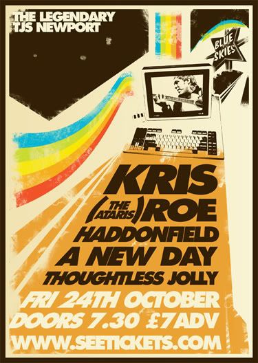
and thats that! I think it looks good and serves the purpose! Infact I am really happy with the end result, and yes I am rather excited about the gig as well!
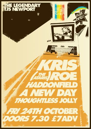
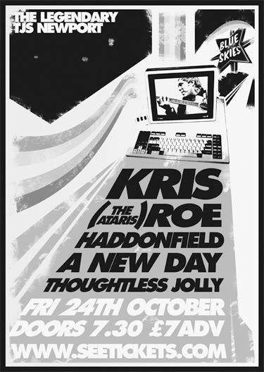
EDIT....
Same shit different day...
It would appear that InDesign's JPEG colour bias is different to Photoshop...
Peas oot!
Defy
Links
Larger Versions
The Ataris
Haddonfield! As I love these gays!
A New Day, also because they are awesome boys!