
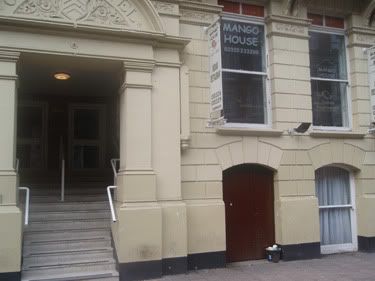
Now for the reasons of a bit of privacy, I am not going to name the place in question, as then google might find me (ha!). So here we go, would you take a contemporary curry house in Cardiff city centre in an amazing location and then use comic sans in the branding?
If you thought yes I am going to hunt you down.
Don't believe me?
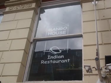
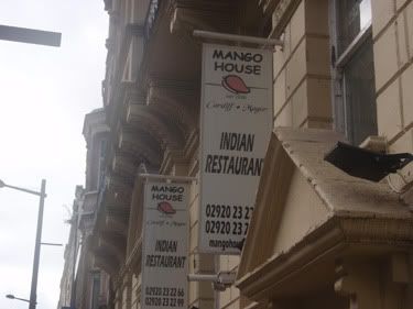
See! Does that make any sense? Well it must have to someone...just not me.
So I decided to redesign their logo! WITHOUT COMIC SANS!!!
This was the first version I did:
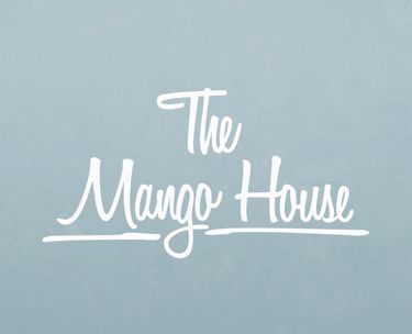
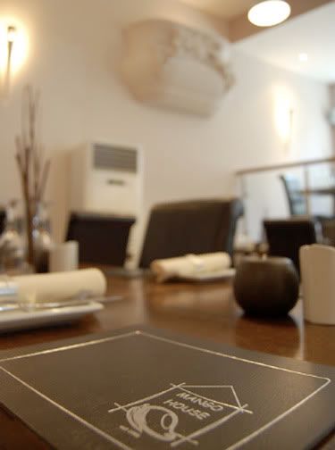
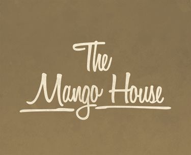
I thought about it, I like the way it is presented, this is how I would like to see it. But they have used browns and neutral colours inside, so I thought about it in terms of a practical redesign and I used a similar colour to that used inside.
Well thats another one for the pile of redesigns. Lets see if they ever find out about this...
Fingers crossed
Michael
Link
Larger Version


No comments:
Post a Comment