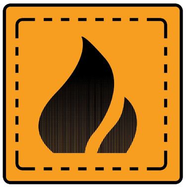
This is one of those random little things that I did, that I wanted to share as I enjoyed making it, even if I didn't get the job.
I chose to do it in orange for a few reasons. Red is generally a warning colour and black stands out the most on yellow. The problem is yellow has become a standard for information signs so the hybrid of red and yellow is...

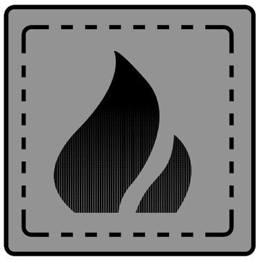
Trying it on grey, as I wanted to see what it looked like.

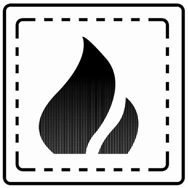
And finally just black and white.

From a technical standpoint, using the halftoning on the flame instead of a gradient, who make this a easier/cheaper to print or lower memory usage if it was online.
Sweet.
Michael
Link
Larger Version


No comments:
Post a Comment