
Not so long ago I did a shirt design for South Wales ParKour, great guys super happy with my work (who knew I could make people happy!) so when they wanted to focus on their team/crew they needed a branding and then something to start making them some dollar bill y'all (I swear I will stop talking like that). The aim of their branding was to move the feel of parkour away from martial arts style (go look its surprising) and closer to the high end skate feel (a la Volcom).
First of branding...
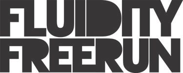
Strong bold text, I tried to link it together a little to keep the sense of flow to it, as flow is a big deal to free running.
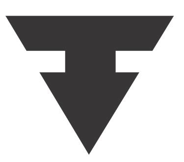
This is the branding mark, now you can look at it for ages and get a bit confused as to what its about, or I can tell you it's the negative space between 2 f's facing each other. I tried loads of combinations of double f's, and this was the only one that looked individual.
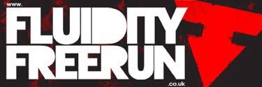
In situ on a sticker:
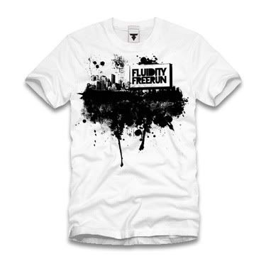
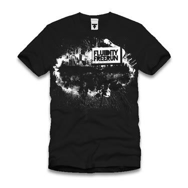
I also did them a shirt design!
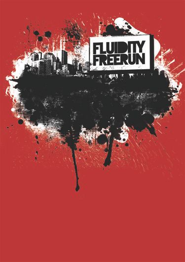
This is how it looks in 2 colour format. A few colour options...
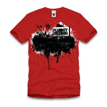
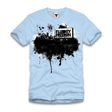
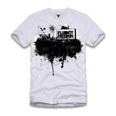
The interesting part of this is, the screens for the white and black elements should work wonders in one colour as well!
I really enjoyed working on this piece, it was cool to combine a few things I really enjoy doing, branding and shirt designs. So plenty of love to them!
More to post!
Michael
Links
Fluidity Freerun
Larger Versions


No comments:
Post a Comment