Wednesday, 2 July 2008

Photos

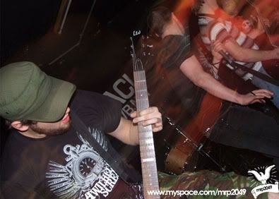
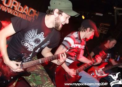
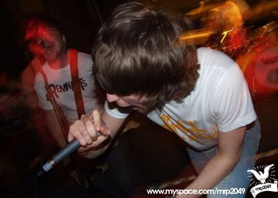
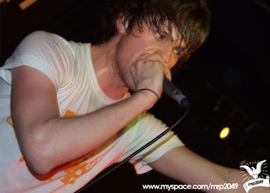
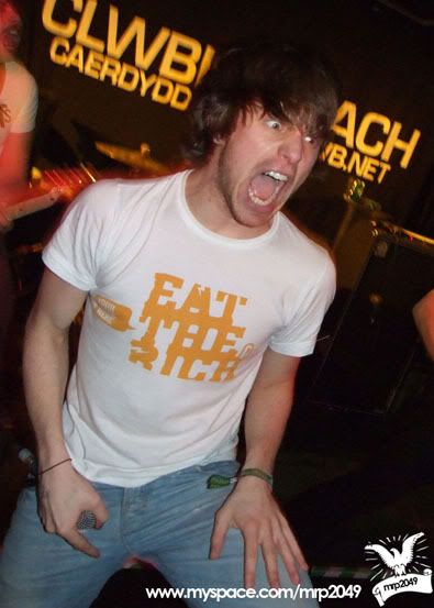
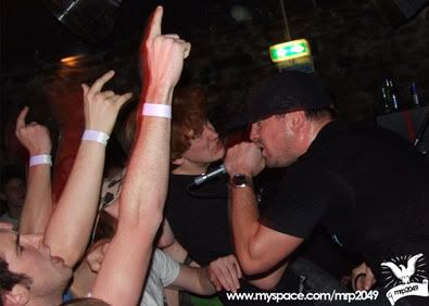
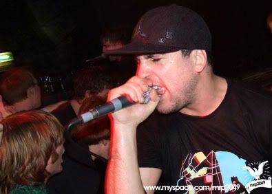
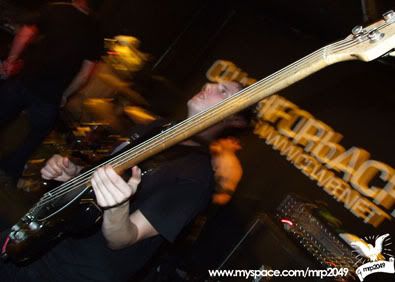
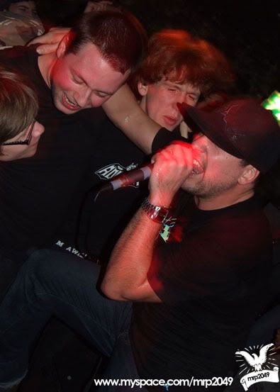
This gig was in January, I was in work when the show started, so missed A New Day as they opened the show.  They do indeed rock!

All Idols Fall:

Photobucket

Photobucket

Failsafe:

Photobucket

Photobucket

Photobucket

A Wilhelm Scream:

Photobucket

Photobucket

Photobucket

Photobucket

Much Love
Defy Designs

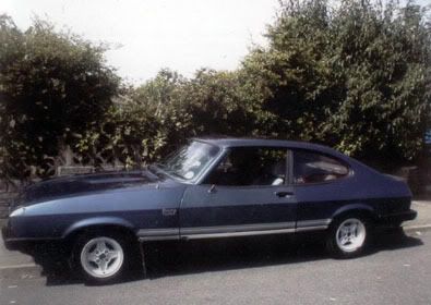
Link-en-continental (like the car)
All Idols Fall Full Album
All Idols Fall
Failsafe Full Album
Failsafe
A Wilhelm Scream Full Album
A Wilhelm Scream
A New Day - Worth a click, honest!

Posters

Most of these posters are old designs, that I look at now and like the idea, but I am willing to admit that if I went back to one or two now they would probably be executed way, way better!

But then that is part of being creative, improving, and being willing to admit your faults!

Photobucket

In this case, I must confess, I was experimenting with just basic photo typography experiment. But I do like the result, I love the colours that are used, the black, grey and blue combo is rather tasty!

Photobucket

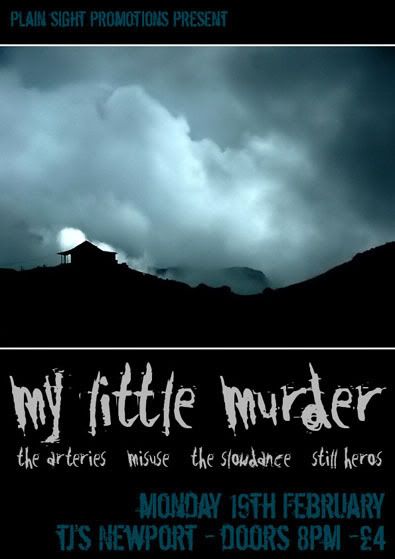
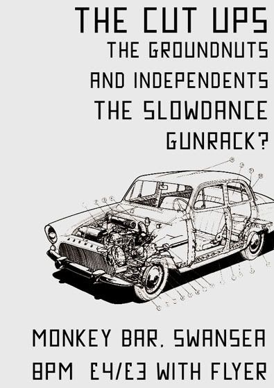
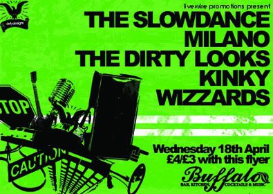
A gig with my band, I still don't hate the idea here.

Photobucket

A poster for a venue in Pontypridd, I liked the idea alot! So much so....

Photobucket

I actually printed this on grey card/paper and it look pretty good. Possibly better than the other attempt.

Photobucket

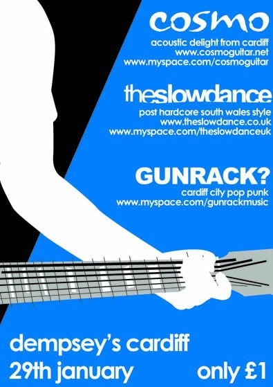
I'd been playing a Tony Hawk's Pro Skater game, and I think it shows, I like the fact that there isn't really an image on here, it is totally about the info!

Photobucket

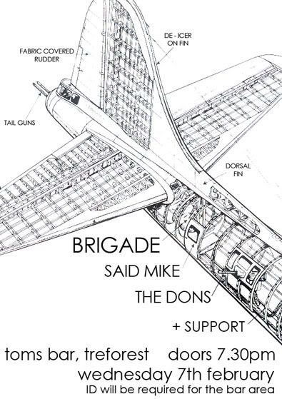
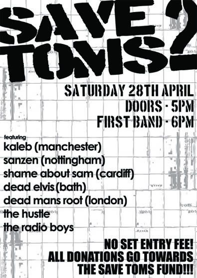
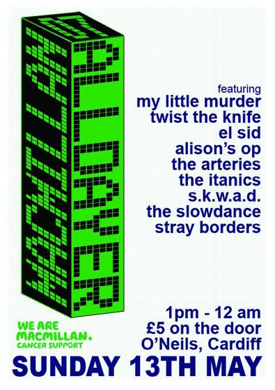
This was for a charity event, it was a real challenge as I was given an enormous amount detail, band descriptions, myspace address, photos, various logos.....
So I genuinely struggled with how to present it all, so decided not to!

Please keep scrolling this is old work....
Defy Designs

Links
Larger Versions

Co-op!

The first part of this was meant to be a co-op, the second half I just found out, and was a complete surprise!

So part one:

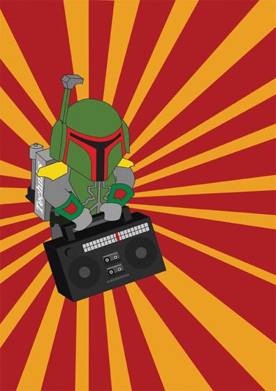
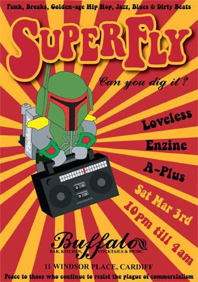
I was talking to a friend (DJ Enzine) of mine about the flyers he was making for a funk/hip hop night he was running, we were talking about using parodying iconic images/flyers and generally ripping things off for comedy value. I had seen a cartoon character of Boba Fett and made a throw away comment about getting him some bling and a ghetto blaster! Before I knew it, I was re-drawing the Boba Fett image and adding some bling and a ghetto blaster!!

Photobucket

At this point I emailed this to my friend and said, "Send us the rest of the details and I'll finish it!" He said he'd rather put the info on, and here it is...

Photobucket

one of the only times I have (thought or atleast till 2 minutes ago) I have ever done anything co-op. I love the result!

Part two was an accident I think, but I'm still taking it!!!

Photobucket

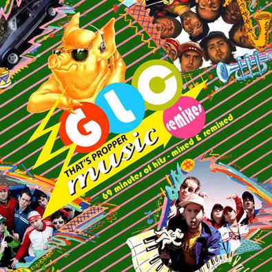
This is the cover of the GLC mixtape, as made by DJ Enzine, it wasn't until I really looked at it, I noticed a photo that I'd taken in the top corner!

Photobucket

See!

So one very deliberate co-op and one seeming accidental co-op!

Peace out.
Michael

Linking
Larger Versions
DJ Enzine VS The GLC
DJ Enzine

Flyer/Poster

This space isn't about me and the fact that I'm in a band, it's about me as a Designer, so let's just get on with this.

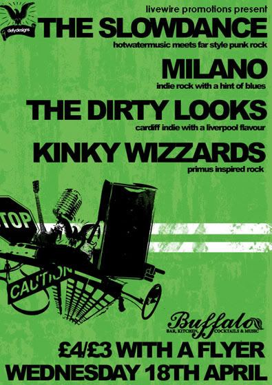
I'm in a band called the Slowdance, from time to time I have done a poster/flyer for us, this is one of those times.

I did this summer 2007, I was just discovering texture's...

Photobucket

The reason for the chaos in the corner, I'm was thinking about things that seem to go into a modern band, it's not just about the music anymore!

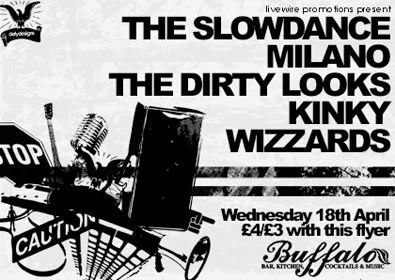
I had to make a poster version aswell, which was a challenge to change the aspect and keep the vibe the same without it looking daft! I think I did well, I used the extra space for detail, now that's a bright idea!!!

Photobucket

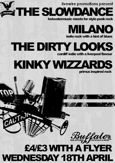
As I have previously mentioned, reproduction across levels of printing is important to me, so here are the black and white's as well!

Photobucket

Photobucket

I'm going to get me some food!
Defy Designs

Link Hawk(you know from "Over The Top")
Larger Versions
The Slowdance

Logo Design

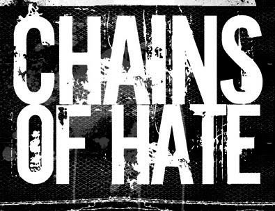
Logo Designs for bands are either annoying or loads of fun. To be totally honest this was both! When you are confronted with a band name like Chains of Hate, who are an old fashioned NYHC band, it's hard not to just churn out some stereotypical college style font and call it a day! But I was the best man at the guitarists wedding, so I couldn't just knock it out!!!!

First attempt was based around an industrial idea, you know chains = industrial...
Photobucket

I wasn't at all sure whether this was any good or if I hated it! So back to the drawing board...

I started thinking about how hip hop style and NYHC have gone had in hand, so there had to be some easy way of getting the two together in a way I liked.
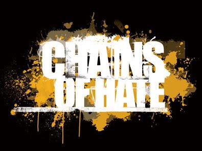
Photobucket

and the end result was a very hardcore looking logo, textually and visually, but I used a very hip hop colour palette, the main gold colour was sample directly from a pair of Missy Elliot signature Adidas! You can't get more bling bling than that!

We out!
Defy Designs

Link M***** F*****
Larger Versions
Chains of Hate

Logo Design

This is from the end of 2005, I was working for a club in Cardiff, one of the owners got his hands on a club in Bristol, knowing full well I did "that design stuff" he asked me to come up with a logo and any ideas about how to apply it.

Logo...

Photobucket

Once again, I'm not going to hide where my ideas came from, the boss asked me for something big and bold, and I was watching scrubs the night before I did the logo! No surprises that the logo has similarities with the scrubs logo!!!

I was really happy when they listened to my suggestion of spray painting the logo onto the shutters outside the club.

Photobucket

Photobucket

The club under that name doesn't exist anymore, I haven't really been back to Bristol since, so I have no idea if it's still there or not. Would be nice if it was though, my design work literally 10m away from a genuine banksy!

Much Love
Michael

Linking to the Links
Larger Versions

Something for fun!

This is older, maybe 8 months, but it's been sat on my computer for ages, and I thought I'd post it as I like it!

I took a photo of a telegraph pole. and then spent an hour or two playing around with it and a bunch of photoshop brushes later, it looked totally different! I want to just try and create something that had nothing to do with anything! I was trying to be artistic!

Photobucket

Defy Designs

Links
Larger Version