Certainly a cool feeling, I did 2 designs for Juliet Echo, (well they liked what I did with her CD artwork, so it only makes sense to follow through) I always try and produce 2 or 3 rough concepts for a client, it gives them a choice and it also keeps me sharp.
But in this case I did 2 different designs, I wanted to do one that was more geared towards being printed in several different colour shirts using the same colours and one that worked on black shirts with a few different printing schemes. Make sense? Good.
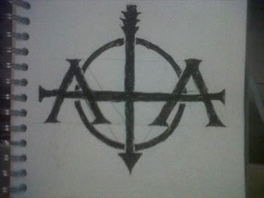
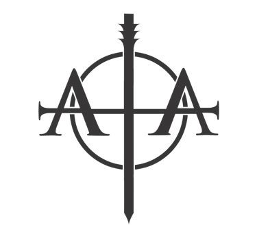
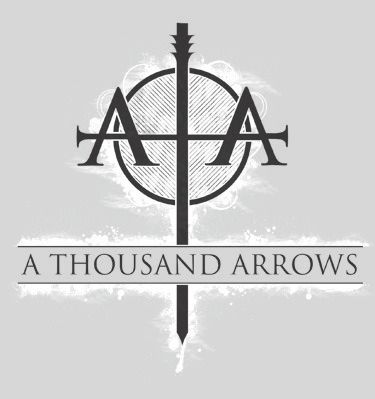
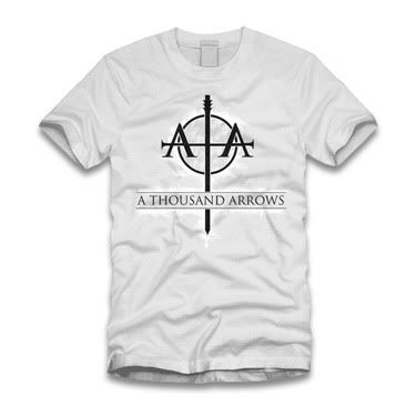
One:
better view of the artwork...
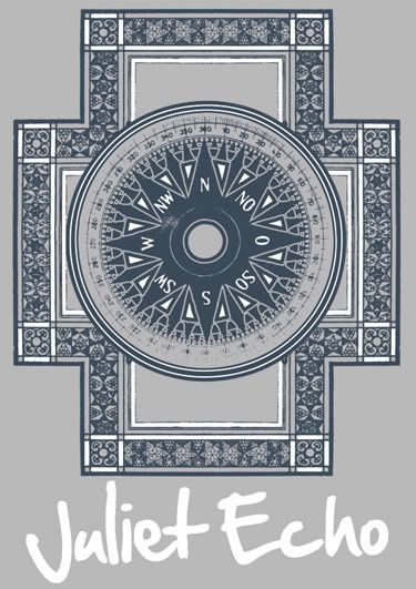
Do you get me now? This would work on more or less any coloured shirt, I just prefered the grey (ash grey on American Apparel if you are a nerd like me), so sent it and they liked it like this, so bonus!
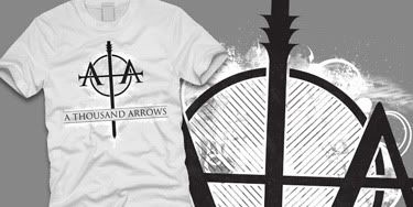
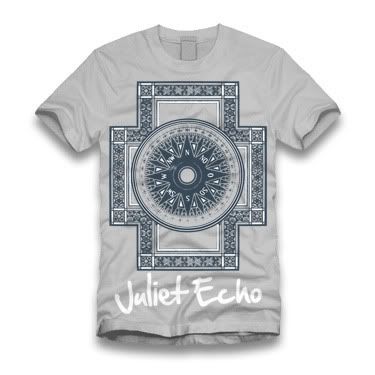
Two:
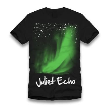
better view of the artwork...
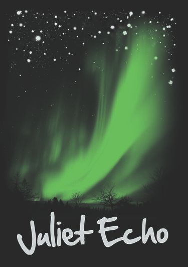
See what I mean, the (Canadian) Northern lights could be several colours, but I sent it in green and they liked the green.
The interesting thing was, I was expecting an email back saying, this one, but not that one, however I got an email back saying, "We'll take both!" ROCK ON!
2 sent, 2 accepted. I hope it works like that in the future!
I can't leave this post with out offering a heads up to Bob "Thrash Nasty" Kawa, who's crazy use of geometric shapes inspired the first design. I'll link him in a second.
I think that is most everything for now...
Michael
LinksBob "Thrash Nasty" KawaYou can buy it hereLarger VersionsJuliet Echo