skip to main |
skip to sidebar
As I said, I fancied trying the stencil thing again, I did!
First off, I thought about designing a logo or something, but then I decided to go with something I've already done just for the sake of making my life a bit easier! Next time, Ill start from scratch.
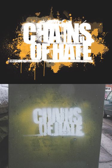
Seeing as I was working with stencils and spray paint, the logo I designed for Chains of Hate sprang to mind, mainly because it has a spray paint(ish) background and block text.
Reminder...

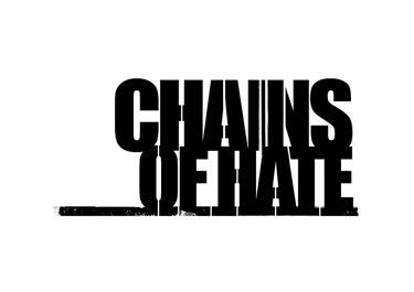
So first things first as I was only planning this to be 2 colours (learning curve going on here) I had to simplify the text as my starting point...

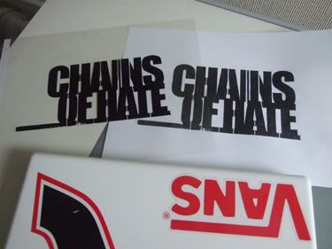
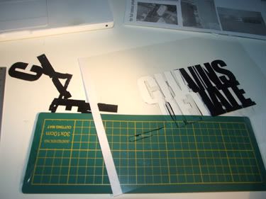
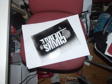
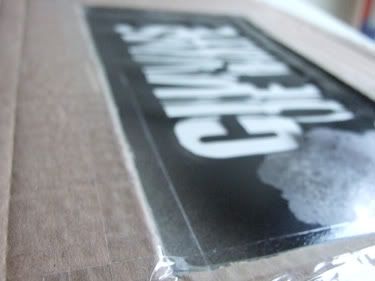
Test print and acetate version

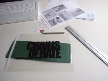
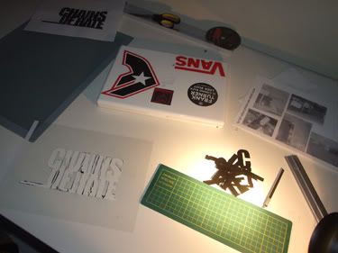
Down in print, now its time to get working...


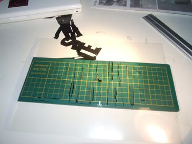
Now I am the first to admit faults if I think it will help someone not make them. So, the logo was a little complicated and at point there wasn't enough linking parts, so there had to be a few modications on the fly, just so it stood a chance of working properly (it would have flapped around everywhere and the lines would have been terrible).
Quick test...

I think this looks rather cool...

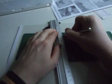
Next problem, over spray and trying to spray whilst holding a flimsy sheet of acetate! So...

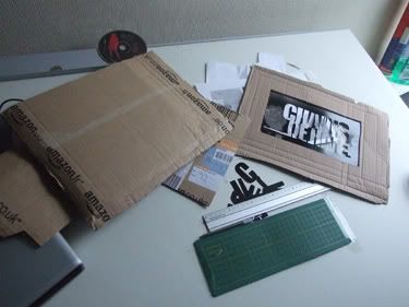
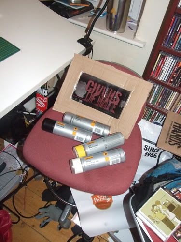
Thank you Christmas presents arriving all at once giving me a big box! Recycling is important people!
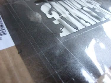
I had a thought, the paint might get into the gaps in the card and it could do with strengthening, cue lots of tape!!!


Ready for a test!

The next stage I am going to say: This is slightly illegal, if you do it somewhere you are not allowed to, so I would strongly recommend not doing it!
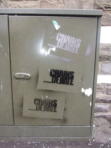
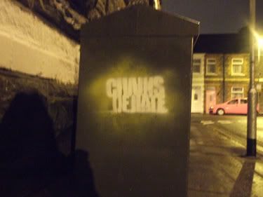
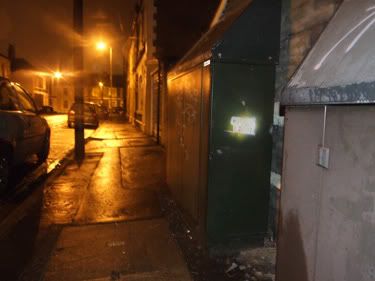
I finished work at 2.30am, ideal time to be out i thought!
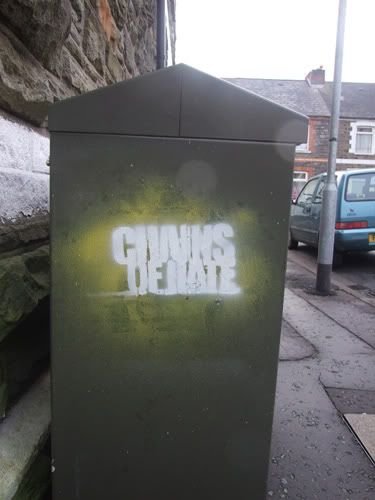
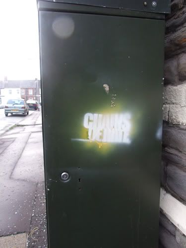
Test one...

Test two...

Then I thought I'd go back and have a look in the day time...
One...

Two...

Not bad for a first try me thinks! A bit of practice and this could look awesome! I'm going to a gig monday with Chains of Hate, I am officially tempted to take fabric paint and my airbrush kit, and spray anyone in a plain shirt with one of these bad boys!
Quick thought, before and after...

With a few more practices, I reckon I could nail this. I'll probably add to this one as I try again!
Merry Christmas!
Defy
As I have said on several occasions, I've got a lot of friends in bands, it happens when you are in band! Not rocket science really...
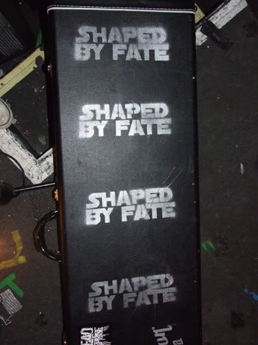
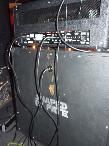
But anyway, about 10 months ago it was my friend Richey, guitarist from the mighty Shaped by Fate and fellow Star Wars nerd's birthday. We had a conversation not long before his birthday about badging/tagging equipment, so birthday just around the corner, what do I think is a good idea, a stencil that says Shaped by Fate! He's a Star Wars nerd, so there was only one thing that could be done, make a Star Wars/Shaped by Fate stencil.
Now this might seem random that his birthday was 10 months ago and I have only just posted photos of the stencil, but they haven't been on tour and really needed to tag it until recently, so it didn't get done till recently.
It was their Christmas show last night and there was cases galore/amps etc with my stencil design on it. That made me smile, so here it is....


So I think I might make a few more of these, as it was fun, next one I do, I'll post the process as well!
Merry Christmas!
Defy
Links
Larger Versions
Shaped by Fate
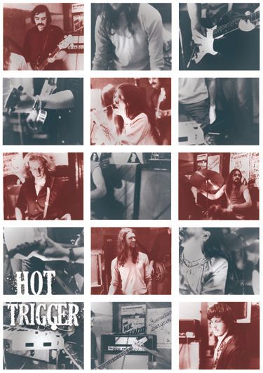
Well what do you do when your best friend says, "What's the best way to get some photo's printed big?" "Why?" "Christmas present for my Dad. He's just re-decorate, I thought it would be nice." Well I'll tell you what I did, I told her that she should forget printing the pictures bigger and I'll make you a poster!
And this is an odd one, when you are given a bunch of photos that are really important, do you:
a) get all designer and more or less ignore the details
b) come up with something that shows the photos off and make it look nice at the same time
c) just throw them all together and hopefully everything will be ok!
Well I went with B! As I felt that was the call for the job, I only had 7-9 photos and not all of them were that great, which is always a risk when you are working with photos that aren't yours and are 20 (something) years old! So the game is how many times have I used some of the photos, one of them is in there 3 times!
So here it is...

It was cool as this way one of the first times that I got to got out source a printer, get it done etc...
So...

I am pretty happy. So next Christmas I think I will advertise this as a service!!! HAHA!
Got to cook dinner now!
Michael
Links
Larger Version
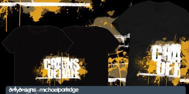
So I didn't go to bed, I got a bug up my ass about a shirt/logo I did ages ago, go on look through my blog and you'll see it...
It's slightly annoying when you design something for a purpose and you don't get to see it live out it's days in that form, and this is probably a good example. I designed this logo for a friends band ages ago, and as much as they liked it, they are poor and can't afford to send a 3/4 colour t-shirt design to the printers! To be honest at the time I was just doodling for want of a better way to describe it, now with a new avenue available to me, I have re-thought it a little and posted it as artwork for sale on emptees. I doubt it will ever get sold as a shirt design, but it's nice to think it's out there in the format it was planned to be used in, I guess until it gets sold, the design is mine(?), so I might re use it for something else...
I would probably give it away, just to see it get printed on a shirt and get one for myself, not saying I will give it away, but to see it live out its days the way it was intended would make me rather happy.

I should really go to bed...
Defy
Link in time...
Shirt on emptees
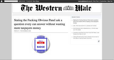
Well a friend of mine asked me for some help as he wanted to step up a site like "The Daily Mash", it's news parody site, rather funny, worth a click, don't worry link'll follow (dear god that is some terrible spelling/grammar), we had a chat and he had set up a blogspot to start getting his writing out there, and rather than suggest to him that I build him a furiously complicated website, at a great expense, I said the best thing to do at this stage is probably just jazz up the blogspot and make it look more newspapery (again with the made up words!).
Yes your read that correctly, rather than talk a client/friend into paying lots of money for something, I suggested he not spend a small fortune for now and just get something going and then my job was just to jazz up a blogspot! So i gave him what he needed, rather than what was the best for my wallet! You see, I am nice really!
But it's called the "Western Male", now if you are from (South) Wales, you will have most likely seen the "Western Mail" at some point in your life, but if you are not, then it is rather likely that the reference would fly right over your head, so in my infinite wisdom, as this is a parody site, I decide to rip off the better know "Daily Mail" (and because there is a newspaper that needs some abuse)!
So here we go and website/blog that looks kinda like a newspaper....
Logo

Site

Right bed time...
Michael
Links
The Western Male
The Daily Mash
Well it's true, I have recently been taken on by on by moley.tv as general mac monkey, it's only part time, but I am learning more and hopefully I will get better learning at this guys feet, as he is seriously clued up!
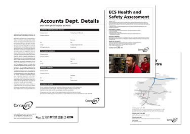
But yeah I spent an afternoon doing some seriously functional design work, ready...rebranding internal PDF's!! Hell yes!
But you know what it was strangely satisfying. There was plenty to think about, positioning the new logo's in the right place, with the correct spacing (I had a 24 page logo use document that I had to read!), making sure that everything that needed to be changed got changed...basically what I'm getting at is, this should have been boring as hell, but I actually enjoyed it! I am actually rather happy that one of the documents had to be completely redesigned and I did it, it looks great in amongst the rest of them, so I did it right!
Yes I am in my heart a wannabe punk rock graphic designer, but even I am honest enough to admit that my split personality took over and the challenge of making corporate stationary look the best it could was actually enjoyable. So please dear friends do not scoff at doing something because it is not as "cool", as it might be more of a challenge than you thought!

T.T.F.N.
Michael
Links
Larger Version
Moley.tv
First off I have to say, this is work from my first year, you hear me? No? Right...LISTEN CAREFULLY, THIS IS INCREDIBLY OLD WORK AND NOT THE STANDARD OF MY DESIGN SKILL THESE DAYS! THIS WAS DONE IN 2002, WHEN I WAS IN MY FIRST YEAR OF UNI! PLEASE FORGIVE THE SOMEWHAT CLANDESTINE DESIGN SKILL, I AM TRYING TO MAKE A POINT ABOUT A GOOD IDEA!
Rant over...
It's mad to really look back at your old work and think how bad it looks visually, it has to be that way, otherwise you are just stagnating as a designer, and who wants to do that? NOT ME!!! But I think the magic of looking back over old work is the little bit of satisfaction you can derive from a good idea. If the idea was good, then you know you were onto something.
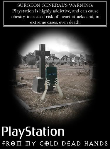
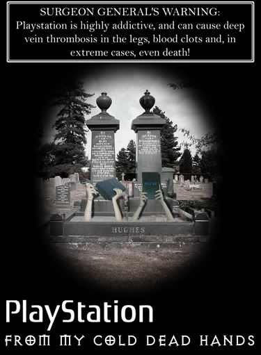
This brief was to create an advert for Playstation (2?), that would be used in a "lads mag", and somehow, with the combination of stories of deep vein thrombosis from long haul flights, kids getting fatter because they aren't as active as they used to be and Charlton Heston's speech in "Bowling for Columbine" as he proudly held his rifle above his head and prolaimed, "FROM MY COLD DEAD HANDS!" and I stitch the two together to get the following...


I can look at this idea now and see all manor of things that I would do to it now to present it better, but that's not the point I'm getting at though, it still remains a good idea, technical execution aside, I think the idea stands up still even now.
Perhaps this is a question of guilting the lily? Or in the case of my first year work, uncovering the lily...I've done it, now you try it!
Peas oot...
Michael
Links
Larger Versions
Well I do love it!! I think it is a really great idea, the brief was to create some form of promotional material that discourages people from dropping gum. It costs so much money to clean up!! It costs approximately, if memory serves, 17p to remove each piece from the ground!! And when you think a pack costs 30 something pence (don't know don't buy it) it is an insane amount of money being thrown at a problem.
I am really proud of this result as it was shear research that got me there, research into disposal methods, solutions that have been trailed, comparative solutions....and most of the solutions that were in effect were stupidly expensive, plastic pouches, some really disgusting posts/walls covered in gum...
I've always been aware that negative slogans/advertising don't have any effect whatsoever, look at the average smoker, you could put pictures of brutal deformed lungs fill with tar (wait they do that now) and it does nothing to stop them smoking, I found a completely random study done in Holland's public toilets where they printed a fly on a urinal. I won't repeat the statistic as I can't believe that they measured it, but it's safe to say it stopped people pissing on the floor as much because they were aiming for the fly! So here research said something funny...
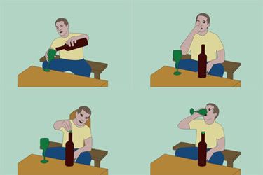
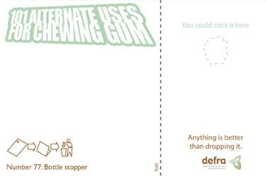
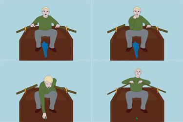
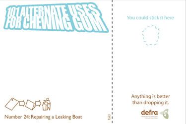
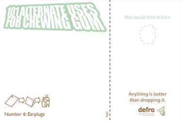
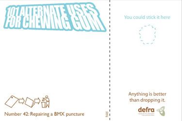
Roll on the alternate uses for chewing gum, I knew full well that these would probably have to come with an idiot warning on them, but I love the idea. There was an abandoned idea involving superheroes. So I tried my best to come up with as many ideas as possible, I think I got to 20 something, but to be honest I was clutching at straws past 10.
So I focus on the few that would make the best visuals, and did my homework into instructional images, that usually come on planes and warning cards...
And this is what I came up with....


Somewhere in the final stages, this went from just being a postcard, to the idea that you could stick the gum on the postacrd, doubling its usefulness! This came up when I looked back at the research, realising that it would costs roughly 5p per card, thus saving 12p on cleaning costs.
Please don't judge the quality of some of the drawing to harshly, I wanted to learn how to use illustrator at the time and this was my baptism by fire, I can see things I'd change now, but I still think it is a great idea and that's what counts! I still think the back is a lovely combination of colours and style, it's formal enough to be a government thing, but funky enough (colours and logo) to be cool!
Other things to do...
Michael
Link
Larger Versions
Heard of it? Yes? Good! No? Bad you! Well maybe not bad, you are still here aren't you! So maybe you should click on the inevitable links that will appear in due time...
Right back to the point, Emptees, t-shirt website where you can post and sell your t-shirt designs! Now I joined and the first thing I did was have a look through my external hard drive (only work that is on right now is on my computer) for old/long forgotten good ideas that probably deserved some airing/re-thinking/somewhere to be seen!
Well this is my first submission!

It is something I did in my second year in the development stages that just ended up being forgotten about, which is sad, because I think it's fun! Well anyways if you like it, you can contact me and BUY IT! Check that shit out! But seriously, you can! I can add some logo/branding and away we go!
Roll on a whole new set of challenges, I'm am so used to working in square frames, this is going to be rather interesting....
Love
A smiling Michael!
Links
BUY IT!!!
Emptees
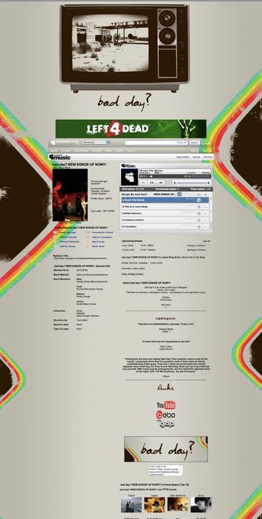
I've just done this, they liked the Kris Roe poster I did, and wanted me to make a myspace layout for them that looked similar. Not a particularly complicated brief, but still a brief none the less. In truth a rather complicated brief, how do you do something similar, but different at the same time? Well my answer was to use the same colour palette and just the idea a bit...
They gave me a logo that they wanted to use, and their name is bad day, so I started thinking about bad days, bad situations etc. I've just finished reading Dave Gorman's "America Unchained" (read the book, forget the documentary), and without going into too much detail he drives across America, trying to not pay any money to Big business chain stores, and one of his worst moments was running out of petrol, seeing an independent "gas" station and then arriving closer to see it was closed down. So a bad day? Chasing a dream and the lack of something making it impossible, thank you Dave Gorman!
Anyway, this is what it looks like...

This is the image as I made it, it was interesting as I layered the top banner on and made the background image alot bigger and then set it to repeat, you can't really see it there, but click on the link down (keep going...) and it'll make perfect sense. It was a good idea that meant the back ground wasn't completely static.
After a rough of the myspace layout they asked me to do banner, and this is it.

I was tempted to bring the TV image back in, but its only a small space, so would have been a nightmare or more to the point, a messy nightmare.
A good day!
Michael
Links make a chain...
Bad Day?
Dave Gorman - Look at it, the guy is a legend!
From time to time it has to happen! Learning is good! Learning is fun! I sound like I should be on Sesame Street!
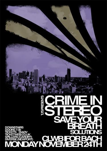
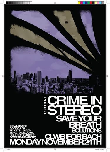
Anyways, new poster to make, and this time I had to get it all presented right to go to printers, so I did most of this one in InDesign! And learnt about saving it all the right way in PDF format for the printers!! Go me!!
But this was a cool little design, I must confess to abandoning 3 ideas completely because I was using the "Crime in Stereo" logo, which is some messed up form of Helvetica, so the ideas I had were abandoned in the early stages, because the text just fit with the other ideas.
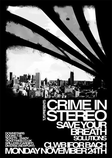
So I look on my shelf, pull out "Crime in Stereo is Dead" and got part of the idea for it from there,(click on me if you want to see it).
So here it is my most recent offering!


And here is the special bit for me....

PDF print ready! Oh yes, I learnded sumthink good!
I'm happy.
Defy
Links make the world go round
Larger Versions
Crime in Stereo
