Thursday, 10 March 2011

Roller Derby again!

Second thing I have done for my girlfriend's Roller Derby team! This time, rather than just colouring something in (seriously) I had to design something! Who would have thunk it?

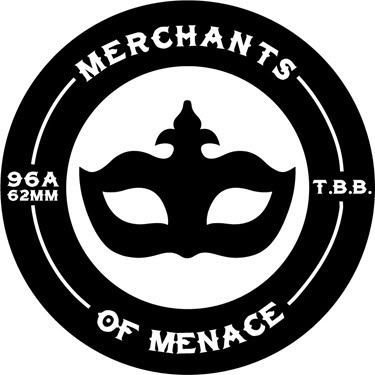
This branch of the Tiger Bay Brawlers is called the "MERCHANTS OF MENACE" (caps used for drama).

I had to design this with heat pressing in mind, to there isn't any crazy texture details or anything like that, big and bold.

It needed to include:
A Venetian mask, check.
Their name, check.
Some reference to the Tiger Bay Brawlers, check.
And if possible some sort of skating reference, check. Thats what the 96A, 62MM bit is about, wheel dimension, hence the circle!
Photobucket

Ain't I clever! Shucks, Jon Boy!

End stereotyping.
Michael

Link
Larger Version

Corporate things..

I was asked to do this as part of a treatment of logos by a friend as she wanted something completely different in the mix of what she was doing. Strange explanation I know, but it's true, when stumped, asking someone else for an bright idea can always help!

Photobucket

What do you do when you have to design a logo for a company who are company at the top of a series of companies, so have no clear visual identity....the answer is some clean and cool looking! I did that ^.

Judge for yourself!

Listening to music on shuffle is a dangerous idea.
Michael

Link
Larger Version

Instant album art 6

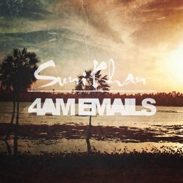
This one didn't go quite to the rules as it was inspired by an odd conversation with a client about waking each other up sending '4am emails' and a random joke about that sounding like an album title. So my brain said, 4am emails does sound like an album title...artist can be the clients name...look out flickr random search here I come!

Photobucket

So I give you Suni Khan's '4am Emails', a never to be released experimental acoustic trip hop album.

Best ideas are often the weirdest!
Michael

Link
Larger Version

Going backwards and forwards!

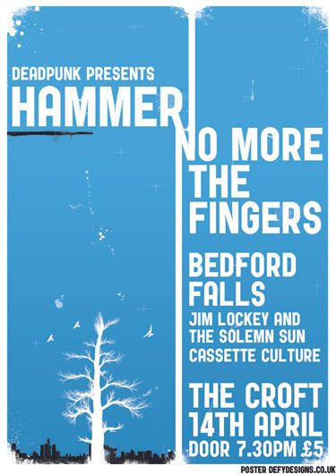
Another poster for the crew at the Croft, this was a really odd one as the band name was painfully long, "Hammer no more the fingers", if I had used the format they like the headline act's name would have been tiny! So I decided to try and make this one more typographical.

In the process of doing so, I seemed to manage to take a step back to 2009ish, in terms of my style, and make it very similar to what I used to do rather than what I have been doing. Does that make sense? Who cares? Visuals time!

Photobucket

You will have to troll through some of my old work if you don't believe me, or you could just not and believe me...I'd prefer that.

Few more posts....
Michael

Link
Larger Version

Wednesday, 23 February 2011

Corporate Logo

Bit of a weird one here, I was contacted at short notice to produce this logo, the client had a very solid idea of what he wanted, but was willing to let me run with most of the decisions, font choice, little embellishments...

This is a black version, if we are talking corporate guidelines, it should be a royal blue or white on a royal blue background.

Photobucket

An interesting little piece me thinks. It is also a middle finger to a designer I argue with a lot who says Trajan Pro is an awful font...I beg to differ, I think it looks great!

Listen to City and Colour, it's great.
Michael

Link
Larger Version

Friday, 18 February 2011

Something for a competition.

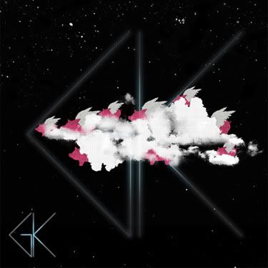
I am a bit of a message board lover, I love the inspiration, I love the dramas...with one I love dying soon (Emptees), there seems to be a movement to another, and the other is Bandjob. Great place, they love competitions as well, this particular one was for Glamour Kills.

The challenge was to take their logo and just go wild. So I started thinking, their logo is a flying pig, and the expression is "when pigs fly" and one pig isn't a plural, so I thought about a flock of pigs and went from their!

Photobucket

So I have decided that this is a flock of pigs trying to hide using a smoke machine. I added a bit of text and I like that, I wish I could fit it in clearer, maybe I should post that separately....

Yeah, I like this!
Michael

Link
Larger Version
Contest on Bandjob

Saturday, 5 February 2011

Pet food!

You heard me right, pet food!

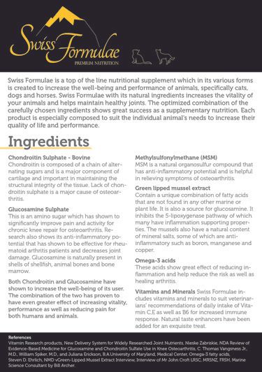
I have just finished an info sheet for a pet food company! It's not all rock and roll, but it is always good!

Photobucket

It is an A5 info sheet, personally, I would have loved a little less info, but then that is always going to be the challenge with these things! Small space, loads of info, get it all in neatly!

Nearly bedtime...
Michael

Link
Larger Version