Not heard of them, shame on you! They are truly special, an odd blend of folk, funk, acoustic, country...basically takes lots of good things squeeze them together and they are the result, awesome sunny afternoon music.

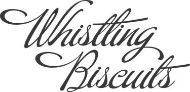
This was the version that flew out of illustrator, but that is never enough for me...

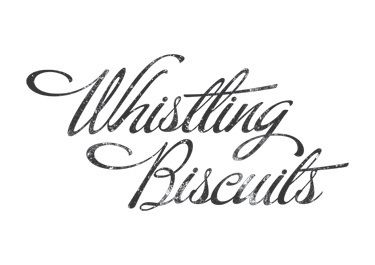
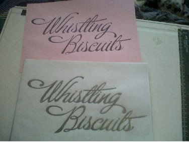
So I took it into photoshop and added some texture, I sent this over to the band and they were happy, but asked if there was another version, I had a few that were very similar, just different versions of texture, so I had a brainwave...This is a re hand generated font, I know what I am doing wrong, I am attached to my computer, so I printed the original non-textured version out and set to work.

Again this was an amazing process, as I had no idea as I was drawing how it would evolve, the answer is, not a great deal, but it did happen in ways I wasn't expecting and certainly in ways that wouldn't have happened had I been on my computer.
Once I had done the hand drawn version, I scanned it a whole bunch of times and pieced together a version from several scans.

I think it is a much stronger result for get my hands dirty.
Safety
Michael
Links
Larger Versions
Whistling Biscuits Myspace


No comments:
Post a Comment