I get bored sometimes, more to the point I get a little distracted when I should probably be working...(Frazer, if you are reading this, expect an email soon)
I did a bit of generic stock hunting for a logo I'm working on right now, I wanted the buildings for a texture, but got a little distracted when I started playing with the levels.
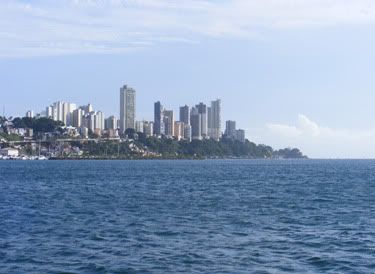
So here we go folks generico stock imagio. Just a city skyline, nothing special.
This is almost a half assed tutorial, but tweak your levels, turn reds up, greens down, blues up, then just play some more. I noticed an almost complete change to the feel of the image, it felt different, it was warmer, more worn looking, the colours were washed out, I liked it more already.
I thought to myself this isn't enough, so added these...
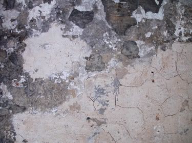

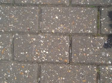
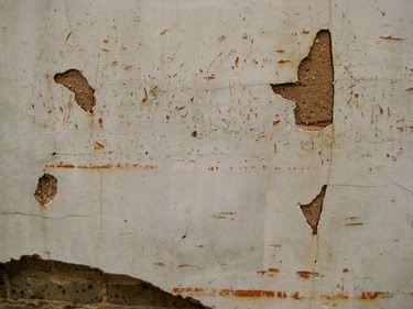
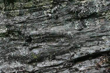
all of these image layers were changed to overlay and then opacity jerked down to around the 30% mark.
And you are left with...
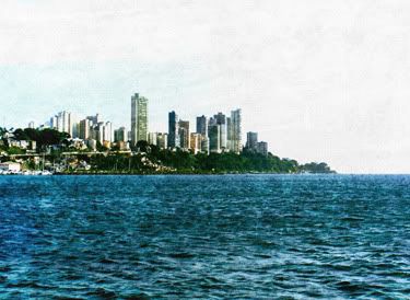
Which is far easier on the eyes don't you think?
NB: Some of these images are mine, some are from stock sites, some are from CD's from mags, I doubt anyone will notice or mind that I have uploaded them to my photobucket, however if you do have a problem, tell me and POOF they will be gone.
Time to send some emails....
Michael
Link
Larger Versions


No comments:
Post a Comment