
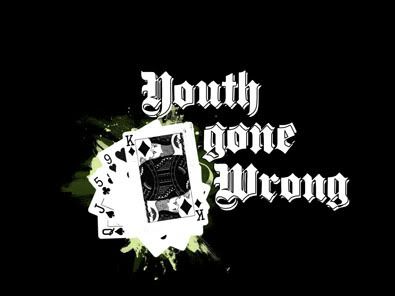
Here is the first version i did, there was genuinely something i couldn't put my finger on that i didn't like about it.
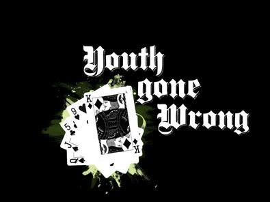
So I thought I'd add a little more detail to see if that helped...
But that didn't do it either, then I realised what was wrong, I totally wasn't fussed on the text, white with white, so a change was needed.
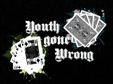
I also upped the darkness on the back pile of cards, so they had a little more detail. As well as changing the colour of the 2nd text layer and adding some texture.
But as with all good design, if you change something it's worth changing that original idea aswell...
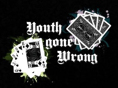
I am more than happy with both the 3rd and 4th results. Lets see what happens...
Explanation: The reason for the seemingly random card choice is, I was thinking of doing a full house, but then surely that would be a good thing?!? Nothing gone wrong there! So I chose what was a straight draw in the making, but not got. Somewhere there is an idea about bluffing and failing, over exuberance of youth etc... I've never explained my work before!
Love to y'all
Defy Designs
Obligatory Links:
Larger versions
Youth Gone Wrong


No comments:
Post a Comment