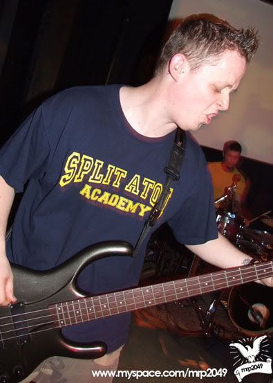
As I just posted the poster design I did for Engineering Consent, it seems a little random to not include the myspace layout and corporate ID I did for them! I was given a ball park idea, he said he like political style posters, I was given an example from the fine selection of work(the graphic design, lets not get all political here) done by some of the Communists.
We'll start with the corporate ID as it's been a while since I made one!
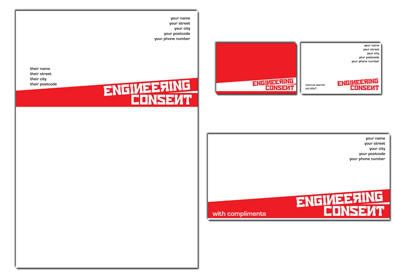
First a full sheet...
Now a closer look at the front of the business card...
and the back, I did try to add continuity to the front and back.
Compliments slip...
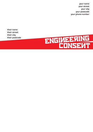
Letterhead....
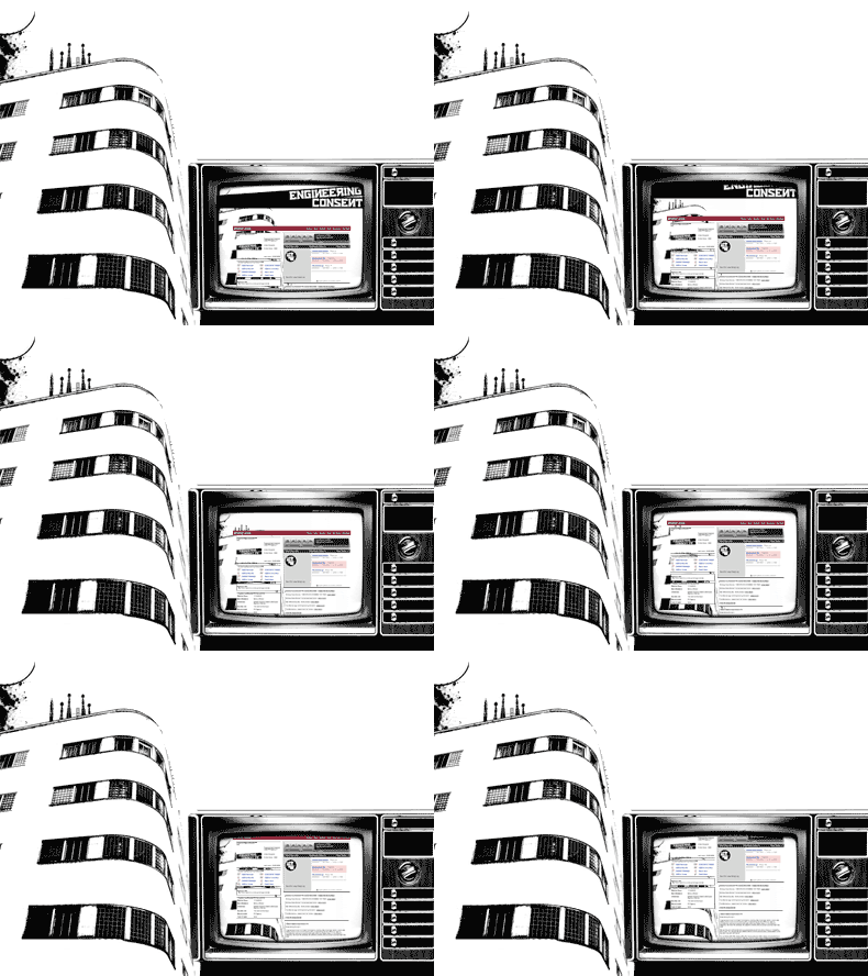
Myspace layout!!
I've included the little gif, just so you can see how I it works!
This was alot of fun to do, as it involved some random elements, but I was pleased with the result!
Much love
Michael
P.S. Definetly an example of spilt personalities working in harmony!
Link-tacualr:
Larger Versions
Engineering Consent
Sunday, 29 June 2008
Saturday, 28 June 2008
Poster Design...
Well there is a gig a coming! I've just finished the poster!
I will openly admit that I have been looking at a lot of Scott Hansen's work as well as the gent who designed my band's album cover, Ben Griffiths. There is no denying it this is where the inspiration for this poster came from!!!
I wanted to get mostly detail into it, but have some drama around the detail, so the focus remains on the info, but it wasn't so dull.
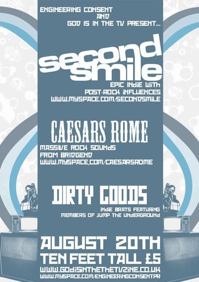
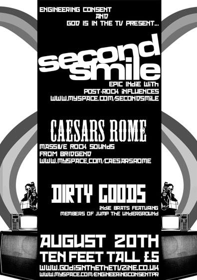
A big thing for me, is the fact that you have no idea what medium your work is going to be used in. So I constantly try to think about a different appropriation a piece some it can work across more than one format. It's all well and good a design looking great on screen or when someone can afford full colour super high quality printing, but that is so rarely the case! So I've done one in colour, with a bit more detail should it get to the printers/can be used on the web and one with most of the detail, but a few tiny changes so it could run through a photocopier and still look half decent.
Colour version in all it's sparkly glory!
Black and White version in it's photocopyable glory!!
Much love
Michael
Links, links, links...
Larger Versions
Ben Griffiths
Scott Hansen
Engineering Consent
Friday, 27 June 2008
Logo Design...
So in truth I had an idea in my head about something to do with playing cards, and I had just played with a band from Plymouth called Youth Gone Wrong twice in the space of about a month, so I just decided to use them as the name for it!
Here is the first version i did, there was genuinely something i couldn't put my finger on that i didn't like about it.
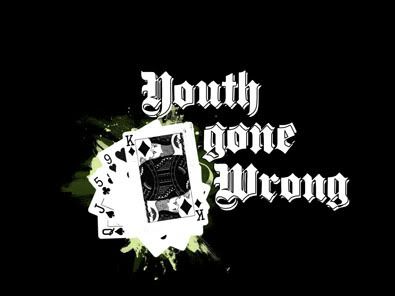
So I thought I'd add a little more detail to see if that helped...
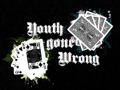
But that didn't do it either, then I realised what was wrong, I totally wasn't fussed on the text, white with white, so a change was needed.
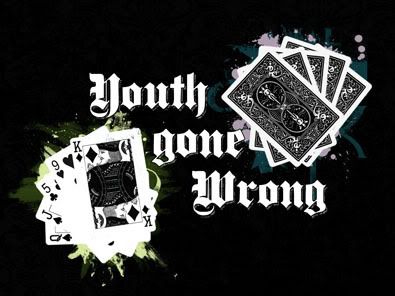
I also upped the darkness on the back pile of cards, so they had a little more detail. As well as changing the colour of the 2nd text layer and adding some texture.
But as with all good design, if you change something it's worth changing that original idea aswell...
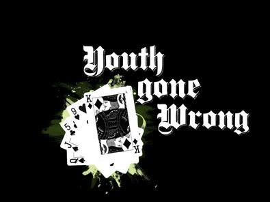
I am more than happy with both the 3rd and 4th results. Lets see what happens...
Explanation: The reason for the seemingly random card choice is, I was thinking of doing a full house, but then surely that would be a good thing?!? Nothing gone wrong there! So I chose what was a straight draw in the making, but not got. Somewhere there is an idea about bluffing and failing, over exuberance of youth etc... I've never explained my work before!
Love to y'all
Defy Designs
Obligatory Links:
Larger versions
Youth Gone Wrong
Sunday, 22 June 2008
As if by magic....
Well it's only day 2 in the existence of this blog and I've got something I want to post!
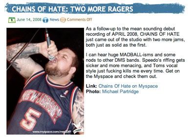
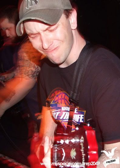
Yes one of my photo's being used on fully backed.
Article as you can see is on south wales freshest, finest hardcore band Chains of Hate.
A few choice cuts from the rest of the album include...
Love to you all.
Defy Designs
Links:
Full Album
Fully Backed
Chains of Hate
Yes one of my photo's being used on fully backed.
Article as you can see is on south wales freshest, finest hardcore band Chains of Hate.
A few choice cuts from the rest of the album include...
Love to you all.
Defy Designs
Links:
Full Album
Fully Backed
Chains of Hate
Saturday, 21 June 2008
Day One!
So after much soul searching, and thinking "I need a website!" I've got an interim! I doubt i'll ever loose this space, as I can upload rough stages, different versions of images that will probably never make it to my portfolio, but still you've got to try and do something interesting every now and then!
Subscribe to:
Posts (Atom)