At the beginning of the year, I swore blind I was going to make a more concerted effort to try and do more projects for no reason/contests/just because, so it hasn't been going that well, but I have certainly tried a few things that haven't seen the light of day on here because they haven't been finished. Give me time, they will come.
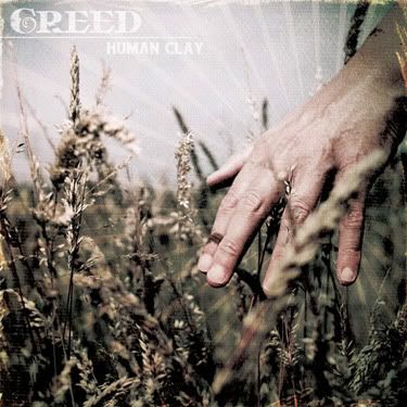
I've mentioned Emptees in the past, there is a similar site called Bandjob, and there is currently a competition running to "Re-Design A Horrible Album", what a great idea, when I saw that it was Creed's "Human Clay", I thought to myself...screw sleeping I'm going to have a crack at this!
I hate Creed and I hate that album cover, its an embarrassment! So this was really exciting to even think about. Meet my offering...
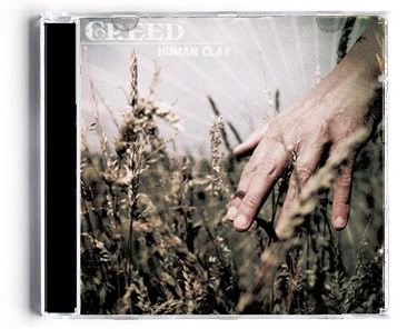
It is a stock photo that I have treated pretty heavily to try and make it more interesting, my idea was to not get a million miles away from something that they could use, whilst being a thousand times better than the original. I'm going to list this as for sale, as I doubt I will win the contest and this might interest someone as a cover for their record, stranger things have happened, but I honestly have no idea what will go over well with the judges, we shall see...
Links
Larger Version
Contest on Bandjob
Tuesday, 29 June 2010
Parody/homage
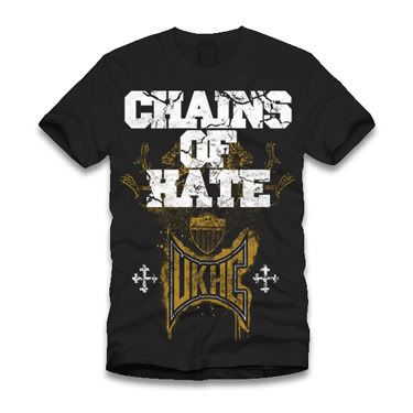
There is a fine line to walk between a homage, a parody and out and out theft. This shirt design was inspired by an afternoon following my girlfriend around various shops, a conversation about parody and knowing some friends far too well.
I give you...
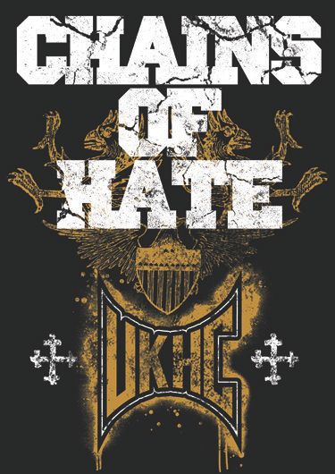
This design came to life after wandering around shops seeing countless "Tapout" shirts in a few different shops, a conversation with a friend about how funny it would be to do a parody of it for my friends in Chains of Hate. I tried a few variations around the style that is generally used in "Tapout" shirts, grunge, heraldry, big text...
I wanted to get the heraldry as the focus of the shirt and use Chains of Hate to parody the Tapout logo, but I couldn't figure it out, I had a brain wave and their ever present UKHC was used instead. I really enjoyed making this!
Details time......
I'm going to be very upset if they don't get this printed on an A2 screen as it will look rubbish on an A3.
First post in ages...
Michael
Links
Larger Versions
Chains of Hate
Subscribe to:
Posts (Atom)