Wednesday, 17 March 2010

2 pick ups!

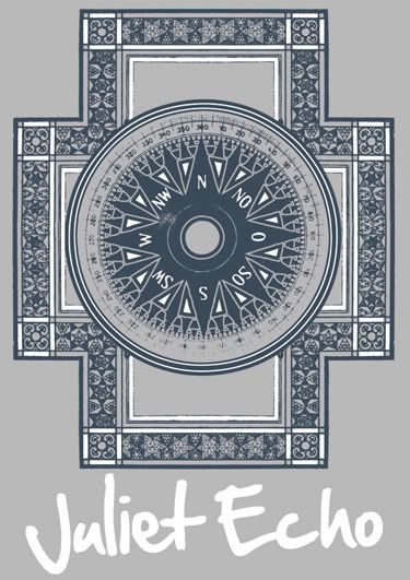
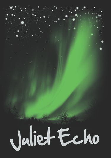
Certainly a cool feeling, I did 2 designs for Juliet Echo, (well they liked what I did with her CD artwork, so it only makes sense to follow through) I always try and produce 2 or 3 rough concepts for a client, it gives them a choice and it also keeps me sharp.

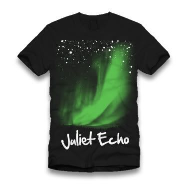
But in this case I did 2 different designs, I wanted to do one that was more geared towards being printed in several different colour shirts using the same colours and one that worked on black shirts with a few different printing schemes. Make sense? Good.

One:

Photobucket

better view of the artwork...

Photobucket

Do you get me now? This would work on more or less any coloured shirt, I just prefered the grey (ash grey on American Apparel if you are a nerd like me), so sent it and they liked it like this, so bonus!

Two:
Photobucket

better view of the artwork...

Photobucket

See what I mean, the (Canadian) Northern lights could be several colours, but I sent it in green and they liked the green.

The interesting thing was, I was expecting an email back saying, this one, but not that one, however I got an email back saying, "We'll take both!" ROCK ON!

2 sent, 2 accepted. I hope it works like that in the future!

I can't leave this post with out offering a heads up to Bob "Thrash Nasty" Kawa, who's crazy use of geometric shapes inspired the first design. I'll link him in a second.

I think that is most everything for now...
Michael

Links
Bob "Thrash Nasty" Kawa
You can buy it here
Larger Versions
Juliet Echo

Satisfying

This is about vindication and how nice it is to see your work come to life.

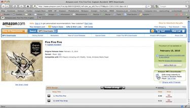
Artwork for Captain Accident was a really satisfying, it was done at break neck speed and looked great, so it was rather satisfying to see it up on Amazon.

Photobucket

Now I was not aware of this, but the physical artwork got re-done as there was more time for that. My logo stayed on it, but it was mostly redrawn.

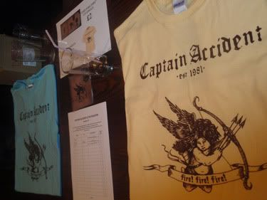
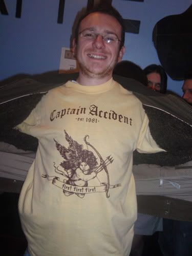
I had no idea there were going to be tshirts for the release show, so it was a pleasant surprise to see this when I walked into the show...

Photobucket

Here, have a better view, don't worry he is a friend, so he pulled a stupid face for me!

Photobucket

Sweet times.
Michael

Links
Why not go buy it?
Larger Versions
Captain Accident's myspace.

The never ending job...

It is never ending...

I have done all I can to get this done, it is just waiting on the band to get it together and get it all sorted. In truth, not my place to post the parts that haven't gone public yet, so here is the interesting part...

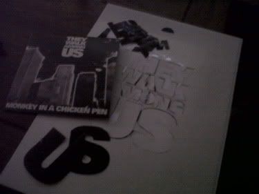
Photobucket

Look you can see the actual album in the picture! It does look good in your hands, the 40, 20, 20, 100 black is really black. What an odd sentence that must be to someone who doesn't know about CMYK printing.

The reason I carved it all out is...

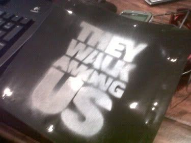
Photobucket

The thing with this album was to keep costs down, and this approach was way cheaper than a standard dual case, and far FAR more interesting! AND there is still more to come! But you will have to wait for that...

One day there will be a post with everything in it!

Few more things to post.
Michael

Links
Larger Versions
They Walk Among US Myspace

Sunday, 7 March 2010

Desktop design.

2 in quick succession, again.

I like doing it this way, again another f1 desktop design for this comp.

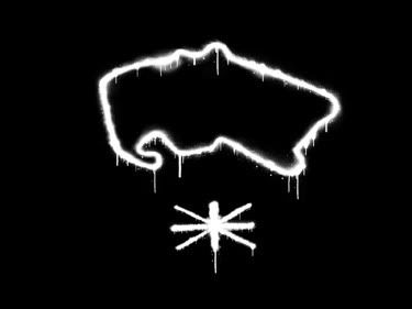
I was thinking about a version of the London Underground map that was done with squeezes of oil paint, I wanted to make it more relevant to the 21st century and the high speed, adrenaline charged nature of the sport. In case you don't know, this is Silverstone, you know the famous British race track? Yeah? Good.

I thought about doing this with spray paint, but I wasn't sure I would have the control, so I cheated and did it with spray paint brushes instead!

Photobucket

The interesting thing is, this could have more colours, be very different instead of just black and white, I might change it, who knows? There is also the possibility of a series that relate to different tracks...

Back to shows about heavy metal!
Michael

Links
Larger Version

Friday, 5 March 2010

Space in yo face!

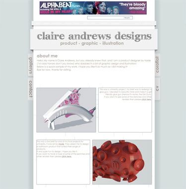
A myspace design, this is a very important layout for me, mainly because if I had made a mess of it my girlfriend would have killed me!

This is the layout for her myspace, she is a very talented designer in her own rite (mainly product design), and she needed a portfolio site, and once again myspace is an excellent solution in a hurry, as the coding is simple and effective.

This was another destroy and rebuild layout, lots of text areas and the like, nice CSS learning curve.

Photobucket

This was an attempt to be clean and concise, yet very cool looking, I tried my best, personally I love the green and brown balance.

I've included a link, I am however not sure if she has updated all the details yet...

Night
Michael

Links
Larger Version
Claire Andrews Designs

F1 Desktop

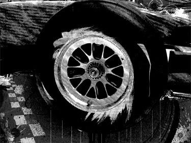
I saw a brief to design a desktop with an f1 theme. Now I don't know a lot about f1, infact the last time I was up on the motor sports world was when Damon Hill was still racing! So yes a few years.

I thought about it, trolled the sites I love for stock images and here we go....

Photobucket

I love how the tires look, so that was my inspiration. I have another idea that I want to follow through, so I might do that now.

Or I could go to bed...
Michael

Links
Larger Version